Clarity Trumps Persuasion: How changing the first seven seconds of user experience drove a 201% gain
“Be sincere, be brief, be seated.” While some experts have dutifully penned entire tomes about this subject, the famous advice Franklin Roosevelt gave to his son about public speaking still resonates today for its stark honesty.
If Franklin Roosevelt 2.0 was giving advice about Internet marketing, he would probably change “brief” to “clear” (and perhaps “seated” to “testing”). While marketers invest the majority of their time and budgets on complex areas deeper down in the funnel, MarketingExperiments research has found that most of the gain from optimizing a website occurs in clarifying the first seven seconds of users’ experience.
Much of the complex analysis and formulaic methodologies used by our scientists to create optimized pages with triple-digit conversion improvements can be summed up in this truism…
Clarity Trumps Persuasion
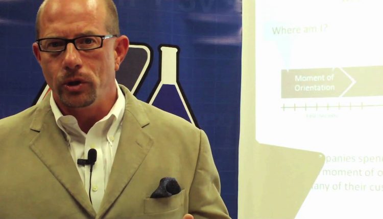
The first seven seconds, and perhaps just those first three, are vital to clearly guiding your visitor into an inevitable conclusion to engage in a transaction with you. Below is a quick excerpt from a recent live web clinic in which Dr. Flint McGlaughlin, the Director of MECLABS (our parent organization), discusses how your visitors interact with your website in those first few moments they land on your page…
Yet Difficulty Trumps Clarity?
Of course, so many websites produced by experienced, professional marketers don’t follow this simple principle because, in reality, it can be quite difficult to truly be clear. Put another way, what is clear to an insider (a marketer that lives, breathes, and eats his product every day) can be meaningless and confusing to your visitor. And even when you have every intention to be clear, how many monkeywrenches get thrown your way (Sales wants one thing, Operations another, and don’t even get me started on Legal)?
To help you on your journey along the road to clarity and prosperity, you can view a replay of the clinic or read the latest issue of MarketingExperiments Journal. Our next live web clinic, Maximizing your Agency ROI: How adding science to the creative process reveals a 26% gain, will be taught on January 13th from 4 to 5 p.m. EST.


Hi Guys,
I enjoyed the Clarity Trumps Persuasion Webinar. I am going to implement some of those ideas on our home page redesign which I am working on now.
I have a question though. Many big internet retailers like Pro Flowers, Red Envelope and others do not seem to follow your theory. Does the where am I ? question not apply to brand names because they are already established. I do not see UVP statements from these large retailers.
What are your thoughts?
@Simon
Hi Simon,
We are glad you enjoyed the webinar.
While you bring up a good point that larger brands are already established, that does not necessarily mean that the “Where am I?” does not apply to them. The opportunity for a disconnect is unfortunately always present. Even the larger brands should be cognizant of the fact that clarity trumps persuasion.
As you mention, there are several larger brand sites that do not have or mention a unique value propositions. This can actually be a challenge for established brands as their messaging is typically already well positioned. Rather than changing or revising their overall brand message though, there are opportunities for them to express value propositions related to specific services or products.
Although, please note that Pro-Flowers does mention “Over 25 Million Bouquets Sent – Send Flowers Today” on the bottom of their site. This statement can be considered a value proposition as they are basically quantifying their level of experience.
It is important for larger brands to consider while they are recognizable, there will almost always be competition offering similar products or services. So not only should they address the “Where am I?” when a user arrives to the site, but they should also focus on providing a unique value proposition for their service or product.
Thanks for the feedback!