This Just Tested: Could you spot the better homepage if a 59% conversion difference were at stake?
Homepages are vital to any website. Many times, they can be the first interaction our prospects have on our website and therefore what we do (or don’t do) at that moment can significantly impact our future relationship with them. But this is not anything that most marketer intuition hasn’t picked up already – hence the constant battle lines drawn over use of the homepage.
Where the marketing intuition gets a bit fuzzy is when it comes to strategically actualizing all the goals we have for a homepage with an optimal design. We know what we want a homepage to do, but we just don’t know exactly how to make it happen.
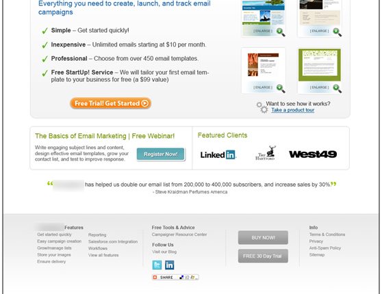
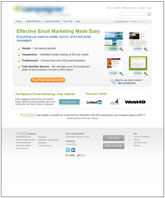
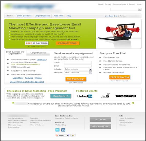
And this is where a recent experiment might give us a little insight on how well we understand home page design. Below are two homepages that were recently tested.
Could you pick the better page on pure gut alone?
Experiment Background:
This is a homepage test for a B2B company offering email marketing solutions for small and large businesses. The primary objective that we were attempting to increase conversion for was the free trial. Therefore, the key performance indicator (KPI) for this test will be total free trial starts.
As follows, the primary research question for this experiment is, “Which homepage will generate the most free trial sign-ups?” and the test we ran was an A/B multi-factorial split test utilizing our radical redesign methodologies.
Experiment designs (two versions):
Experiment Results (UPDATED):
Which was the winning homepage design? Well, we have revealed the results since the question was first posed in this post, and to many people’s surprise VERSION A produced 59% more free trials sign-ups than VERSION B. This difference is mostly accredited to a reduction in competing objectives, a simplified eye path, and an intensified communication of the value. What else do you think contributed to VERSION A’s success?
During Homepages Optimized: How using the homepage as a channel led to a 59% increase in conversion, we looked deeper into the results of the experiment above as well as discussed five key optimization strategies that should be utilized for every homepage.
Related Resources:
Homepages Optimized: How using the homepage as a channel led to a 59% increase in conversion
Homepage Optimization: How your peers use keywords and communicate with visitors


Austin, great post. The company you refer to primarily offers email marketing solutions. Is there a framework you follow to help companies offering a portfolio of products and services optimize their home-pages for structure, format, and content?
Do you suggest a company split its site (a rather large site) up into mini-sites in order to more clearly convey a distinct value proposition based on the product or service it is trying to promote?