It’s always great to see our students set sail in the world of testing. When Seth Jenks of G5 Leadership (a company that provides online leadership training) submitted his treatments for the MarketingExperiments Optimization LinkedIn Group members [Editor’s note: It’s reassuring to see that, after Boris first sent me this post for editing, some of our group members offered similar optimization and testing advice] to review and critique, I wouldn’t have guessed that it was one of his first attempts to structure a split test.
The results of his test are not only useful in the immediate sense—he doubled the conversion rate—but also are highly valuable as a starting point for building future iterations of tests.
What we can glean from Seth’s results, and how might subsequent testing be shaped? I thought Seth was already on to the key issue here: he called it “trust.” At MarketingExperiments, we’re used to calling it “credibility” and “clarity of the value proposition.” Both of these must be understood in the context of what motivation (another special term in our jargon) the visitors bring to the page. So let’s start from the top—what are visitors looking for when they arrive?
What is the offer?
Looking at the search terms that drive traffic to the page, it appears that most visitors are interested in training, workshops, courses, seminars, etc. Targeting search terms that include these words makes sense—they connect with the “live workshop” nature of the offer. However, does the page itself reflect the visitor’s motivation?
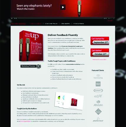
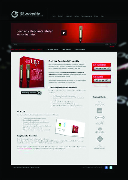
After initially looking at each version of the page (before reading through all the copy), I didn’t have a clear idea of what it was selling. It displays a boxed product, reminiscent of a software or DVD package. However, small text at the very top of the page tells me that these are “live, online workshops.”
This might seem insignificant, but especially when you are competing in Search, your visitors are arriving on your page with a singular initial objective: to eliminate you from consideration, much like you would try to sort out the junk somewhere between your mailbox and your office or kitchen.
If they were looking for a workshop, and you are ostensibly selling a boxed product, they instantly go for the “x” button. No copy (and certainly no video—more on that below) can save you.
The confusion about what’s being offered, continues even after the visitor figures out that it’s a workshop: “Am I being offered one or all four workshops on this page? Is its $39 for each, or for all four?”
This is where I suggest looking at you time-on-page metrics. The average will not be very meaningful, but look into different time-based segments (Google Analytics breaks them down nicely into – under 10 seconds, 10-30, 30-60, and so on) as you run subsequent tests to understand whether you are improving clarity. Especially using them to slice your ad CTR and conversion data can tell you whether and who tends to bounce right off and who tends to stay and/or buy.
Why your offer?
Aside from confusion about the product—which should be fairly easy to eliminate—another key instant-elimination criterion is lack of a clear value proposition. Value proposition must be communicated throughout the page, but it’s especially critical at the top, where the visitor initially starts the “conversation” with you. If you don’t do a good job of introducing yourself, the conversation can be quite short.
One hypothesis I would test is that all three pages (in the LinkedIn discussion, Steve Myers makes an excellent point about looking for similarities) heavily rely on video to communicate your value proposition. None of them has a specific value-communicating headline. The problem with video is that it implicitly demands “work” from the visitor (time), whereas they can read text effortlessly in seconds. Video can be great at supporting the value proposition, but not as the primary means of expressing it.
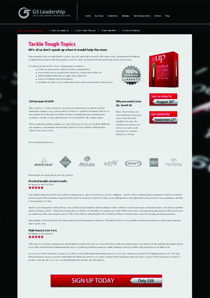
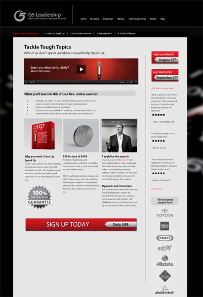
In fact, I suspect that the sub-headline “69% of us …” is in large part responsible for the lift in the treatments (that would make for a great single-factorial test to confirm), along with the bullets being nearer to the top of the page. These elements quickly communicate several key aspects of value—and the visitors are more likely to want to read on.
I would test into other headline and sub-headline variations that explicitly answer the question “What will I/my company get out of watching this?” I think the site offers great answers to this question, but they need to be stated sooner and more explicitly. For example, some statements on the “Credentials” page should be tested on the landing page.
Too good to be true?
I would further put the price comparison of $39 to $699 to the test. The adage “you get what you paid for” is embedded deep in the consumer’s psyche. Perhaps the stark “discount” resonates well with some visitor segments, while to others such a wide gap can look suspicious. Consumers have been conditioned to distrust claims like “you can be paying thousands of dollars for [fill in the blank], but with this special TV offer, you can have it for only $19.95.”
I would test focusing the message on the idea that previous customers got the same results from your $39 product as others did from the $699 product. As with any of the tests mentioned above, tracking your data separately by source can reveal that different language works best for different traffic channels.
Price testing can be quite telling here. If the market currently is 17.5 times higher than your offer, you probably have some room to increase the price. Also, as Bob Schewe points out in the LinkedIn discussion, stating the price in the ad can pre-qualify your traffic, reducing the CPA.
More ideas?
I wanted to keep this post focused on the “trust” issue, but there’s certainly a pressing need to test a more continuous eye path that leads to a single action (order button). This page just makes it complicated for the visitor to answer the question “What can I do here?” More importantly, I wanted to ask you, our readers, to weigh in using the Comments feature: What would YOU test next?
Related Resources:
The MarketingExperiments Quarterly Research Journal – Q2 2010
Reaching Decision Makers: Four biggest sales challenges Internet startups and entrepreneurs face
The MarketingExperiments Quarterly Research Journal – Q1 2010


 [click to enlarge]
 [click to enlarge]
 [click to enlarge]
I’ve been doing a lot of due diligence recently for the Debt Management industry. Now those guys have got it right – virtually every PPC advertiser has a great landing anding page strategy, with a clear, compelling call to action.
Many other industries could learn a lot from debt management. For them the rewards for online marketing are so great, and the cash cycle so quick (very often), that they have developed a very scientific approach to internet marketing.
When you’ve taken the trouble to develop a highly effective landing page that increases customer conversion rates, then it just becomes a mathematical formula – money-in, money-out.
Landing pages are critical.
@Matt Chandler
I agree. Having Don Link pagein the debt segment, I have seen just how competitive that space is. CPA is so high that landing page optimization is a matter of life or death. It forces companies to test fiercely–and the ones that survive are typically good examples.
Of course, there are many factors that are invisible when you look at someone else’s page. For example, you may land on a page that’s currently being tested, and you could be looking at the worst-performing treatment 🙂