Big mistakes from a great marketing test at Air Canada (and 4 lessons to help you avoid them)
Optimization marketers have a lot of explaining to do. They have to explain why one call-to-action is better than several are, why an image needs to be changed, and even why test results are lower than expected.
Explaining why a test came up short is never fun, and Tim Burgess knows this well. He joined Air Canada as the Web analytics manager last year and began conversion testing the airline’s website. One of his first goals was to get more customers to buy seat upgrades.
“Seat selection is probably one of our largest revenue streams,” he says.
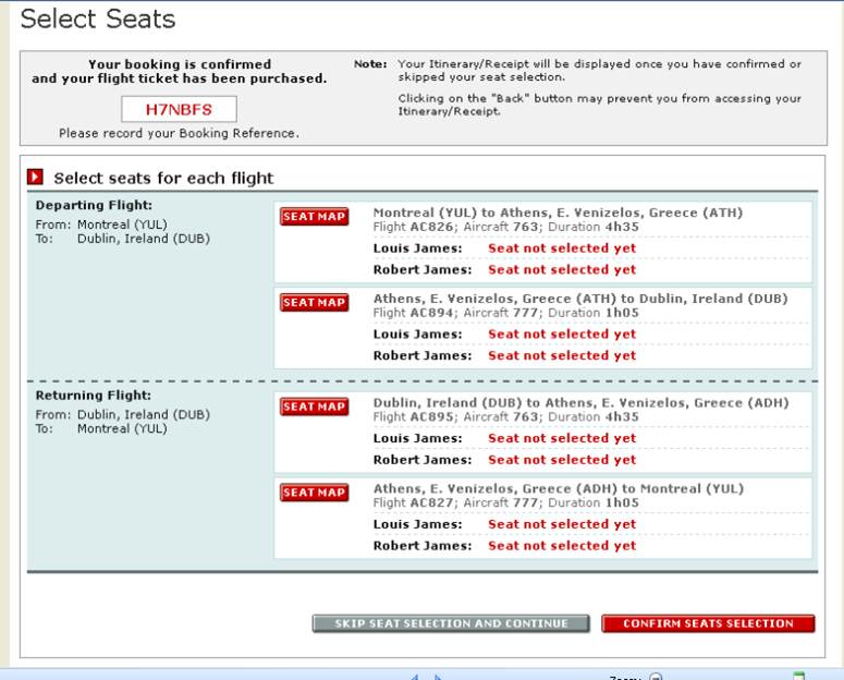
He focused on the confirmation page shown after ticket purchases. Customers had two options:
- Advance Seating – customers could pay to choose a specific seat, such as a window or aisle seat.
- Preferred Seating – customers could pay to upgrade to a more comfortable seat near an exit row.
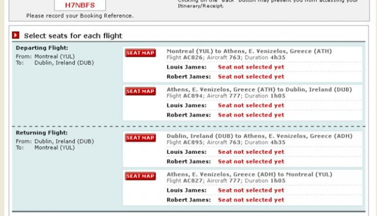
Here’s what the page looked like before testing:

Focus on value and friction
The page did not mention Advance or Preferred Seating, even though customers could click a button to select them on a seat map. The page assumed customers already knew about the upgrades and where to find them, but that wasn’t necessarily true. Burgess’ team planned a radical redesign.
“We made big changes to the entire layout, trying to keep in mind friction and value, and we came up with a few variations,” he says.
Here are three variations the team tested:
Test Page #1 – used bullet points and a supporting image to communicate the value of the options.

Test Page #2 – used the same bullet points as test #1, but with a different image and layout.

Test Page #3 – designed to answer the question, “What if they don’t know the difference between Preferred and Advance Seat selection?” Burgess says. The page included more copy and a different image than the others did.

Results
Each test improved response, but test #3 was the winner. Compared to the control, 48.78% more customers chose Advance or Preferred Seating from the page.
“The results were huge,” Burgess says. “We then did a follow-up test where I had 95% on the new variation and 5% on the original, and all the results were fairly consistent over a month.”
Burgess was excited. As the testing evangelist at Air Canada, he strives to teach colleagues about optimization and get them excited. He told everyone about the test who would listen.
“We went to Revenue Management, who were the stakeholders in this, and said ‘Look at this. It’s 50% more revenue.’ They were really pleased.”
Indeed, everyone was pleased. But, that was before they remembered a very important email.
Test results are not actual results
When Air Canada launched the winner, nearly 50% more customers purchased Advance or Preferred seating from the page, as expected. However, that did not translate into 50% more revenue from seat upgrades overall.
“It was more like a 5% increase in Preferred Seat section and almost no change in Advance Seat selection,” Burgess says.
How is that possible?
The page’s conversion rate shot up after launch, but most of those conversions were stolen from an automated email sent later in the sales process. The new page merely convinced many customers to purchase the upgrades earlier.
Never waste a mistake
Although revenue did not achieve liftoff, the 5% overall increase in Preferred Seating was a big success.
“If you look at overall revenue, it was the biggest positive change I’ve had since I’ve been here,” Burgess says. “But when you build up the expectation that it’s going to be three-times that amount, then it’s a bit of a disappointment.”
The conversation that Burgess had with management after the page went live was a bit “unpleasant” and “embarrassing,” he says, but he learned from the experience and changed how he evangelizes testing at the company.
Burgess took away four key lessons from the experience:
Lesson #1. Remember the big picture
A test focuses on a tiny fraction of a customer’s experience. The results apply only to the page being tested. You cannot assume that an increase in clicks will equal an increase in revenue, because much more than a page or a click determines revenue.
In the future, Burgess will remember to consider the larger context of tests, he says, and will explain that context to stakeholders and coworkers.
Lesson #2. Manage expectations
This will likely be the last time anyone hears Burgess lauding a test before its results are final.
“What I do differently now is frame things in much-less-certain terms … I am continually framing it in terms of ‘this may show that this is a great idea,’ rather than ‘I can guarantee you that this page is going to perform better than it did before.'”
Lesson #3. Predict scenarios – not results
Even though he avoids predicting results, Burgess is sometimes pressed to give an estimate. If forced, he provides a range and describes how each result could impact customer behavior and revenue.
“Putting a projection on how a test will perform has always bothered me,” he says. “If I’m forced into it, I might say ‘if we get 2%, then it would mean this; and if we get 5%, it would mean this; and if we get 10%, it could mean this.'”
Lesson #4. Continue to teach
Burgess continues to evangelize optimization at Air Canada. By learning from every test and explaining the results, he helps others understand that not every test is a blockbuster and that optimization is a process, not a goal.
Want to learn more? Tim Burgess will present at Optimization Summit 2012 in Denver, June 11-14.
Related Resources
Landing Page Optimization: Radical redesign leads to 3,566% increase in conversion
Customer Value: The 4 essential levels of value propositions
Value Proposition: A free worksheet to help you win arguments in any meeting


Those are great lessons Tim, thanks for sharing! Shows how challenging testing can be in a multi-channel environment.
Thx for sharing. This is an important lesson in context for optimizers.
Reminds me of when a company gets better ctrs in ppc with new keywords so they get all excited, only to find out later that they paid for clicks that don’t convert.
Hello Tim,
Awesome story and wishing you nothing but success in De ver! Looking back at pour trip toi Adobe Digital Marketing Summit 2012 in Salt Lake City makes think we came back wiser and ready for Action Land!