

One of the most enjoyable parts of being a MECLABS employee is seeing tests performed for a wide variety of companies and organizations. From international conglomerates to regional mom and pops, we always welcome new opportunities to test, learn and share for the betterment of the marketing community.
[End shameless self-promotion]
However, while looking far and wide, there are often some very interesting things going on right under our noses. For example, when our sister company, MarketingSherpa, let us know they’d be trying something new with a promotional email for an upcoming event, we put away our passports and paid closer attention.
–Background
From late December 2010 into early January 2011, most MarketingSherpa readers had received numerous emails referencing the upcoming Email Summit ‘11 in Las Vegas. Subscribers had received a number of sends detailing the event’s “last chance” ticket sales and incentives. Though the company’s marketing team was insanely busy with last-minute Summit preparation, they couldn’t ignore the opportunity to try a different email format while simultaneously trying to improve open and clickthrough rates.
The team decided to try a new idea by sending both text-only and graphic/HTML emails to see how open and clickthrough rates would compare. MarketingSherpa primarily uses text-only emails that feature, at most, limited graphics in a personal letter format – an approach with which they’ve achieved considerable success. Each text-only email also typically includes a clearly defined call-to-action in the body copy and in the P.S. message beneath the salutation.
Though Sherpa had previously used graphics/HTML for a number of email sends, the marketing team found that many email programs rendered these sends unreadable for any user who had deactivated the image function to improve program performance. Still, the advent of new email programs and providers – alongside the worldwide growth of HTML email use – made this a worthwhile investment of time and resources.
–
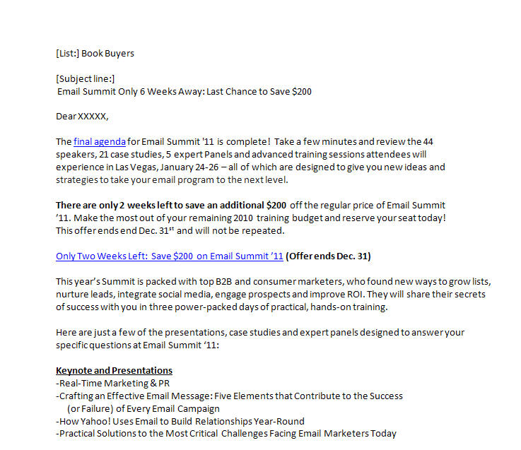
Email #1: Just the facts, ma’am

The text-only email was sent during the last week of December. It was minimalist in its design, but not in its content. The email opens with a personalized introduction (the subject of another test we’ll discuss at a later date) and spares the reader any superfluous introduction in favor of a link to the Email Summit ’11 agenda – highly sought-after information for MarketingSherpa readers and event attendees.
The first paragraph immediately follows the link with additional statements supporting the value proposition. These statements are written in a terse, almost staccato fashion that creates an impactful cadence for the reader, whether read aloud or to oneself.
At nearly the same time as seeing the event’s name, the user also sees/reads “44 speakers, 21 case studies, 5 expert panels and advanced training sessions…” Though the value of these statements obviously varies per recipient, the value proposition is nevertheless well supported. It’s clear that this event – whether or not a match for the user’s specific needs – was going to offer attendees a wealth of content and value.
The second paragraph creates urgency by reminding users how little time remained to secure a discounted ticket for Email Summit ’11, leading directly to the first call-to-action (which reiterated both the time limit and discount offer).
The remainder of the email expands on the event’s details at length, effectively using both bold sub-headlines and bulleted text. The result is an email that is both in-depth and scannable, allowing recipients to clearly see the value propositions and calls-to-action, helping to satisfy the readers’ need for pertinent information while also potentially avoiding deletions.
–
Email #2: A picture is worth a thousand words (well, at least a higher CTR)
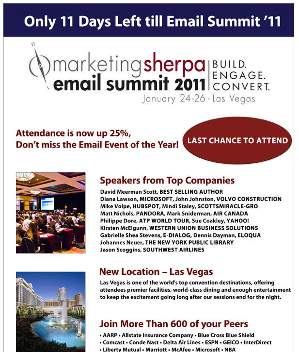
The graphic/HTML email was sent during the first week of January. This timeframe was chosen because of research that indicated people might be more accepting of product images in emails due to the just-passed holiday season.
(Frankly, after the holidays, the less colorful, pretty pictures I see, the better. But who am I to argue with research?)
This treatment reformats the messaging from the text-only email by taking advantage of the available colors and imagery. The reader is greeted boldly with the statement, “Only 11 Days Left till Email Summit ’11.”
Though this wasn’t the primary message in the text-only email, this usage creates immediate urgency for the reader, which is supported beneath the large event logo via the statements, “Attendance is now up 25%” and “Don’t miss the Email Event of the Year!”
Before the reader even had a chance to learn more about the event, it was made abundantly clear by this inherent urgency that Email Summit ’11 was going to be hotly discussed and highly attended. Though no actual ticket sales figures are present, using “11 Days Left” alongside “Attendance is now up 25%” lets users know that they’d better act quickly before missing out. By the time the eye-path was directed to the red oval indicating “Last Chance to Attend,” the primary message was firm in the user’s mind.
Being that this was MarketingSherpa’s first venture to Las Vegas, there was no shortage of exciting, visually enticing imagery on hand. And though users had likely seen similar photos of Las Vegas many, many times before, it’s the images’ presence alongside the bold red value statements that made this email impactful.
How so? All of the terms that are typically used when seeing images of Las Vegas – exciting … breathtaking … action-packed – were now implied when the images were paired with the value statements. Whether intentional or not (the Sherpa team will never tell) this subtext went a long way toward increasing both the visual and written impact of this email.
–
Results
–
Please pardon the generalization, but the MarketingSherpa audience tends to be a “no-nonsense” bunch. That’s not to say they don’t enjoy the company’s creative content or outside-the-box research, but they have shown themselves to be, as a whole, a group that prefers its information direct and to the point.
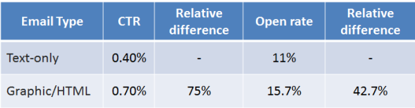
This is why it’s surprising that the graphic/HTML email outperformed the text-only email in clickthroughs (0.40% vs. 0.70%) and open rate (11.0% vs. 15.7%), showing relative differences of 75% and 42.7% respectively. We have no level of confidence for these results, since we are simply comparing results from sequential sends and have not yet conducted a true scientific test. Yet, we believe these results are still interesting to share, as this is a challenge marketers often confront.
When testing, you must try to flesh out the motivations of your audience from the results. In this case, an audience of marketers, likely coming off a busy, unrelenting holiday season, preferred a graphic-intensive email to the more direct, text-only approach. If I was to hypothesize (and let’s face it, most tests begin as pure hypothesis), the increased sense of urgency from the HTML email headline, alongside a series of visually compelling images, was magnified by the timing of the send. Because it was sent immediately following the holidays, marketers – many of whom had spent time away from their desks – were facing the daunting reality that is backlogged correspondence.
In short, seeing that they were close to missing a deadline could have possibly evoked more of an immediate response, urging them to more hastily open, click through and learn more. Without the distraction of the exhausting holiday season, this could have produced different results.
So, naturally, this experience doesn’t show that the HTML emails are going to consistently perform better, or even that this format is ideal for most marketing situations. What it does confirm is that trying new formats and changing an approach from time to time can noticeably affect your results.
—
Curiosity helped Sherpa try something new. We’re curious, too. Do you have similar stories of experimentation with email sends? Have you changed a marketing approach because of results stemming from these experimental sends? If so, we’d love to hear from you in the comments section.
–
Related resources:
MarketingSherpa Members Library — Email Marketing Summit 2011: 7 takeaways to improve results
Crafting an Engaging Email Message (Web Clinic)
MarketingExperiments Email Marketing Course
MarketingSherpa B2B Summit 2011
Thank God you wrote that last paragraph, I was getting worried due to the fact that they were sent at completely different times and are completely different emails – which makes the test “almost” useless on its own because there are so many variables.
The scarcity of the graphical email alone is enough to cause those changes.
That IS a great test though (text vs. graphical) and as you said, depends on the audience. For example, an Ecommerce store selling pet toys would need graphic emails, while a local business owner would most likely need the personal tone of a text email (in most cases anyway).
Any chance you guys can do a true A/B test with the exact same copy… and the only difference is text vs. graphics?
Seconding Jeremy’s comment – this whole post is really confusing, in that it leads all but very careful readers into thinking that you’re endorsing the comparison of two different emails sent at different times. This is the kind of testing we need to *discourage* people from doing! I’d love to see you re-do this with a randomized controlled test.
Jeremy and Michael,
Thanks for writing. For MarketingSherpa, this wasn’t so much a test as it was an interesting result from “trying something new.” Obviously, if this was a true split test, we would not allow so many random variables. Our goal in discussing this was to highlight how even the most innocuous, unplanned change in routine can provide results that encourage future testing.
I have been in touch with MarketingSherpa’s marketing team — who were responsible for these sends — and am hoping to have more concrete, true testing results for a future post.
Thanks,
Brad
Well, the key I’d say is the headline when looking at inboxes that get flooded with over 50 emails each day. Brand recognition is also important. For me, the first elimination process is by sender (brand): I select all emails sent from companies that I don’t have interest in. This takes care of at least 50% of “the email mess”. Then I do another scan by title, and eliminate emails that are overly sender-focused, i.e there’s no quantifiable answer to the “What’s in it for me” question. What’s left is a list of say 15 emails that I then open by importance for me. Some emails never get opened despite going through two rigorous and trigger-happy sorting swipes. From the ones that get usually the highest rate of deletion are text-heavy and have no scanability. They just require a lot of time to go through, despite them being rich in content. The density of info is so high that it’s overwhelming to read through.