

Responsive design, like any new technology or technique, does not necessarily increase conversion.
This is because when practicing Web optimization, you are not simply optimizing a design; you are optimizing a customer’s thought sequence. In this experiment, we discovered the impact responsive design has on friction experienced by the customer.
Background: A large news media organization trying to determine whether it should invest in responsive mobile design.
Goal: To increase free trial signups.
Research Question: Which design will generate the highest rate of free trial sign-ups across desktop, tablet and mobile platforms: responsive or unresponsive?
Test Design: A/B multifactorial split test
The Control: Unresponsive design

During an initial analysis of the control page, the MECLABS research team hypothesized that by testing a static page versus an overlay for the free trial, they would learn if visitors were more motivated with a static page as there is no clutter in the background that might cause distraction.
From this, the team also theorized that utilizing a responsive design would increase conversion as the continuity of a user-friendly experience would improve the customer experience across multiple devices.
The design for the control included a background image.
The Treatment: Responsive design

In the treatment, the team removed the background image to reduce distraction and implemented a responsive design to enhance user experience across all devices.
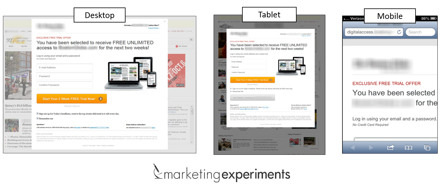
Experiment side by side

The Results: How does responsive design impact conversion?

The responsive design outperformed the control by a relative difference of 56.41%. When we reviewed the control and treatment data across desktop, mobile and tablet devices, here’s what we found:

Free trial sign-ups from desktop and tablet sources increased with the responsive design, however, mobile traffic did not.
What you need to understand
As I mentioned in the opening, responsive design is a limited solution to optimizing the customer experience as its focus is primarily a design solution concerned with size and scale.
Sure, I anticipate some controversy, but responsive design can’t live in a vacuum. It’s not a Hail Mary for optimizing your business online and there are no sacred cows here.
While it may improve the customer experience to a degree, it does not necessarily account for the full scale of changes occurring in the minds of our customers.
Why should it?
That’s not why responsive design was created.
Understanding the true scope of user impact requires you to think outside the idea of responsive design by itself. You have to think about your customers, and if you’re really good – think like them.
You should consider not only how a responsive design will render across a customer’s desktop, tablet and mobile devices, but rather, consider how a customer’s perception of those design changes will affect their decisions.
You may also like
Web Optimization Summit Sessions [Interested in more conversion optimization strategies? View 16 free on-demand sessions from Web Opt Summit 2014]
Responsive Design Tested [Learn more about this test in this Web clinic replay]
Landing Page Optimization: What a 29% drop in conversion can teach you about friction [More from the blogs]
LPO: How many columns should you use on a landing page? [More from the blogs]
I am having a really hard time understanding why the responsive mobile design would have lower conversion when the control requires the user to scroll horizontally to enter their information. Is it possible the sample size wasn’t large enough? This doesn’t make sense to me. What are your theories?
Hi Melanie,
Great question!
I wanted to address first that the sample sizes were sufficient for the testing to yield significant results.
As far as theories go it’s tough to determine absolute cause from one test.
The bigger picture in my view however, is responsive design ultimately needs to be tested with the same rigor as any other design solve to determine how customers are being impacted by implementation.
I hope this helps and thank you again for a fantastic question. 🙂
-best,
John Tackett
Why when you did all the testing on the responsive / non-responsive with the tables and mobiles, did you not simply turn the tables and or mobile to landscape?
Surely this is what the customer would do if faced with the layout that lends itself to that format. To my thinking the research seemed floored because of that very simple process was totally ignored.
Hi Ron,
Thank you for your comments.
I’m not 100% sure I fully understand the connection you’re making between device orientation function and responsive rendering.
-best,
John Tackett
Hi John,
I remember reading in an earlier (months to years ago – not sure) about the importance of the image as the right image helps the user view the product – i.e. what they’re getting.
Could it be that one of the reasons the response on the mobile device did not mirror that of the other devices could be because the image is not present on the mobile (due to space I assume)?
Keep it up the amazing work. You guys are the benchmark in the web-optimising industry.
Well done!
Daniel (Perth, Australia)
Hi Daniel,
Thank you for the kind words.
It is plausible that the image could be a factor in the difference in performance. Definitely would make for a great follow-up test! 🙂
-cheers,
John Tackett