I could have made the title of this blog post, “Subject Line Testing: How we achieved a 48% lift from a split test.”
That is the challenge you face with your subject lines, as well. Should you make a promise? Or should you intrigue your audience? This is a perfect opportunity for you to do a little A/B testing and to see what resonates most … which we did recently for a MarketingExperiments Web clinic invite.
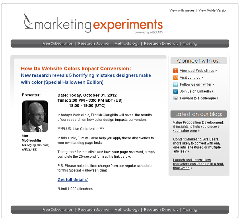
This was a single variable, A/B/C split test, with the only variable being the subject line. One “promise” subject line was tested against two “intrigue” subject lines.
TREATMENTS
“We created two subject lines that were intrigue based. One was a question, and one was more of an intriguing statement,” said Paul Cheney, Editorial Analyst, MECLABS. “We wanted to narrow down what makes people more intrigued. Is it more of a question or more of a statement?”
Subject Line Treatment A (promise) – How to Effectively Use Color on a Website
Subject Line Treatment B (intrigue) – Are Your Website Colors Hurting Conversion?
Subject Line Treatment C (intrigue) – 5 Horrifying Mistakes Designers Make With Color
EMAIL BODY
The email body remained the same for all three treatments. The only changed was the subject line.

RESULTS

The two “intrigue” subject lines generated more clicks on the call-to-action than the “promise” subject line. Treatment B did not perform well enough to meet our goal of a 95% level of confidence. However, Treatment C generated 47.9% more clicks on the call-to-action than Treatment A, with a level of confidence over 99%. So one thing we learned from this test is that “intrigue” outperformed “promise,” which is consistent with an earlier subject line value prop test.
That earlier test is why the team chose to have two forms of an intriguing subject line — to see which form of intrigue was most successful.
“For the experiment, we ran the intrigue winner to make sure our learnings were still valid,” Paul said.
“What we found out in this case was that the intriguing statement performed better than the question. It may not be due to the question format, it may due to the content of the subject matter, but regardless, it is a compelling research question to keep testing and narrowing down on,” Paul added.
“The next thing we want to learn is whether or not it was the content of the subject line or the format of question versus sentence that generated the additional lift,” Paul concluded.
Related Resources:
MarketingSherpa 2013 Email Marketing Benchmark Survey – Receive a free Special Report, CMO Perspectives on Email Deliverability, for completing this survey
How Do Website Colors Impact Conversion? New research reveals 5 critical mistakes designers make with color – Web clinic replay
Email Optimization: 72% of marketers test subject lines
Email Marketing: Tips from your peers about writing subject lines


Very very interesting post. I guess the classic example of using an attention grabbing title remains important always. I think too, your target audience will respond in different manners to different title types. e.g. a personal blog for people not looking for information will respond better to a ‘out there’ title whereas an informative post may attract those looking for education with a more ‘to the point’ title. I don’t know. Just something to think about.
So questions still get the best response. Well that worked for me when I dated as well. People always are questioning the world around them and when we give them a question they don’t know about their interest is drawn.
That’s a good, clear winning tip for copywriters and marketers. Intrigue over promise! Thanks
I’m not sure that your test is about “intrigue vs promise”.
(1) People don’t like questions, they like answers.
(2) People want ‘appetizer’, a small portion of the information right now.
Treatment A – question, no appetizer.
Treatment B – question, “colors hurt conversion” appetizer.
Treatment C – answer, “5 mistakes with color” appetizer.
You should also try “5 Horrifying Mistakes Designers Make With Color Hurting Conversion” 🙂
Sergey,
Thanks for your test interpretation. Just one thing to note, though, Treatment A is not a question.
@Daniel Burstein
Daniel,
Treatment A does not have a question mark, but you get a sense of the question.
Thanks for sharing these fascinating results.
Daniel, interesting, given the admonition to entitle books, articles etc. with the “how to…”opening!
Curiosity lured the cat.
And, I think readers feel (I know I do) that if somebody can help me prevent a mistake before I make is, I want to know!