At MarketingExperiments, we’re always looking to find new ways to optimize webpages and, in turn, improve conversion. We have a big research team constantly testing and coming up with ideas to discover what works and what doesn’t. But the everyday marketer may not have access to this type of team. What if you are your own marketing and research team?
Trying to optimize a Web site with limited resources can be overwhelming and a bit scary. I mean there’s so much you can do. You can change your call-to-action button, remove columns, add pictures, blah, blah, etc. I could probably go on forever with changes you can make.
EUREKA!
Well, I’m here to tell you that you don’t have to be scared and go crazy trying to figure out where to start. There is a little thing on your page that can quickly get you a lift, and believe it or not it’s been staring at you in the face the whole time. That little thing is your headline. And while this is one of the easiest tweaks you can make, it will only work if you do it right.
Your headline is important because it is your “pickup line.” It is what piques interest and gets the visitor to continue reading. You only have four inches to make a good impression, capture them and get them to continue in the process. And if your headline is not good, you run a high risk of losing that visitor, and that means money running off.
We addressed this issue on our last Web clinic, Headline Optimization: How testing 10 headlines revealed a 3-letter word that improved conversion more than major changes. There, MECLABS Managing Director (CEO) Dr. Flint McGlaughlin went over some key principles to engage an audience with your headline and get a lift. He also had two really smart members of our research team, Jon Powell and Tony Doty, join in and help our audience fix their own headlines by doing some live optimization. But, we didn’t get to optimize every audience submission.
Not-so-live, live optimization
Lucky for you, after the clinic I decided to kidnap our gentle giant, Tony Doty (he’s really tall), and get him to optimize a couple of submissions. And this is where I get to the meat of this post. We’re going to do a little “Blog Opt!” But we’ll pay specific attention to two common mistakes most marketers make when crafting their headlines.
MISTAKE #1: Assuming customers understand your value
Let’s start with submission number 1:
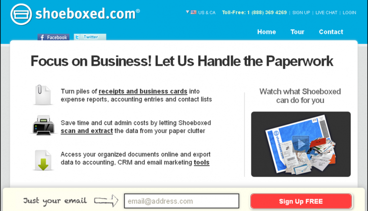
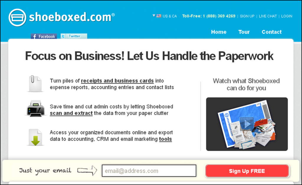
Headline – Focus on Business! Let Us Handle the Paperwork
-Why it doesn’t work
1. First thing you might ask yourself after looking at the headline is, “what is it that Shoeboxed.com is selling me and how can I benefit from it?”
If we break it down, Tony asks, “What’s the benefit of ‘Focusing on Business?’ What’s the benefit of ‘… Us Handle the Paperwork’?” These are pretty vague statements that don’t give the visitor any idea of what they’re getting or why they should even bother reading more.”
“What is the product? Once we have the benefit established, I need to understand the actual product to actually trust your claims. Why would I give you my email? What’s going to happen? You email me? You let me download something? I get access to an online tool? Just being clear about what I actually get in exchange for my email address could be huge here,” says Tony.
2. The headline is assuming that the visitor will understand its meaning off the bat.
“Expecting the visitor to make the connection between Shoeboxed.com handling the paperwork and the visitor having more time or money, this is unsupervised thinking,” says Tony.
And he’s right. Unsupervised thinking is dangerous. You can’t expect your visitor to know, you have to guide them through the process. As soon as your visitor lands on your page they should know the answer to two critical questions: “Where am I?” and “What can I do here?” If you don’t have that, you lose them.
-How to make it work
So now that we know it needs help, how do we fix this headline? According to Tony, the headline should address how much time and money the visitor will save (on average) if they use Shoeboxed.com. Using quantifiable statements such as “Cut HR expenses by an average of 24%” or “Annual savings of more than $15,000” can improve the headline. These statements show potential customers what value they’re getting from this service and help you begin to gain the visitor’s trust with quantifiable information backing up your claims.
MISTAKE #2: Burying your value
Here’s submission number 2:
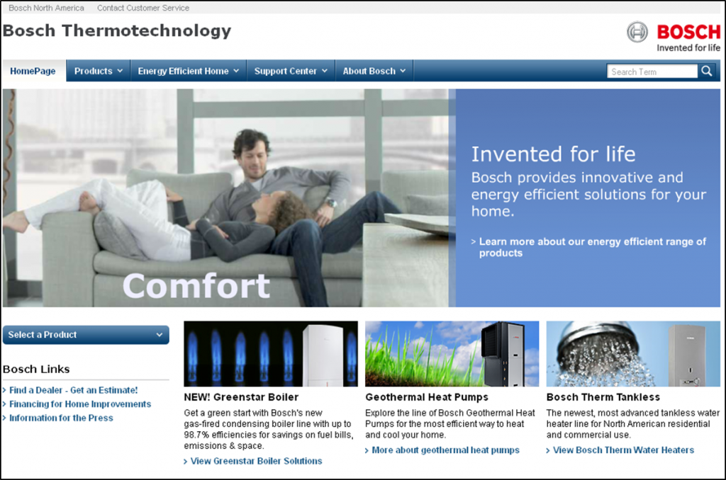
Headline- Invented for life
-Why it doesn’t work
1. This is another headline that is very vague. What does “Invented for life” mean?
“[It] has no meaning to me. The important part of the message is right below “…innovative and energy efficient solutions for your home.” OHHH, that’s what you do,” Tony says.
Why is it that what they do is buried underneath that vague main headline? You have to get past “Invented for life” before you know what it is that Bosch Thermotechnology offers visitors. Invented for line is more of a tagline for their business, not a headline that serves the visitor any good. They should avoid the fluff and get to the main point of the site.
2. Other problems that aren’t directly related to the headline are the picture and the feel of the page.As a package, the picture and feel of the page don’t connect with the sub-headline that reads, “…innovative and energy efficient solutions for your home.”
“The site look and feel seems very grand, something more like IBM (where companies go to shop, not individuals). If it is individuals, keep the terminology and benefits simple,” Tony says.
Essentially, you want a cohesive look to match your headline. If this is a service for individuals, then make the site express that. This brings me to the picture.
“Too bad the couple sitting there looks like they’re relaxing at the airport. Even the image makes me think enterprise level,” Tony says. This comment made me laugh, because it’s so true. If this is about innovative technology for your home, why doesn’t the picture have a better “homey” feel to match the headline? It causes a disconnect that can confuse the visitor and make them bounce. That’s if they even got past the “Invented for life” headline.
-How to make it work
So how do we fix this? Tony suggests going for the benefit-driven route. I mean, who doesn’t want to know that they’re getting something in return for their time? Remember, your headline should give the visitor a reason to stay, and telling them all the great things you can offer them is key.
What are the benefits of your innovative and energy-efficient solutions? Save money? Increased value of my home? Longer lifetimes than the alternative products (less maintenance)? Lower total cost of ownership than alternatives? Better for the environment? Government incentives?
Tony says those are a few things you should address in your headline. In this case, those seeking-energy efficient technology are probably money savers and people who enjoy protecting the environment. So play on that. Make sure to let them know how much they can save, how the products help the environment, etc. These things appeal to the visitor.
The “top” line (about the headline)
- When writing a headline it is crucial it is to grab the visitor’s attention by centering on their interests with a clear headline that expresses value. My boss, Director of Editorial Content, Daniel Burstein, said it best with a line that was too good not to credit, “Clear leads to conversions. Clever leads to confusion…and bounces.” He is so right. We say it over and over again, clarity trumps persuasion.
- And TEST! After all, these are just suggestions for improvement, and the only way to know for sure which will be most effective is to test.
So, the next time you look at your page and become overwhelmed by what changes you should make, remember that you can always start with the simplest tweak of them all – the headline.
Related Resources
Free Web Clinic Replay – Headline Optimization: How testing 10 headlines revealed a 3-letter word that improved conversion more than major changes
Headline Optimization: How would you make this title better?
Copywriting: 10 headlines tested
Optimizing Your Headlines: How changing a few words can help (or hurt) conversion


Excellent points! It is great that you point out a key mistake many marketers make when taking their sites live. They fall in love with their headlines and refuse to tweak them even if/when it is clear that they create a “disconnect” with their potential clients.
Thank you, Cleofe. I agree. The key is to be clear and provide value. A cutesy or clever headline doesn’t matter if your customer doesn’t understand what you’re trying to say and/or doesn’t see the value that’s in it for them.
Writing good headlines is indeed challenging, especially when you add SEO considerations to the process. Thanks for the suggestions!