

In a recent Web clinic – Double the Value of Your Online Testing: Don’t just get a result, get the maximum customer insights – Flint McGlaughlin and the MECLABS Conversion Group team conducted the first-ever “Test Strategy Recommendation Session” of audience-submitted campaigns. Looking at the test history of audience-submitted online Web pages, we recommend future test strategies based on a decade of optimization research.
But there was one page on the clinic that we did not have time to get to, so Flint asked the audience for their take on some test suggestions.
After reviewing all of the great ideas that participants offered to the optimization of this page, I have selected a small group that demonstrate some best practices to optimizing your own landing pages.
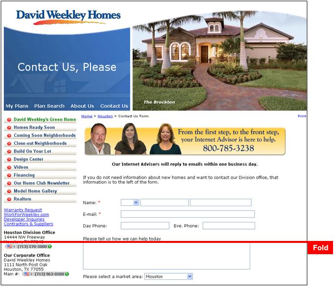
The first step in any optimization process is identifying the primary purpose of the page. It is important to limit the number of secondary purposes. In this instance, the David Weekley Homes page submitted for optimization is the “Contact Us” page.
Original page – (Click to enlarge)

Optimizing secondary objectives
In this example, the primary objective of the page is very clear – to have the potential customer contact the sales department to get more information and start the sales process. However, the secondary objectives for this page are counterproductive. With this in mind, Wayne from Washington state suggested “the left hand navigation be removed or simplify it leaving more focus on the call to action – contact the Internet advisors.” This would decrease the confusion of the customer. It is always a good idea to give as few options as necessary.
How do visitors want to be contacted?
The next question that must be answered is: How do visitors want to be contacted? On this page there are two options. I would want to prioritize the contact method that is more effective. Again, this is a strategy to give visitors fewer options, therefore directing their actions towards the option that is most effective.
The primary contact method seems to be 866-493-3553, especially with the notice that “Our Internet Advisors will reply to emails within one business day.” In this case, D Bnonn of New Zealand commented that “My eye totally skipped over ’From the first step etc’…looks like a banner ad.”
The yellow highlighting used in this page element does separate it from the rest of the page suggesting that it is a banner ad. Simply revising the element to have the yellow along the bottom with a strong call to action would be a good test to run.
Call-to-action location
A number of participants, including Craig from California, mentioned a weak or non-existent call to action (CTA). He identified the issue as “too much space given to the header graphics, shoves CTA below the fold.” Getting rid of the contact “banner” would be one good way to address the problem of having the CTA below the fold. It may however change the look and feel of the page enough to cause anxiety within visitors (i.e. am I still on the same page?)
Shan offered an alternative solution for the CTA location. Shan suggested to ”put the form up on the top left blue section, under ’contact us, please,‘ and put some content in the current form section.”
This would be a radical redesign and would be an excellent option to test. It places the primary objective of the page in the highest priced “real estate” (Editor’s note: nice pun, Spencer) on the page. This is a reasonable option that would not be an option on all pages. In this case, visitors have already clicked on a menu item that reads “Contact Us.” This is creates continuity which can significantly reduce friction.
I would include a testimonial quote prominently on this page. Remember to continue to build value throughout your visitors’ experience on your site. It is much too easy for a visitor to become distracted and disinterested. The process never stops.
Simple and direct
In conclusion, creating a simple, direct page to maximize the visitor’s experience and optimize conversions is the goal.
On a contact page, such as this, example
- stripping out all non-critical elements
While keeping in
- personal touches, such as the “Internet Advisors” images
- clear primary and secondary calls to action
Along with continuing to
- build your value proposition on all pages in the process.
Related Resources
“Double the Value of Your Online Testing: Don’t just get a result, get the maximum customer insights” Web clinic replay