

Small tiles, big tiles, wide tiles, blocks of tiles.
Some are self-appointed, some are pre-downloaded and some lead to a miniature world that you love to get lost in like a good book or an Oscar-winning flick.
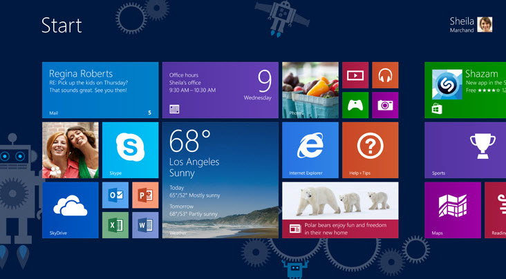
Tiles are a key component of the latest Windows operating system invading PCs, tablets and Windows phones. The technology behind this software teaches us a lot about prominence – the size and location of an object.
In this MarketingExperiments Blog post, I will share with you the importance of prominence from the perspective of a consumer with the help of Windows 8.
Don’t bury “the ask”
Each page has its own goals. Whether the goal is to get customers to add a product to their cart or generate a sales-ready lead, your page has a goal.

The idea here correlates with how Windows 8 users position their tiles. Tiles located on the start screen are often the most visited websites and apps that users place in a location they find to be logical and easy to access.
So what does this tell us?
Make sure the goal of your page is located in the right place.
Whether it should be shown in a larger size or in a more prominent location on the screen to immediately grab a user’s attention, make sure the location of “the ask” is easy for users to find.
In short, avoid burying “the ask” by guiding users to the goal of your page.
Size can also supercharge your goal
Along with location, size is a major player in the page prominence goal.
After all, why make the user work to find your product or service? Here we can consult what Windows app developers have done with the size of the tiles and how a number of apps are using this knowledge to their advantage.

Apps like Skype and Vimeo will appear on the home screen as soon as they are downloaded.
Not only are they directly placed on the home screen, but their corresponding tile sizes are larger than the average display. This development trick is an interesting approach to increasing the likelihood of the click and grabbing the user’s attention similar to the largest ad displayed in Times Square.
The app is competing for your attention and on your website it’s much the same.
So, it would make sense to make the goal of your page the largest focal point of the page.
Why this combination works
Location and size are two key components when it comes to prominence, as the goal of the page is to grab the user’s attention at the most opportune time.
Whether the goal of your page is to lead users to the most common product or complete a lead generation form, placement and size are key to prominence.
You may not directly control a customer’s needs, but you can control how the consumer sees you.
Photo attribution: Microsoft
You may also like
The Boston Globe: Discovering and optimizing a value proposition for content [Video]
LPO: 2 types of security seals that can help you reduce customer anxiety [More from the blogs]
Landing Page Optimization: 3 template design changes to help you serve multiple customer types [More from the blogs]