

Test Your Marketing Intuition: Why did this treatment outperform the control by 53%?
In this world, there are systems that underperform. It is a fact of life. A quick look at the world’s distribution of wealth is all anyone needs for proof of that. It happens all the time on a macro level. And when a system doesn’t just underperform but is truly broken, it usually means you need to tear it down and start from scratch.
And while it may not be humanly possible to do that for the world’s economic system, it’s very doable with your website.
Our websites are simply little systems that should present enough pieces of our value proposition in the right sequence to our ideal customer so that they take the desired action. You can make many tweaks to your site to improve how well it does that … and in so doing, improve conversion.
But for some websites, the system is broken. A new approach is needed. At MECLABS, we call this a category shift.
How can I implement a category shift for my website?
To implement this category shift, you need a radical redesign.
A radical redesign is simply an experimental approach in which the experimental treatments are “radically” or “categorically” different from the control.
While definitions are certainly interesting, it’s probably easier to give you an example of a radical redesign. So here’s a radical redesign experiment we recently ran with one of our research partners to flesh out that definition. It also happens to be the same experiment we’ll study in-depth for today’s free Web clinic at 4:00 pm EST: Rapidly Maximizing Conversion: How one company quickly achieved a 53.9% lift with a radical redesign.
Experiment Details:
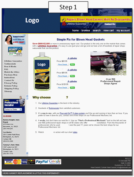
Background: The company is a leading automotive head gasket repair solution
Goal: To increase total orders on cart page
Primary Research Question: Which landing page/cart will result in a higher conversion rate?
Approach: Radical redesign of cart page through a variable cluster A/B split test
Control:
The control is a single product shopping cart process with six steps. Get ready to look at a lot of creative samples:
|
|
|
|
|
|
|
|
|


Treatment:
The treatment attempted to fix the obvious problem with the control by shortening the number of steps down to two. But besides that, it was a completely different approach in design and layout.


Results:
Now if you read the title of today’s Web clinic earlier in the post, you probably know which of these treatments won and by how much. But what’s really interesting about this test is WHY the treatment won.
Once you can figure out why a treatment performed the way it did, you can apply the underlying principle to your own pages and likely get better success than simply copy/pasting the specific tactics in the treatment.
So to test your marketing intuition, tell us why you think the treatment outperformed the control in this experiment.
The marketer who comes closest to our Sciences team’s expert speculation will win a mention on this blog with a link and the adoration and envy of their peers.
And once you’ve left your comment, be sure to sign up for today’s free clinic to learn more about radical redesigns.
UPDATE:
Congratulations to Kai for having the closest reason (in our opinion) for why the treatment outperformed the control. To get a better idea of what went into this experiment, checkout the replay for this Web clinic.
Related Resources:
Web clinic replay – Rapidly Maximizing Conversion: How one company quickly achieved a 53.9% lift with a radical redesign
Landing Page Optimization: How to plan a radical redesign so you get a lift AND a learning
E-commerce Shopping Carts: How a redesigned checkout process led to 13% increase in conversion rate
Homepage Optimization: Radical redesign ideas for multivariable testing
I think it’s got to be the removal of all other navigation options on the checkout stage combined with good use of the 100% money back guarantee icon throughout. If you can make someone feel confident in going forward at the checkout stage and at the same time reduce any other options as much as possible, they’re far more likely to finish the buying process. Even the possibility of adding more products to the purchase convolutes the process and gives more time for anxiety and indecision to build up.
I have no doubt reducing the steps in the checkout process would also have contributed to the increased performance, but I think if you were to do one or the other, the removal of navigation options is going to see the greatest increase. That’s my initial thoughts anyway.
2 things….
Firstly, there is control over the visitors thinking by placing a clear, SINGLE call-to-action button directly in the eyepath so it is obvious what I am supposed to do.
Secondly, the fact that I can see (all on one page) that I only have 5 short steps to complete in order to buy will boost the chances of me completing the conversion.