Landing Page Optimization
Increasing Conversion by 150% and Lead Gen by 2,379% with an Effective Call-to-Action
Which changes will produce the best Conversion results when optimizing a Call-to-Action? Can distinct approaches be combined to increase both sales and leads?
Previous test results have shown that a single change is typically a trade-off: It may have a negative impact on direct, immediate Conversion but if combined with an effective basket-recovery effort it will increase overall Conversion.
In this brief we’ll look at a case study in which changes to a
Call-to-Action increased direct, step-level Conversion by 150% and Lead Generation by 2,379%.
Editor’s Note: Further analysis conducted after the Nov. 7th clinic on Landing Page Optimization found that the number and percentage of emails captured by the Treatment path during the test with our partner was 18,460 and 2,379% instead of 43,352 and 5,722%. This brief contains those corrected figures though the audio recording of our clinic does not.
Editor’s Note: We recently released the audio recording of our clinic on this topic. You can listen to a recording of this clinic here:
Case Study 1
Background
We conducted this test for a reference book publisher with whom we have had a long-term, successful partnership.
The company has a solid Value Proposition. Its research articles are written by respected, trusted experts in many different fields. It offers a free trial of its product.
Our previous efforts had twice resulted in quite significant conversion increases, but we had yet to hit a “home run” in terms of an effective basket-recovery campaign.
Previous test results have shown that adding email capture can have a negative impact on direct, immediate Conversion by increasing Friction and Anxiety but ultimately increase overall Conversion when the lead is used in an effective basket-recovery campaign. We used that as the basis for our test design: Capture leads for a basket-recovery campaign that will increase the effective Conversion rate to the free-trial offer.
Test Design
The set-up for the test was relatively simple:
- Add an email capture field to the current Call-to-Action.
- Give visitors a reason to enter their email address.
- Follow up with a friendly email to those visitors who start but do not finish the sign-up process.
The paths for the test protocol were straightforward:
CTR = Click-through Rate
LGR = Lead Generation Rate
CR = Conversion Rate
The primary research question was:
Which article page will produce higher Lead Generation and free trial Conversion rates?
But we’re going to start by answering one of our secondary research questions first:
Will adding email capture on the “teaser” article page decrease its Click-Through Rate?
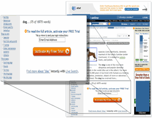
Treatment Article Page with Email Capture
| Article Page |
Unique Visitors |
Free Trial Offer Page Views |
Click-Through Rate to the Offer |
||
|---|---|---|---|---|---|
| Control | 427,740 | 47,337 | 11.07% | ||
| Treatment | 853,833 | 43,352 | 5.08% | ||
| Nominal Difference | 5.99% | ||||
| Relative Difference | 54.12% | ||||
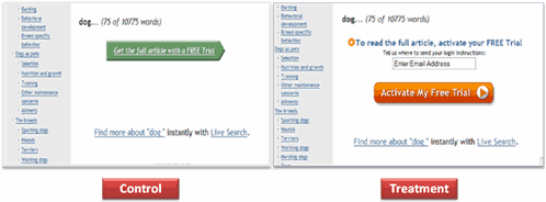
What you need to understand: The Control Page outperformed the Treatment Page by 54%.
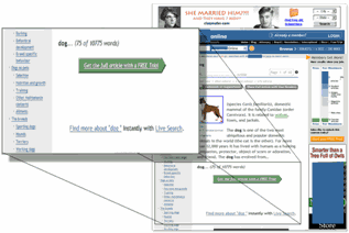
The green button design had worked very well for us in previous tests and had produced a significant gain, but adding email capture decreased the Click-through Rate to the offer page, as anticipated.
The “login instructions” copy on the Treatment page may have also increased anxiety by making it sound difficult to access the rest of the article. We will consider those factors as we design further tests, but based on previous tests, our analysts were not surprised by these results.
That leads us to the first half of our primary research question:
Which article path, the Control or the Treatment, would produce higher Lead Generation results?
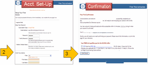
Even though the Control article page did not have an email capture field on it, if visitors clicked through to the next page — the offer page — they were asked for their email address, name, and credit card information.
Control Path:
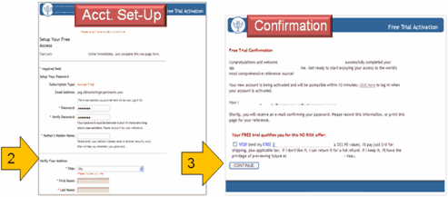
The Treatment article page had an email capture field added to the Call-to-Action. The email address was automatically loaded on the offer page if the visitor had already entered it on the article teaser page before clicking through.
Treatment Path:
Results
| Article Page |
Unique Visitors |
Free Trial Offer Page Views |
Emails Captured |
Email Capture Rate |
|---|---|---|---|---|
| Control | 427,740 | 47,337 | 373 | 0.09% |
| Treatment | 853,833 | 43,352 | 18,460 | 2.16% |
| Nominal Difference | 2.07% | |||
| Relative Difference | 2,379% | |||
What you need to understand: The Treatment Path outperformed the Control Path by 2,379% in terms of the number of leads captured.
So once again, adding email capture to the article teaser page significantly increased the number of leads generated, even though the click-through rate to the offer page had declined sharply due to the increased Friction and Anxiety.
Now, while we know that a highly qualified email capture lead has significant inherent marketing value, the additional research question remains:
Will a recovery email campaign using those leads increase the effective free trial Conversion Rate?
Test Design
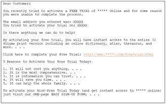
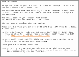
We sent out two emails. The first was sent 1 hour after the incomplete free-trial sign-up process; the second was sent 24 hours later.
In our recent clinic on Lead Generation we reviewed a case study in which an email campaign increased conversion for a financial newsletter service by 56%.
When sending basket-recovery emails we have consistently achieved the best results by using short paragraphs written in a very customer service-oriented and helpful tone free from sales hype.
The 24-hour version of the email steps up the level of urgency by specifying that “This is our last attempt to contact you” in the first sentence and “if you do not respond to this email, we will remove your information. . . . and you may miss out. . . .” in the postscript text.
1 hour version of email (truncated):
24 hour version of email (truncated):
Results
The Treatment’s recovery emails had almost no impact on the free trial Conversion rate.
In fact, only four free trial orders were recovered using the email campaign. Follow-on analysis is underway to determine why the basket recovery campaign results fell short of the expected range of likely outcomes, and further testing may be conducted.
That brings us back to the second half of our primary research question:
Which article page will result in more conversions to free trial sign-up?
Did adding email capture to our Call-to-Action hurt direct Conversion?
Results
| Path | Article Page Unique Visitors |
Free Trial Offer Page Views |
Free Trial Sign- ups |
Conversion Rate: Article Page to Confirmation | Conversion Rate: Offer Page to Confirmation |
|---|---|---|---|---|---|
| Control | 427,740 | 47,337 | 316 | 0.074% | 0.67% |
| Treatment | 853,833 | 43,352 | 724 | 0.085% | 1.67% |
| Nominal Difference | 0.008% | 1.00% | |||
| Relative Difference | 15% | 150% | |||
What you need to understand: The Treatment path overall Conversion rate from article page to confirmation outperformed the Control Path by 15%. The step-level Conversion rate from offer page to confirmation was 150% higher for the Treatment Path than for the Control path.
Observations
Step-level Conversion rate is essentially the Conversion from one step or stage in the sale process to a specific subsequent step rather than from arrival to confirmation page. We did observe that visitors who clicked through to the Treatment offer page were twice as likely to sign up for the free trial.
Remember: Adding email capture to the Treatment article page increased Friction and Anxiety and decreased the CTR to the Offer page in Finding #1. Why did Conversion to the free trial increase? Did automatically loading the email address on the offer page make a difference?
Let’s look closely at the two Calls-to-Action again, side-by-side:
Observations
Using the test data available, MarketingExperiments analysts made the following observations:
- Direct Conversion increased because of the changes to the Call-to-Action:
- On the Treatment article “teaser” page, friction from email capture is minimized by ensuring that it feels as though it will be easy to complete the process, receive the free trial, and read the full article. This will have a favorable impact on lead generation and minimize order abandonment.
- Clarity was increased. The text is larger and easier to read.
It re-emphasized the free offer. - Changing the button from green to orange drew the customer’s eyes more effectively.
Key Point: Optimizing the Call-to-Action, such as changing the green button to orange in the Treatment path, helped to mitigate the impact of additional Friction from email capture. When we pulled the email capture forward to the article “teaser” page in the Treatment Path we expected to see a Friction-induced reduction in Click-Through rate, but those visitors who did enter email addresses and clicked through were much more likely to complete the remainder of the process and register for the free trial. The net outcome was a 15% increase in overall conversion to free trial, plus more than 18,000 (2,379%) more qualified sales leads for this and potentially other related products.
Here’s an aggregate view of the three findings:
| Path | Unique Visitors to Article Page | Unique Visitors to Offer Page | Free Trial Sign-Up | Article Page to Free Trial Con- version Rate |
Offer Page to Free Trial Con- version Rate |
Emails Captured |
Email Capture Rate |
|---|---|---|---|---|---|---|---|
| Control | 427,740 | 47,337 | 316 | 0.074% | 0.67% | 373 | 0.09% |
| Treatment | 853,833 | 43,352 | 724 | 0.085% | 1.67% | 18,460 | 2.16% |
| Relative Difference | 15% | 150% | 2,379% | ||||
Recommendations
- Determine the information you need to capture for each customer.
- Determine the minimum information you need to capture “up-front” in order to minimize Friction and Anxiety and optimize Conversion. Ask for additional information no earlier in the sale process than you need it in order to accomplish your primary objective.
- Test groups or “clusters” of changes, such as email capture location and Call-to-Action design that may be combined to achieve gains that neither might produce alone.
- Test different designs and experiment with the timing for basket-recovery email campaigns.
Related MarketingExperiments Reports:
- Lead Generation: Is Your Sign-Up Process Costing You Leads and Conversions or Maximizing Them?
- Landing Page Optimization—Big Conversion Gains from a Little Scissors and Grease?
- Landing Page Optimization Tested—How to Create “Sticky” Landing Pages
- Optimizing Landing Pages
As part of our research, we have prepared a review of the best Internet resources on this topic.
Rating System
These sites were rated for usefulness and clarity, but alas, the rating is purely subjective.
* = Decent | ** = Good | *** = Excellent | **** = Indispensable
- Sales Lead Generation ***
- How to Create High Conversion Lead Capture Pages ***
- Lead Generation Online: Is Your Site a Leaky Bucket? ***
- 10 Tips for Lead Generation Landing Pages **
- Interactive Advertising Bureau Lead Generation Resource Library **
- Creating a Lead Capture Form for Your Website **
- 7 Tips for Generating Leads Online **
- 2004 Lead Generation and Best Practices Study **
Credits:
Editor(s) — Frank Green
Bob Kemper
Writer(s) — Gaby Diaz
Jimmy Ellis
Maria Hendricks
Peg Davis
Contributor(s) — Flint McGlaughlin
Bob Kemper
HTML Designer — Cliff Rainer
Email Designer — Holly Hicks
Test Protocol(s):
- 1043


