A subjective factor like intuition might alarm those basing new Web site designs on test results that discover what really works when it comes to Internet marketing. It doesnt seem scientific. Its certainly not represented in our Conversion Index formula:
Yet the very nature of the optimization procedure includes an element of intuition. Where does it fit when identifying the most effective Internet marketing strategy?
Previous MarketingExperiments surveys showed intuition was unreliable when it came to predicting the best page performance, the best headline, the best copy in the test cases we studied. Our survey-takers were wrong at least 50% of the time.
In the interest of updating our previous findings on marketer’s intuition, we invited those attending our December 5, 2007, Web clinic to evaluate side-by-side Web site and email optimization choices and vote on which ones they believed performed best in our tests. We then conducted a live poll of the audience, shared the tally, and reviewed the actual test results.
The results were fascinating: the majority of the December 5th audience failed each time to pick the best performing design. Even when Dr. Flint McGlaughlin provided pre-vote commentary on two of the designs, the votes still ran counter to his “hints.”
Given that intuition is a subjective “X” factor in marketing decisions, we attempted to answer these questions: How can it be honed to its maximum reliability? And should we ever trust it?
Editor’s Note: We recently released the audio recording of our clinic on this topic. You can listen to a recording of this clinic here:
Marketer’s Intuition Revisited: Is There a Place for Intuition in Web Page Optimization
Definitions of intuition vary, but generally it means
- felt knowledge,
- direct perception,
- immediate knowledge, or
- gut instinct
Arriving at a conclusion without apparent deductive reasoning.
In Jungian psychology, “intuition” is on one end of a personality axis, and “thinking” is on the opposite end. But using intuition doesn’t mean thinking has not taken place.
In the Recognition Primed Decision-Making (RPD) model, psychologist Gary Klein found that intuition means “using previous experience to rapidly interpret perceptions and subconsciously choose feasible solutions.”
Therefore, marketing intuition may be a refined ability to immediately filter variables and opportunity through a mental library of data, results, and analyses based on what has worked and what hasn’t in one’s previous marketing testing experience.
Case Study 1: Incentive
Test Design
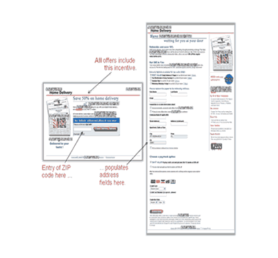
- We conducted a one-month test for a major newspaper.
- Would a subscription path convert better with pop-up incentives?
- Incentive is a key element in overcoming Friction. (We cover this extensively in our Landing Page Optimization Course.)
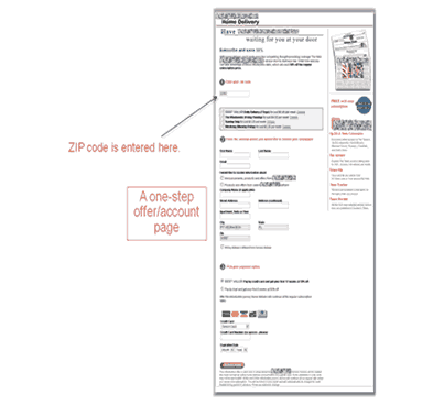
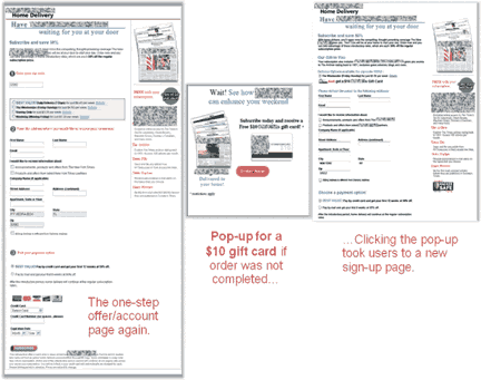
- We tested two different designs without pop-ups and one with. All offers included a 50% discount incentive.
- We looked specifically at the test results for a pop-up incentive for a major international coffee chain offering a $10 gift card with a new subscription.
Control (without gift card)
Voting
We asked our clinic audience:
Which offer performed best in our tests?
A plurality thought Treatment 2 would perform best.
| Offer Path | votes | ||
|---|---|---|---|
| Control (w/o gift card) | 22.45% | ||
| Treatment 1 (w/o gift card) | 35.71% | ||
| Treatment 2 (with gift card) | 41.84% | ||
Test Results
| Offer Path | Conv. Rate(%) |
|---|---|
| Control (w/o gift card) | 1.93% |
| Treatment 1 (w/o gift card) | 2% |
| Treatment 2 (with gift card) | 1.71% |
| Relative Difference btwn Control and T2 | 13% |
| Relative Difference btwn T1 and T2 | 17% |
What you need to understand: Both the Control and Treatment 1 performed better without the gift card incentive.
Why? – especially since previous test results have shown us that Incentives can be a powerful factor in the Conversion Index formula.
Was this a rare case where an incentive worked against the Conversion rate?
- Did the pop-up turn people off?
- Was the $10 gift card perceived as valueless?
Another difference between the two best performing offer pages: one is two steps, the other just one. Did that somehow make the difference?
Analysis
Testing experience may lead us to the intuitive conclusion that offering an incentive may increase conversion. But an experienced analyst also knows that we cannot definitively show the impact of the incentive alone – we cannot isolate it – unless we use identical versions of the offer where the incentive is the only variable.
Our primary analyst also raised a concern about possible Instrumentation, Sample or Selection Threats having intruded into his test protocol.
We would need to retest the incentive premise.
Case Study 2: Copy and Headline
Test Design
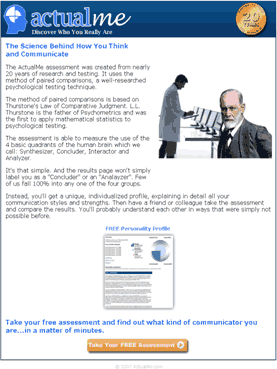
- 2½ week split test for an online personality testing business.
- The goal was to motivate more people to take a personality assessment.
- Which of three offer pages will have the highest conversion rate? We also had a secondary research question: Which headline would perform best?
Voting
We asked our audience to answer two questions about Case Study 2:
Which offer page performed best in our tests?
| Offer Page | Votes | ||
|---|---|---|---|
| Control – Long copy w/ “Science Behind How You Think”. . . Headline | 18% | ||
| Treatment 1 – Shorter copy w/ “ActualMe” Headline | 23% | ||
| Treatment 2 – Shorter copy w/ “Communicator” Headline | 59% | ||
Which headline performed best?
| Headline | Votes | ||
|---|---|---|---|
| Control – The Science Behind How You Think and Communicate | 15.53% | ||
| Treatment 1- What Actual Me Profile Are You? | 9.71% | ||
| Treatment 2 – What Kind of Communicator Are YOU? | 74.76% | ||
A majority of our audience picked Treatment 2 both times.
Our primary analyst also thought Treatment 2 would perform best.
Believing “ActualMe” does not have brand recognition and using it in the headline might be confusing, the analyst tried “Communicator” in the Treatment 2 headline, positing that with clear communication the shorter page would outperform the longer page.
Test Results
| Offer Page | Conversion Rates | ||
|---|---|---|---|
| Control – Long copy w/ “Science Behind How You Think” . . . Headline | 26.81% | ||
| Treatment 1 – Shorter copy w/ “ActualMe” Headline | 0.98% | ||
| Treatment 2 – Shorter copy w/ “Communicator” Headline | 27.78% | ||
| Relative Difference between Control and T1 | 9.1% | ||
| Relative Difference between T1 and T2 | 5.3% | ||
What you need to understand: Shorter copy performed better than longer copy, and Treatment 1 performed best.
Why didn’t the analyst’s intuition work? Why did the “ActualMe” headline perform better?
We reached no definitive conclusion, so we tested again. . . .
Case Study 3: Headline and Page Design
Test Design
- We conducted another split test.
- The conversion path stayed the same.
- We used the best-performing headline (ActualMe) from the last test and pitted it against what the analyst believed to be an even stronger headline.
| Control | Treatment 1 |
 |
 |
Treatment 2
Voting Results
Now which offer page would have the highest impact on conversion?
| Offer Page | Votes | ||
|---|---|---|---|
| Control- “ActualMe” Headline | 29.91% | ||
| Treatment 1 – Free Personality Test Headline | 33.64% | ||
| Treatment 2 – Free Personality Test Headline w/graphic | 36.45% | ||
The votes were closer this time, but the majority of our audience still picked the wrong offer page.
Test Results
| Offer Page | Conversion Rates |
|---|---|
| Control – “ActualMe” Headline | 20.14% |
| Treatment 1 – “Free Personality Test” Headline | 25.17% |
| Treatment 2 – “Free Personality Test Headline” w/ graphic | 20.8% |
| Relative difference between Control and T1 | 25% |
| Relative difference between T1 and T2 | 21% |
What you need to understand: Treatment 1 produced a 25% higher conversion rate than the Control page. In this case the primary analysts intuition was correct: the very direct, clear headline performed best.
A clear, concise headline about what you get and how long it takes was obviously a very good design choice.
But let us dig a little deeper.
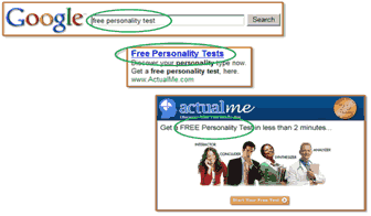
- Both Treatments had the new, clear headline, which included the time it takes for the test, in order to reduce Friction.
- Both Treatments used Continuity to match the keyword phrase, the Pay Per Click ad, and the headline:
Did adding a picture of the profile increase Friction and Anxiety or convey Incongruence? Did visitors think this . . .
. . . was all they would get for their time and effort?
The actual personality profile is very detailed and several pages long.
Case Study 4: PPC Ad Copy
Test Design
- We conducted a three-week split test for a research partner selling products for home exteriors.
- We wanted to determine if a Yahoo! 5-star credibility indicator could increase Click-Through Rate on a PPC ad.
- Merchants participating in Yahoo! Shopping can receive up to a 5 star rating. This is extremely difficult to get, as it indicates 100% positive feedback. It provides the highest credibility.
| Ad 1 – ID 6 | Ad 2 – ID 7 | |
 |
||
Which ad performed better in our tests?
| PPC Ad | Votes |
|---|---|
| PPC Ad 1 with no five-star rating | 47.06% |
| PPC Ad 2 with a five-star rating | 52.94% |
The audiences intuitive choice was again trumped by the test results:
| Google Adword |
Impressions | Clicks | Click-Through Rate % |
||
|---|---|---|---|---|---|
| PPC Ad 1 | 4,875 | 330 | 6.77% | ||
| PPC Ad 1 | 2,208 | 130 | 5.89% | ||
| Relative Difference between Control and T1 | 15% | ||||
What you need to understand: The PPC ad without the 5-star credibility indicator outperformed the Treatment by 15%.
Why? Previous test results have shown us that adding credibility indicators is a powerful Anxiety reliever.
Analysis
One analyst interpreted the results this way:
“Yahoo’s rating may not mean as much to users [who are] unaware that Yahoo rates their stores based on customer feedback.”
Another interpreted the results this way:
“Looks like customers pay more attention to the functionality of the product than merchants credibility. People first find the product with the functions they need, then check on quality, credibility, etc., and finally purchase the product. AD1 gives [a] clearer idea what the ad is for.”
Still another analyst interpreted the results this way:
“I think it’s all based on the nature of the product and how savvy customers are. If this were electronics I think the rating would have more impact, but for this niche it has less.”
Yet another looked at the test from a completely different perspective:
“What if the Yahoo version led to higher conversion of visitors to sales? We’re making assumptions about the ad, but without half the data we need. We might be discarding the ad . . . not knowing that it results in a 27% increase in sales, for instance.”
Keypoint
A “sequence of concerns” takes place in the purchasing decision process.
Early in the process shoppers want to know if you have the best price, if you have the widest selection, if you have what they need. The credibility concern arises as a shopper gets closer to the buying decision.
In Case Study 4, visitors may have been presented the five-star credibility indicator too early in the sequence.
Anticipate what is on a visitor’s mind at each step of the process, starting with the design of your pay-per-click ad. Then meet each of their concerns, the Anxiety or the Friction factors, with the appropriate relievers as they click deeper into the process.
Case Study 5: Email Subject Line and Copy
Test Design
- MarketingExperiments Certification Course Email.
- Perform a Split Test on a subset of the MarketingExperiments journal list.
- Determine whether a comparison approach or an academic approach has a better impact on Click-Through Rate.
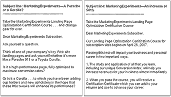
- Subject Lines Tested:
- “MarketingExperiments – A Porsche or a Corolla?”
- “MarketingExperiments – An increase of 541%”
- Take the better performer and send it out to the rest of the list.
| E-mail 1 | E-mail 2 | |
 |
||
We asked our audience to again test their intuition, and to tell us why they voted the way they did:
Which email performed better in our tests?
| Email Subject Line and Copy | Votes |
|---|---|
| Email 1 – “Porsche vs. Corolla” | 56.52% |
| Email 2 – “541% Results” | 43.48% |
Some participants thought the Porsche vs. Corolla email seemed more engaging, that cars were an exciting, emotional analogy and that Email 2 was boring. Others thought the “results” approach better explained the course’s benefit.
| Email Subject Line and Copy | Click- through Rates(%) |
|---|---|
| Email 1 – Porsche vs. Corolla | 1.35% |
| Email 2 – 541% Results | 1.75% |
| Relative Difference between Control and T1 | 29.3% |
What you need to understand: The format with the academic approach produced a 29% higher CTR than the informal email.
Why?
Analysis
- The familiar, “standard” academic format may have created less Anxiety, being what subscribers normally expect from us. The Porsche vs. Corolla idea may have been Incongruent with the clinical tone our subscribers are familiar with.
- Perhaps the car analogy did not translate, or the radical redesign of the copy’s tone was perceived as Irrelevant to our Value Proposition.
Case Study 6:Landing Page Design
Test Design
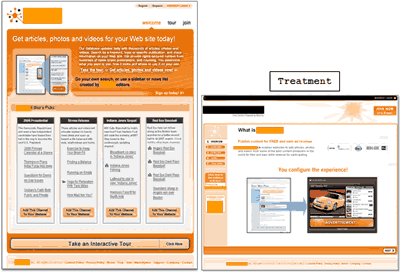
- A 3½ week split test for a content delivery business allowing Web site owners to receive free content and a share of ad revenue.
- The objective was to increase membership.
- Which Landing Page would convert better?
- A page with lots of copy and multiple products shown or
- A page with shorter copy and a specific example of one of the products offered.
Control
Our audience’s collective intuition was 0 for 6 so far. We asked one last question:
Which landing page performed better in our tests?
| Landing Page | Votes |
|---|---|
| Control (long design) | 30.77% |
| Treatment (short design) | 69.23% |
We again solicited audience feedback on why they voted the way they did before revealing the actual test results. Someone thought the Control design was clear and easy to understand. Someone else offered that the Treatment was a better sales approach. Dr. McGlaughlin offered that he didnt like either design.
Test Results
| Landing Page Design | Conv. Rate(%) |
|---|---|
| Control (long design) | 9.53% |
| Treatment (short design) | 4.44% |
| Relative Difference | 114% |
What you need to understand: The Controls Conversion Rate was 114% higher than the Treatments.
Analysis
The Control’s focus is about getting content for your site, while the Treatment emphasizes earning ad revenue by publishing content. Was getting content a stronger Value Proposition than earning ad revenue?
Was there too little copy in the Treatment, creating Anxiety about the offer and making a decision to continue? The “Call to Action” buttons on the Treatment page were also small and poorly placed.
Summary
- Breakthroughs in science may start with intuition, but they are only confirmed by good scientific methodology. Intuition is no substitute for valid data.
- Developing test treatments naturally involves intuition. For any given variable there are virtually unlimited possible variations. Your decision about what may work will be influenced by intuition.
- Applying professional discipline to your testing effortsgaining expertise with marketing testing tools and procedures’can help hone your intuition.
- Marketing is testing. The value of marketer’s intuition is predicated on experiencing repeated, valid test results and witnessing the sum of all outcomes, both positive and negative.
- Things that worked “yesterday” may not work as well today. You can intuit/speculate all you want, but science requires that your premise, your hypothesis, be tested again and again.
- The more you test the more confident you are and the better your intuition, but overconfidence may also lead you to make decisions without factoring the true risk associated with each variable, option, and outcome.
- Culture and personal background also play a role in intuition. The perspectives of a diverse team can bring unique, creative solutions to an optimization project.
- Our certification course teaches how to choose what to test; how to develop Treatments based on a defined objective. With extensive experience marketers may progress from focusing only on the primary test objective to a more holistic approach.
Related Marketing Experiments Reports
- Marketer’s Intuition Tested
- Landing Page Optimization TestedCreating Effective Incentives-The Science of the Art
- PPC Ad Copy Tested
- Google AdSense Tested-Learn How to Maximize Your Paid Search (PPC)
- Email Marketing Tested
- Email Marketing Tested, Part 2
- Site Headlines Tested
- Multivariable Testing
As part of our research, we have prepared a review of the best Internet resources on this topic.
Rating System
These sites were rated for usefulness and clarity, but alas, the rating is purely subjective.
* = Decent | ** = Good | *** = Excellent | **** = Indispensable
- On Making the Right Choice: The Deliberation-Without-Attention Effect ***
- Big Decision: Head or Gut? Hmm . . . ***
- The Intuition vs. Analysis Conundrum ― Plus a Podcast **
- The Perils of Intuition **
- Evolving the Marketing Function: From Intuitive Art to Precision Science **
- Wheres the Intuition? **
- It May Be a New Year, but Your Gut Is Still Not Smarter Than Your Head **
Credits:
Editor(s) – Frank Green
Bob Kemper
Writer(s) – Peg Davis
Bob Kemper
Contributor(s) – Flint McGlaughlin
Maria Hendricks
Jimmy Ellis
Jalali Hartman
Nick Usborne
Jeremy Brookins
HTML Designer – Cliff Rainer
Email Designer – Holly Hicks
Test Protocol(s):
- TP1038, TP1021, TP 1042, TP 4012, TP 2002, TP 4013


