Which specific optimization steps have been shown to increase Conversion by reducing Friction and alleviating Anxiety?
In this clinic we looked at two case studies where Landing Page elements that overcame the value inhibitors of Friction and Anxiety increased Conversion. The increase attributed to these elements in one test was 162%.
Questions our research examined:
- How does providing more or fewer choices affect click-through and Conversion?
- Ensuring a Landing Page is “congruent” sounds like a simple step, but what exactly does that mean?
Editor’s Note: We recently released the audio recording of our clinic on this topic. You can listen to a recording of this clinic here:
Improving Conversion by 162%: How to Overcome Value Inhibitors
Background:
Highlighted in the Conversion Index are the elements “i” and “f” representing the value inhibitors Incentive and Friction, weighted by the factor “2.”
Editor’s Note: The MarketingExperiments’ Landing Page Optimization Certification Course examines the index in detail.
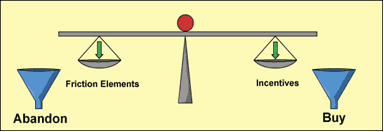
Friction is a psychological resistance to a given element in the sales process. Anything that creates annoyance in the mind of the person interacting with your presentation or your Web site is a source of Friction.
But Friction cannot be eliminated entirely.
Because asking for a credit card number, an e-mail address, or other personal information to complete a transaction is a necessary element of online business, the value inhibiting aspects of Friction can only be minimized and then counter-balanced with an appealing element―an Incentive―to stimulate a desired action.
Principle 1: One of the most effective ways to increase Conversion is to decrease Friction. Our experiments suggest that focusing on reducing Friction produces a disproportionately high return on invested effort.
Principle 2: The objective is to minimize—not eliminate—Friction.
Principle 3: Once Friction has been minimized, seek to overcome the remainder with Incentive.
“2a” in the conversion index represents the value inhibitor Anxiety, and it can be more “lethal” to Conversion than Friction.
While Anxiety is often stimulated by a legitimate concern, its degree and impact are often disproportionate to the measure of risk. In practice, a fundamental understanding of the psychological aspects of Anxiety calls for “over-correction” in the conversion process. . . .
Wherein:
AR = Level of Anxiety Relief.
AL = Anxiety Level: Intensity Level of customer Anxiety as it relates to the core concern.
SP = Specificity as it relates to the core concern.
PX = Proximity as it relates to the geography of the concern.
IC = Intensity of Corrective measure as it relates to the core concern.
Editor’s Note: The Anxiety Relief formula and its application are reviewed in depth in other, topic-specific research briefs and in the Landing Page Optimization Certification Course
Case Study 1: Background
Last year we conducted a 24-day test for a non-profit supporting Alzheimer’s disease research.
The objective was to improve Congruence in their donation conversion path, ensuring every element—design, copy, images, colors, logo, price—either stated or supported the Value Proposition.
Let’s look briefly at the Control, Treatment, and results for that study before moving on to a more recent, subsequent test.
We concentrated on improving the Congruence of this Control page:
- Headline
- Design
- Copy
- Images
- Colors
- Logo
- Price
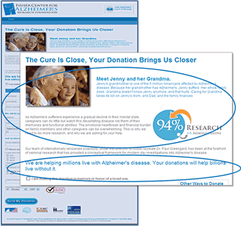
The goal of the Treatment was to make it feel personal rather than institutional:
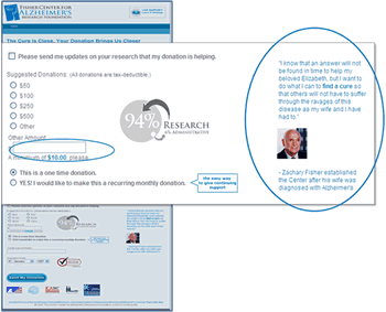
We changed the way donations were requested. We brought the founder’s voice and personality onto the page by adding the testimonial, and a one-time donation was set as the default in order to reduce Anxiety:
Every element in the Treatment—the new headline, new copy, new image, and the founder’s testimonial—was made congruent with a personal, intense, emotional tone that touches people and invites them to donate.
Results
| Case Study #1 (Background) | Visits | Donations | Conversion Rates |
|---|---|---|---|
| Control |
1,319
|
39
|
2.96%
|
| Treatment |
1,185
|
54
|
4.56%
|
| Relative Difference: |
54%
|
||
What you need to understand: The Treatment increased Conversion by 54% over the Control.
There was also a 33.1% increase in total donations.
This Treatment then became the Control in our next test with this partner.
Follow-Up Test
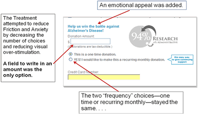
Subsequently, we completed a two-week A/B test with the same partner, attempting to further optimize their donation Landing Page.
Our primary and secondary research questions:
- Which donation page, Control or Treatment, yields the higher revenue per donation?
- Which page yields the higher Conversion Rate?
We split traffic from the Offer Page equally between the Control and the Treatment pages.
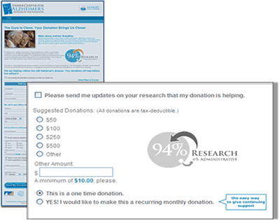
On the Control page there were four donation amount choices plus the option to write in an amount (with a $10 minimum). There was also a choice to make it a one-time donation or a monthly recurring amount:
| Case Study #1 | Visits | Donations | Conv. Rates |
Donation Revenue |
Revenue Per Donation |
|---|---|---|---|---|---|
| Control |
395
|
32
|
8.10%
|
$5,898
|
$173.00
|
| Treatment |
436
|
24
|
5.50%
|
$2,335
|
$89.81
|
| Relative Difference: |
33.3%
|
47.3% |
152.6%
|
92.6%
|
|
What you need to understand: The write in your own amount Treatment did not perform as well as the Control. The Control outperformed the Treatment in Conversion Rate (47.3%), donation revenue (152.6%), and revenue per donation (92.6%).
Conclusions
Previous studies led us to the conclusion that providing too many choices on a page causes Friction. In this case having only a blank field actually made the donation process more difficult and emotionally stressful: In essence, it provided too much flexibility with little supporting guidance.
Though the “suggested donation” amounts in the Control offered choice, they reduced difficulty and therefore Friction. They also alleviated Anxiety by eliminating the requirement to determine the “right” amount to donate.
Key point: You should strive to minimize the amount of “unsupervised thinking” in the Conversion process.
Case Study 2: Background
We conducted a one-week A/B/C split test for a Web hosting firm with the goal of increasing service sign-ups.
Our primary research question: Which Landing Page will produce the highest conversion rate? We were also interested in which page would produce the most revenue.
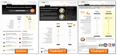
Traffic from the Offer Page was equally distributed between a Control page and two Treatments.
Editor’s Note: The company’s name and logo have been obscured in the page images for anonymity.
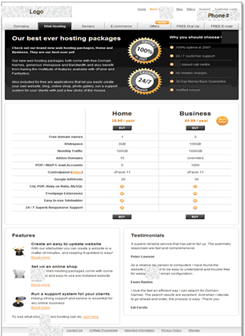
Here they are side-by-side, but let’s look at the details.
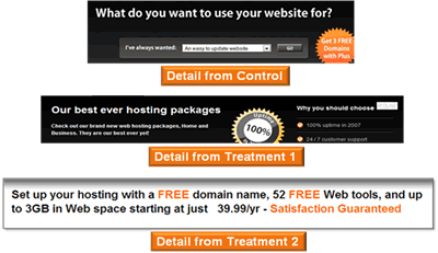
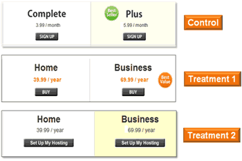
Treatments 1 and 2 both concentrated on strengthening the headline:
The Control and both Treatments assisted the customer in the decision-making process by effectively organizing information on the page:
But the confusing product descriptions “Complete” and “Plus” in the Control were changed in both Treatments:
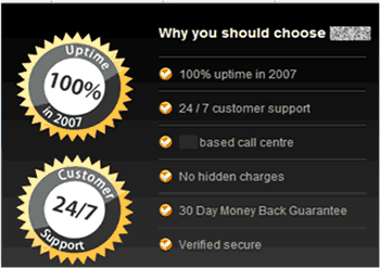
MarketingExperiments’ best practices include alleviating Anxiety by addressing visitor concerns such as:
- Quality of Service
- Customer support availability
- Money-back guarantees
- Security
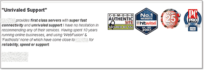
We also recommend using effective testimonials and third-party credibility indicators:
Key point: Take measures to address concerns in proximity to the factors causing the concerns. Placing guarantees, security seals, etc. near the sources of Anxiety makes them more effective at overcoming the Anxiety.
Results
| Case Study #2 | Conversion Rates |
|---|---|
| Control |
1.31%
|
| Treatment 1 |
3.44%
|
| Treatment 2 |
2.05%
|
| Relative Conversion Rate Difference (Control vs. T1): |
162%
|
What you need to understand: While both treatments outperformed the Control, Treatment 1 was 162% better than the Control in its Conversion Rate. Treatment 1 also yielded 128% more revenue per visit.
Conclusions
The specific elements in Treatment 1 that reduced unnecessary Friction and relieved Anxiety were key factors in its success:
- Clean copy; prioritized information
- Clear eyepath
- Quality of Service claim
- Customer support information
- Money-back guarantee
- Testimonials
Key point: Remedies for Anxiety must be:
- An intense over-correction
- Specific to the source of the concern, such as
- Quality of the service
- Reliability of the product
- Security of the purchase
- Supportive of the price (Competitiveness, Cost/benefit)
- In proximity to the occasion of the concern.
The level of congruence on the Treatment 1 page was also better.
It had a more professional look, reflecting the elements of the brand (design, copy, images, colors, logo, price) and the product’s Value Proposition.
Upcoming research efforts should focus on finding an ideal Incentive to further increase Conversion.
Summary
- One of the most effective ways to increase Conversion is to reduce Friction: The objective is to decrease it, not eliminate it entirely.
- Eliminating “unsupervised thinking” can contribute to alleviating Anxiety and reducing Friction.
- Once Friction has been minimized, one of the best ways to overcome the remainder and increase Conversion is to offer the right Incentive.
- Remedies for Anxiety must be:
- An intense over-correction
- Specific to the source of concern
- In proximity to the occasion of the concern.
- “Trust is the ultimate remedy for Anxiety.”
Related Marketing Experiments Reports
- Landing Page Optimization: Improving Conversion 50-60% by Applying Continuity and Congruence
- Site Design Tested: Reducing Customer Anxiety
- Landing Page Confusion: How Does Having More Than One Objective to a Page Affect its Performance?
- Landing Page Optimization TestedCreating Effective IncentivesThe Science of the Art
- Landing Page Optimization: How Businesses Achieve Breakthrough Conversion by Synchronizing Value Proposition and Page Design
- Optimizing Site Design
- Optimizing Free Trial Offers
As part of our research, we have prepared a review of the best Internet resources on this topic.
Rating System
These sites were rated for usefulness and clarity, but alas, the rating is purely subjective.
* = Decent | ** = Good | *** = Excellent | **** = Indispensable
- Landing Page Optimization Webinar (Omniture/MarketingExperiments) ****
- 10 strategies for enticing visitors to buy or act ***
- Converting Visitors Into Buyers **
Credits:
Editor(s) Hunter Boyle
Frank Green
Writer(s) Peg Davis
Bob Kemper
Contributor(s) Gina Townsend
Boris Grinkot
Flint McGlaughlin
Bob Kemper
HTML Designer(s) Cliff Rainer
Mel Harris
Email Designer Holly Hicks
Test Protocols:
- TP1055
- TP1063


