

Some people might think that optimizing a payment form page is a waste of time. But, I would have to disagree. In fact, I would argue it’s one of the most important places to test. And when it comes to a form, the same elements of optimizing a landing page apply. If your analytics are telling you that you’re losing traffic in the form fields, that’s like if a person was standing in line at the grocery store, ready to check out, and then suddenly they drop their groceries and run to the car. You’re losing out on what otherwise could have been a sale.
Wherein:
C = Probability of conversion
m = Motivation of user (when)
v = Clarity of the value proposition (why)
i = Incentive to take action
f = Friction elements of process
a = Anxiety about entering information
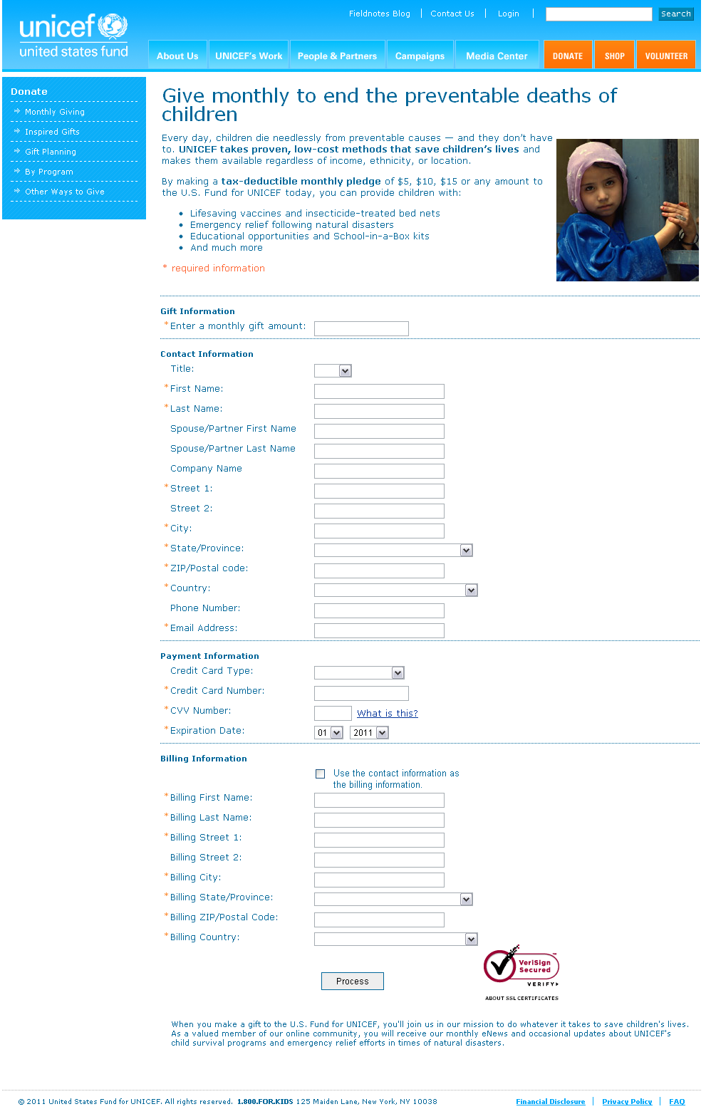
In the case of our next example, UNICEF, you would be losing out on a donation that could help children worldwide. We’re going to be taking a look at UNICEF’s monthly pledge payment page. As always, we’re going to structure our thought process around the MarketingExperiment’s Conversion Heuristic, our thought model for conversions, and highlight how we can use some of those elements to achieve our objective – more monthly pledges for UNICEF.
Don’t assume these suggestions only apply to non-profits or NGO’s; many of the elements are exactly the same regardless of industry or business.

Clarity of the Value Statement
This page does a good job clearly giving a value statement and answering every visitor’s first three questions: Where am I? What can I do here? Why should I do it? It’s communicated in the headline, subheadline and image. “Give monthly to end the preventable deaths of children,” as well as the bullet points underneath describing what my donation will be used for, strikes a solid chord with their visitors. The image of the girl, eyes planted to the camera, drives the value statement home.
There is one area I see needs improvement: the button. “Process” seems pretty dry and well…boring. Given the push to donate on the top of the form, the button text seems to fall short. I suggest mirroring the powerful word choice in the top portion below in the button. A short sentence before the button would also help reemphasize the value statement as well.
Friction
Friction deals with length or difficulty of the page or form in the mind of the visitor. This is an area where this page falls short. The good news though, is it can be an easy fix. Friction is an area that when identified and improved, especially in form fields, can lead to a big increase in conversions. Having form fields in the neighborhood of 25-30 is not optimal. Let’s see if we can reduce friction a bit, here are my suggestions:
- Decide what fields are unnecessary (company name and phone number – if you’re not going to use it, don’t ask for it)
- Have some fields side by side: Title, First Name, Last Name ; Spouse First Name, Last Name ; Street 1, Street 2 ; City, State, Zip. This would reduce the overall length of the page and make it look less daunting.
- Billing information is the most important, so start with that. Have a selector box to use that information as contact information as well.
- With the monthly gift amount, have some pre-selected options with the option of putting “other.” Carry the suggestion from the above text to the form fields.
Anxiety
Recall that anxiety is present in the mind of the visitor as a concern. At first, look UNICEF is doing a pretty good job accounting for anxiety. The site is on a secure server (https ://) and the VeriSign logo is placed near the button. A visitor would feel confident, given these elements as well as UNICEF’s long history, that the information provided is safe. However another element of anxiety is not accounted for, and in fact subtly outlined in the small text at the bottom:
- You give your email in the form, but you’re NOT able to opt out of emails from UNICEF.
- They do not define how many emails you will be getting
This can lead to 2 problems:
- Loss of that conversion entirely
- Visitors enter a bogus or unused email and that email capture is useless anyway
I’m well aware of the good work UNICEF does around the world and the nature of non-profits. That said, not being able to opt-out of emails seems like spam waiting to happen, or at least a concern over possible spam. It’s the concern that we’re trying to mitigate. UNICEF may just send out two emails a year, the problem is that the concern goes unaccounted for, and this can hurt conversions. A suggestion would be to allow opt-out by clicking a box, but have the box pre-checked when the visitor enters the form. This is a common practice around the web and I think losing a few emails is favorable to losing a few conversions (especially visitors that have already entered in ALL their information).
Overall I think UNICEF is doing a good job with their form page and a higher conversion rate is just around the corner of a few suggestions and some testing.
Related Resources:
Landing Page Optimization: Identifying friction to increase conversion and win a Nobel Prize
Internet Marketing: Landing page optimization for beginners
Simple Registration Form Changes to Lift Conversions: 5 ideas to test – MarketingSherpa’s Members’ Library
</strong> Wherein:
C = Probability of conversion
m = Motivation of user (when)
v = Clarity of the value proposition (why)
i = Incentive to take action
f = Friction elements of process
a = Anxiety about entering information</div>
Really interesting article with good tips! I will definitely share this article with our clients here at Dydacomp who would really benefit from this article thanks!
Thanks buddy for posting such an informative stuff. one important part of this post is the conversion equation: error handling on forms. Since form usability is so critical to the conversion process, it warrants a deeper look…
Web Design Company
That’s exactly what I’m talking about!! When you said you’re losing out on potential customers when your analtyics tell you that you’re loosing traffic in the forms field, I totally agree with you.
The firm I work for is looking to create an online branding app. We checked out several free branding apps online, but most of them lose you when you get to the actual forms part.
The forms part, where you’d be entering in your e-mail address (contact – score!) and info about your business, usually only ask basic questions and then generate a very generic branding concept.
These companies almost had my business, but then couldn’t follow through in the last step. The forms fields just didn’t match up.
So far, I’ve found only one free branding app that I like:
http://www.facebook.com/pages/Mindflash-Advertising/180033020422?v=app_4949752878&ref=ts
If you can recommend any other branding apps, it would be much appreciated!
Great article. Thanks!
Cory,
You bring up a good point, it’s important for form fields to be as relevant as possible. Sometimes adding additional form fields can add value both in the mind of the visitor as well as for the sales staff receiving the info. For example, you would only want to be asked certain information if you expect to be getting some type of value for entering it. We classify this as a value exchange for the visitor (what do I get for entering in my info). You would also pre-qualify your lead by asking for extra information. However this should be done with care as it can hurt overall lead numbers, finding a healthy medium is crucial for any business.
Keep in mind that the “free branding app” you linked to, while clever in the approach, is essentially a lead generation tool. The point of the tool is the lead generation form at the end. Their business is not to provide a Facebook app you can use to get logos, it’s to get a consulting role with potential clients. Their social media and free offer approach is an effort to grow leads for that business. I entered different information for the same industry, all to the same resulting brand/logo. As far as branding apps, I don’t use any and couldn’t recommend any either. Building a brand is something that should be done with care and consideration and not with a roulette spin through a database of preselected logos and names. As far as getting inspiration for a creative logo or website, I could recommend more than a few quality blogs, websites, and probably a few good museums.