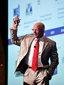
Earlier today at the MarketingSherpa Email Summit 2011, in front of 700 marketers at Caesar’s Palace in Las Vegas, Dr. Flint McGlaughlin worked without a net and engaged in live optimization with actual examples provided by Summit attendees.
Live Optimization #1: Email newsletter
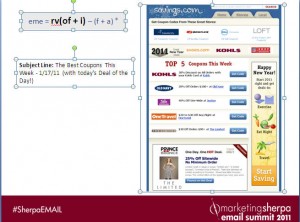
The first was an email from Savings.com. The objective of the mail was to drive clicks and the mail itself is Savings.com’s email newsletter, so the mail went out to the entire newsletter subscriber base.
Flint’s immediate comment is that the information isn’t being presented at the right time in the right way, the mail doesn’t look like a typical email newsletter so there could be confusion on the part of the recipient, and the mail does not have a clear value proposition.
The submitter commented, “We’re trying to deliver the best coupons for that particular week.”
One attendee commented, the best value of the mail — the 30% off offer, etc. — is the hardest to find and read.
Flint’s additional comments were that the mail has no eyepath, enormous friction with seven calls to action and there’s no way to tell the difference between brands and button.
How to guide the visitor’s eyepath
His suggestions were to create a clear headline, a couple of lines of text explaining the value prop, and a design that creates an eyepath.
Flint added controlling the eyes is important to controlling the thought sequence, and eyepath is controlled five ways:
- Size
- Color
- Shape
- Motion
- Position
Flint made the submitter an offer to go to the MarkeingExperiments optimization booth, work up a new treatment and put that treatment to a real-world test.
Live Optimization #2: Reactivation campaign

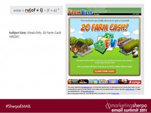
The second example is a reactivation campaign from FarmVille to get players back into a game that had been dead for a month. The mail was part of a multi-variate test and the submitter wanted Flint’s input, but wouldn’t tell the audience whether the mail was a winner or loser in the test.
The submitter mentioned that although the mail looked like a single piece of graphics, it actually combined graphics and HMTL text.
Here are some attendee comments:
- White copy on lime green background is hard to read
- In subject line, “only” in front of the number 20 makes the number look small
- “What do you have to do to get it (the offer)?”
- The mail is sent to previous players of the game, but nothing in the mail connects to that fact
Flint’s suggestion is to consider a radical redesign, even thinking about the mail in a different category. Flint suggested using the mail content as a landing page and create a new mail that serves to drive clicks to that landing page.
Related resources
Email Marketing Optimization: Email messaging 101
Internet Marketing for Beginners: Email marketing optimization 101
Email Makeover: 7 Email Optimization Tactics to Boost Revenue (Members’ library)
(Photo credit: Summit attendee Mark Walter)


