

Editor’s Note: Troy O’Bryan and his team at Response Capture drove a 258% conversion rate increase for their client through two rounds of testing and optimizing a landing page. Yet when I interviewed Troy to write his team’s success story, he made clear that they weren’t content with their achievement. They’re constantly considering optimization ideas for a new test.
So I crept into the lab, distracted Dr. Optimize (a.k.a. Adam Lapp) from his current experimentation, and convinced him to apply his complex genius to this page. Here’s what he had to say…
It’s great to hear a fellow marketer realize the power of testing. Congratulations Troy! Without testing, how will you ever know if your landing page or website is performing the best that it could?
Never stop testing
Let’s all take a lesson from Amazon.com. No matter how much money or market share Amazon creates, they have never stopped testing. They are constantly proving and disproving new ideas and concepts. I have no doubt they have eliminated thousands of page designs that did not work. But that’s indicative of a true testing culture.
If we compare the laboratories of our online marketing colleagues to that of scientists finding cures to common ailments, there are many similarities. How many concoctions do you think doctors will rule out before they find the cure to baldness? I’m sure that number will dwarf the number of landing pages the average marketer will rule out before they find the one that works the best.
That’s the number one optimization recommendation I can give to anyone…keep on testing. And I’m glad to see the team at Response Capture working (and succeeding) by following that creed.
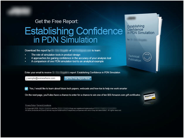
What to test next
Of course, it’s one thing to know the importance of continuous testing. Sometimes, the biggest challenge is deciding what to test next. Let’s take a look at the successful landing page:

My advice is two-fold:
1. Test several more radical redesigns
Then when you think you have a design that can’t be beat by other new treatments…
2. Begin fine tuning (multivariate tests work really well for this)
Radical Test Ideas
The current page does a lot of things right, but there is still room for improvement. The first thing I would test would be the tone.
Currently the look and feel of the page can only be described as “slick.” You look at and say “Wow!” It’s dark and sleek. The bright blue pops out at you. And the overall feels is that this page has been designed by a professional design firm with a very high proficiency with Photoshop.
As great as it is, is this the best tone to go with? At MarketingExperiments, we’ve spoken about the concept that “Ugly converts.” That concept really doesn’t necessarily mean that ugly pages perform better than pretty pages. Rather, we want to remind you that strategy is more important than design.
So what different tones can Response Capture test? Here are a few ideas:
TEST IDEA #1: Simple, plain layout
This page does not have a complex objective – just enter your email to receive a free whitepaper. Assuming most visitors are very qualified (i.e. they know what a PDN is and are your ideal customer), you don’t really have to do much selling.
We see a common mistake across many industries where a landing page is composed of elements that just over-complicate the objective.
For example, if you only want to know if a newspaper is delivered in your area, then your landing page only needs a headline, ZIP Code field, and button. Bulky copy, testimonials, demos, videos, images, and other fancy page elements are just not necessary.
The Washington Post is an excellent example of a simple ZIP Code entry:

Compare this to the New York Post:

I just want to find out if you deliver to my area. I don’t need to know about the top columnist or the Page Six gossip section.
This applies for companies that provide free quotes for insurance or a similar service. A visitor just wants to enter a few pieces of information and see a number. Putting layers of clutter in their way just creates friction.
To summarize, I would test a page that has the following:
- • A non-descript background
• Simple headline: “Download your free report on PDN Simulation”
• Sub-headline: “Tell us where to send the report”
• Email field
• Button
Just make it as simple as possible.
TEST IDEA #2: Report style
So if someone clicks through, we know we have their interest. They are ready to read about PDN Simulation (must be a page turner!). Then give them what they want right away.
Upon landing, visitors could see a page that looks like a report. Here’s one I found quickly from Google Research:

They clicked through with the expectation of seeing a report, and that’s what you have given them with this treatment. Get them engaged right away. Provide an abstract or first couple of paragraphs, then place a call to action to “download the full report.”
Just make sure that you clearly communicate that the whitepaper is free because this treatment strategy communicates much more value than the others. The report style has more of a high-brow, university type of tone – which isn’t always free. It may work or it may not, but the idea is to test.
Those two test ideas should give you a good start, but if you can think of more, test them and let us know how they work out.
Fine Tuning Ideas
Once you’ve found a primary strategy that works, then it’s time to fine tune. Nothing is off limits here. Let’s assume that the current design has stood the test of time…it has defeated several other radical redesigns you have thrown at it. What do you test?
1. Headline
- • Test variations that quantify what’s in the report
• Create urgency (i.e. “available for a limited time” or “you have to know this now”)
• Think of several benefits from reading the report, then test each one in the headline
• Pull out several one-liners from the report that announce an exciting finding
• Test a few provocative questions
2. Rotate bullets and add new bullets
3. Choose three or four different images to test
- • Other images of the report
• Photographs of people that may connect with the target audience
• Charts and graphs
• Other items related to PDN (I have to admit, I’m not your target customer so I’m not quite sure what they would be)
4. Button copy – it’s pretty good now, but you could definitely stumble upon something better
5. Color scheme
- • Test several different background/font combinations
• Will a light background with dark font work better?
6. Placement of gift card incentive
- • In the headline
• As one of the main bullets
• Before the button
• To the right of the button
Now we put this challenge in front of you, the MarketingExperiments community. Use the comments field to post your suggestions for this landing page, agree/disagree with this assessment by Dr. Optimize, and let the page owner know what you would do differently.
Don’t forget to try different colours and styles of submit button – as well as text.
My first test would be headlines then right after that I would start with a big red button.
I’d include one or two powerful, credible, and recent testimonials or 3rd party endorsement etc, that provides real-world evidence of the benefits that business owners have received from reading the report?
Try putting the flag of the referring users country on the landing page… works. 30% lift.