

Sometimes great products can be hard to sell on a website. The market is so saturated with mediocre goods and services that when a truly great one comes along, the same old marketing tactics simply don’t work anymore. Excellent products need excellent websites to communicate their full potential.
And that’s the main problem with this website submitted for live optimization by the makers of the Npower PEG on a past Web clinic.

The product is essentially a battery you can hook to almost any device. But the fun part is that it charges with the kinetic energy you produce while you go about your daily life.
I personally found it fascinating. And I want one.
Unfortunately, (as the owners of the site probably know) the website doesn’t effectively communicate the prodigiousness of the product.
Perhaps you’re in the same boat as the Npower PEG. Maybe you’ve got a great product but you feel like your website doesn’t live up to it. Don’t tune this post out because it’s about someone else’s company.
To help you, I talked to Adam Lapp, Associate Director of Optimization and Strategy, MECLABS, about Npower’s website. From his years of optimization experience, you can hopefully glean some wisdom for your own site.
There are eight main test ideas that Adam highlighted in our conversation about how to improve this website.
Test Idea #1: Make the homepage more like a landing page
One thing Adam noticed was that this entire site is for a single product. Because of that, you could potentially make the homepage a lot more like a landing page with most of the information they need to make a buying decision right there on the first page.
Generally, a homepage like the one they currently have is used to funnel different segments of the audience to the correct sections of a site so they can further engage with the products and services they need.
But it’s not needed here, because you have a single audience looking for a single product.
- Transferrable Principle:
Determine the correct use of your homepage based on the number of audience segments and products/services you have. Many segments and products need a homepage that reflects a high number of offers. But single product homepages can generally be thought of as a landing page.
Test Idea #2: Make the entire site more like a micro-site
Another thing Adam mentioned along the lines of idea #1 was that the whole site might benefit from more of a micro-site look and feel.
“Don’t make a complex traditional website for the sake of making a complex traditional website,” Adam said. “You don’t have to have a big elaborate 10-20 page website with dropdown navigation. Keep it simple. Determine what your objective is and make it as simple as possible to accomplish that objective.”
One way to do this might be to create a navigation that is made up of four (or so) key benefits. So for instance, the links might be:
- Compatibility
- Battery Life
- How it works
- FAQ
No dropdowns needed. Just four key sections, four single clicks.
- Transferrable Principle:
Sometimes you don’t need a website in a traditional sense. What you need is a way to effectively sell a product for the most profit. A website is just a means to an end. With that in mind, think of what your customer needs to know to make a decision and give it to them in the simplest and clearest way possible.
Test Idea #3: Communicate your credibility
Because of the novelty of the product, there might be some credibility issues in the visitor’s mind. Someone looking to purchase the product may be thinking about how reliable it is and what kind of track record it has.
To correct this, Adam proposed using the testimonials that are currently on the blog and moving them to a more appropriate place on the homepage to boost credibility. There is also the issue of who is giving you credit. It might also help to have some statements like, “Used by all the members of xyz hiking club in Portland, Oregon.”
Associations or organizations that use your products can be great credibility sources.
- Transferrable Principle:
Consider whether your ideal customer is questioning your credibility (Hint: they almost always are). If so, cite reliable and well known sources who like or use your product.
Test Idea #4: Optimize your buying process
Currently, the funnel for the buying process appears a little over-complicated. The site asks visitors to reserve a Powerpeg, then wait for it to be manufactured, and then pay if they’re still interested by the time it’s done. But it seems like it would be a lot simpler to go ahead and get the payment up front.
Once that’s in place, Adam pointed out that he would “make it clear that they are made to order. Tell the visitor how long it will take to build it and have some specific money back guarantees to reduce anxiety.”
If the reason for reserving the product ahead of time instead of a purchase was to get leads, there may be alternate means of achieving that goal. For instance, you may try testing an offer like: “First-time customers sign up for our newsletter and you’ll receive a coupon code for 10% off your first order.”
That way if they don’t order the same day, they have a coupon code to come back and complete the order, and you have an email address.
You might even lead the checkout page with a coupon code link under the code box that says: “Don’t have a coupon code? Get yours here.” And collect the lead that way.
- Transferrable Principle:
Friction in the buying process is one of the easiest things to reduce for large conversion rate lifts. Make your buying process as easy as possible and don’t ask for a lead when you should be asking for a sale.
Test Idea #5: Consider an up-sell
As Adam astutely observed in our conversation, an up-sell for this kind of consumer electronic product might also be a great idea. This is the kind of product that people might want two or three of for each member of the family. So depending on how many items people are currently buying per order, you may want to offer something like, “Buy two, get 10% off the second,” or “Buy 20, get one free.”
- Transferrable Principle:
If your product is something people may want multiples of or you have auxiliary offers, test having an up-sell or cross-sell in your purchase process. You may be leaving money on the table because someone wanted to buy more, but you didn’t offer it at the right time.
Test Idea #6: Lead with a clear headline
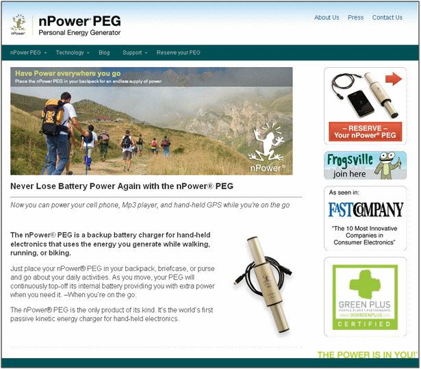
One of the main problems with this page that Adam pointed out was the lack of overall clarity about what the product is and what it can do.
As Adam said, “I see this image of people hiking. Although there is a description of what this image means, and since its small text, I’ll probably overlook this headline. So you’re wasting about 200px of space here with an image that doesn’t really communicate where I’m at or the value of the product.”
To fix this, lead with a clear headline at the top of the page, rather than the middle, that clearly states the name of the product and the primary benefit. Your sub-headline could then state the different uses or some secondary benefit of the product.
- Transferrable Principle:
The purpose of a headline is to drive the reader into the sub-headline or first paragraph. In doing that, it should help the viewer understand immediately that they are in the right place and they should stay on the page.
Test Idea #7: Use relevant imagery
Another problem Adam mentioned was the actual image used on the homepage.
“Instead of a picture of hikers, I’d use an image that more clearly communicates what the product is and how it works. The current image doesn’t connect the dots for me yet.”
One idea for a better image might be a diagram of how the product works. A video may also be a great idea here.
- Transferrable Principle:
Images should be as relevant as possible to the offer on the page and should communicate the value of the product in a way that copy cannot.
Test Idea #8: Move the call-to-action into the eye-path
The right side of the page looks like ads … which wouldn’t be so bad if the primary call-to-action (CTA) wasn’t there. The last thing you want your website visitors to think is that your CTA is an ad.
To fix this, simply drag your call-to-action to the bottom of the page after the viewer has been guided through the value of the product.
- Transferrable Principle:
As Flint McGlaughlin says in almost every Web clinic we’ve ever aired, keeping the CTA above the fold is like asking for a kiss before you’ve even had a conversation. What’s worse is putting the CTA among things that look like ads. Generally, a CTA should always be directly in the eye-path and after the visitor has been convinced of the value of the product.
Related Resources:
Website Optimization: Landing page test leads to 548% increase in conversion
How to Increase Conversion in 2012 — Web clinic replay
Website Optimization: How your peers increase their conversion rate…quickly
Paul,
Your timing is incredible. We are about to launch a new version of the nPower® PEG this spring, as part of that, we are completely redesigning our website to address all of these issues. We’d love for you to take a look at our new site when it’s up and running.
To address some of the issues you identify in the post…..because of the redesign, we can only take reservations at this point. It’s a difficult Catch-22, and is the main reason for all the friction between visit and payment.
We are also a small clean energy startup, with all the inherent challenges. Providing clean energy at the point of use off the grid based solely on the kinetic energy of the user is a revolutionary idea, requiring a little education of the marketplace about the potential of kinetic energy. We try to balance that need with the need to convert visits into sales. Over time, we expect that capturing the imagination of the consumer with the idea itself will be our best persuasive conversion approach.
Thank you again for taking the time to check us out.
Hey Tim,
Really glad I could help! Good luck with your site redesign!
Great post Paul! One thing that I would add to the list of test ideas to increase your conversion rate… “clearly communicate your value proposition”. If a visitor comes to the page you have about 3-5 seconds to communicate who your are and what you have to offer. Test different ways to communicate the value proposition. This will definitely help increase conversions.
Thanks for the comment Scott. You’re absolutely right!