

B2B marketers know that their audience needs a different approach than B2C, from the channels to the landing pages, and ultimately, to the sale.
So for our February 25, 2009 web clinic, we focused our live optimization contest format specifically on B2B landing pages. With guest moderator and lead-generation expert Brian Carroll, and participation from our live audience, the MarketingExperiments team analyzed an array of B2B marketing efforts.
We also awarded prizes to our top contestants and audience participants in the live clinic.
This brief distills the optimization insights from the live clinic into vital takeaways you can apply to your B2B marketing efforts. The summarized critiques include five pages, and you can find the five other “elimination-round” landing pages analyzed on the MarketingExperiments Blog.
Assessing the Competitors
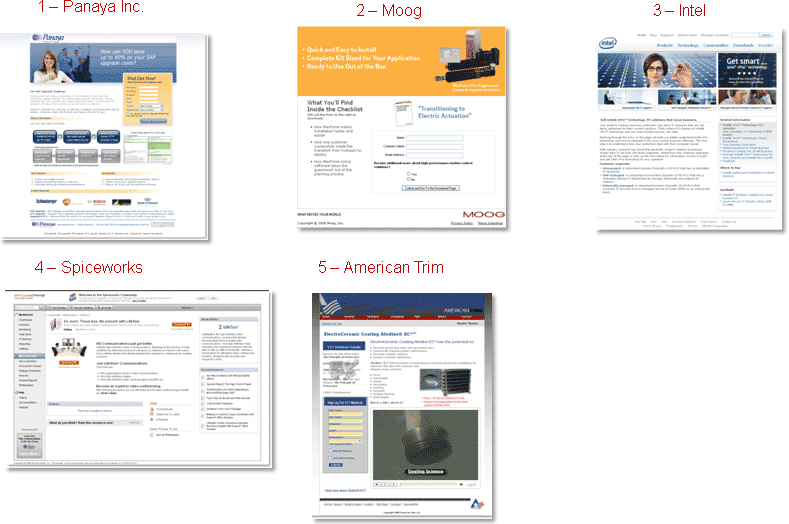
Our B2B candidates came primarily from two sectors of business-to-business marketing: IT and manufacturing. However, within that range, the variety of channels and approaches to landing page design provided diverse opportunities for commentary by our team.
Here are the organizations selected and our team of reviewers:
- Panaya Inc., reviewed by Jimmy Ellis, Director of Optimization Research
- Moog, reviewed by Hunter Boyle, Managing Editor
- Intel, reviewed by Boris Grinkot, Senior Researcher
- Spiceworks, reviewed by Adam Lapp, Analyst
- American Trim, reviewed by Aaron Rosenthal, Director of Channel Research
We used the MarketingExperiments Conversion Sequence as a framework for evaluating the competitors.
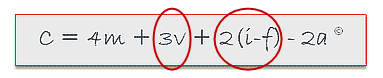
Wherein:
“C” = Probability of conversion.
“m” = Motivation of user (when).
“v” = Clarity of the value proposition.
“i” = Incentive to take action.
“f” = Friction elements of process.
“a” = Anxiety about entering information.
Contestant 1: Panaya
Submitted by: Amit Bendov
Primary channel: PPC
Target audience for this landing page: SAP Directors or project managers in companies that are planning to upgrade their SAP system
Analysis by: Jimmy Ellis
Channel and Page:
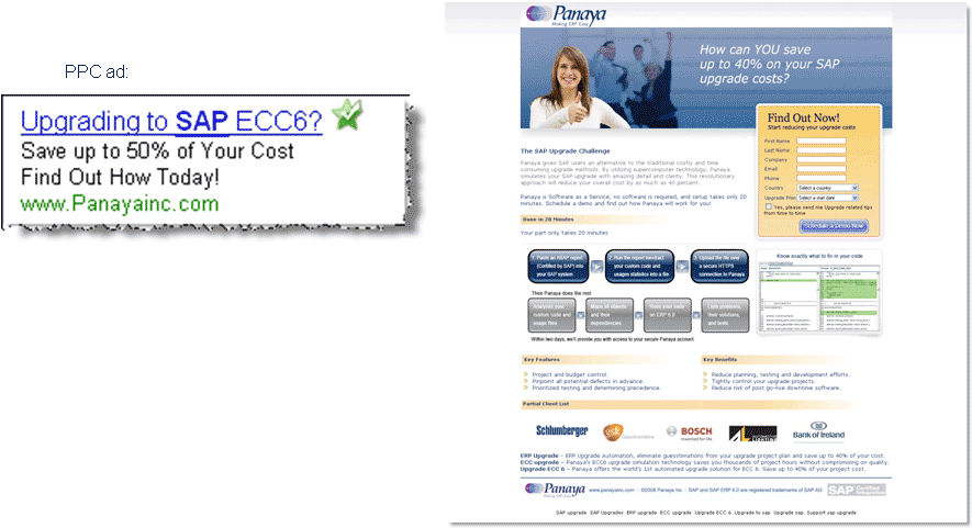
In his initial comments, Jimmy emphasized the importance of continuity between channel and page. He, and many of our audience members, pointed out the discrepancy between the 50% discount offered on the PPC ad and the 40% offered on the landing page. If left unchanged, this negative surprise results in an instant loss of credibility.
Channel: PPC
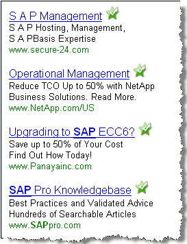
Jimmy Ellis: Of course, your first challenge is to try to get a click on the ad. In comparison with their competition, Panaya almost wins by default, simply because their ad is the only one that offers an upgrade. However, questions rarely perform well in ad copy or headlines on landing pages. If you have a qualified prospect who knows what ECC6 is and knows they need an upgrade, don’t ask them a question they already know the answer to. You’re wasting valuable space.
Instead, test using the exact phrase in the headline, or include the value proposition, for example, “SAP Upgrades — Save 50%.”
I’d like to mention that there is a free demo on the landing page but none of the audience mentioned it because, from these headlines, you couldn’t tell. I’d suggest mentioning the free demo in your headline because it’s the easiest way to start off a low-risk, low-anxiety relationship with a prospect.
Landing Page:
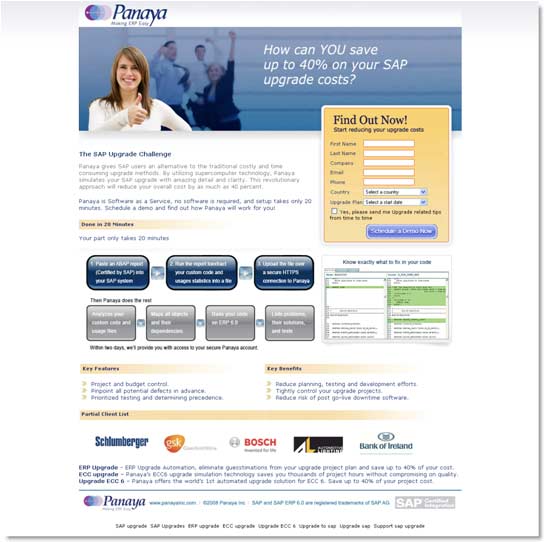
Jimmy Ellis: There’s a disconnect between your ad and your landing page. Remember that whatever you say on the page needs to be as good, or better, than what you say in your ad.
Also, where is ECC6 now? If I’ve clicked on the ad, it’s presumably because I know what ECC6 is and I want it but it is only mentioned in the footer of the page.
The intro/header image does not state or support the value proposition. Instead of a generic image of people cheering, I’d rather have a chart of a graphic, something that tells me how much money I can save or lets me know about the ease of the implementation of this upgrade.
There are several problems related to the copy. First, the white text against the grey or light blue background disappears and becomes very hard to read. Also, while “The SAP upgrade challenge” is a headline following industry practices about presenting the problem to the consumer, it is essential to build the value proposition elements into the headline before presenting the problem. Frankly, with this page, it’s hard for me to find the important points that would help me make a buying decision for this particular product or service.
Aaron Rosenthal: This person is asking the audience to read too much into the images, either at the top of the page or at the footer. The page loses meaning because the thoughts and the images are in the wrong sequence and they don’t support each other or the call to action.
Recommendations:
Brian Carroll: One aspect the designers of this page need to think about is what this page is trying to do and whether or not a free demo is the best way to accomplish their goal. At the moment, it’s really not clear, from an objective standpoint, what they’re trying to do. Are they trying to schedule a demo or educate people about the process? If a prospect really doesn’t know your company, is offering them a demo the best way to get them involved? A demo may raise more questions instead of providing answers.
Jimmy Ellis: Test placement of your call to action by taking your top performing PPC ad copy and building that into your headline, sub-headline, and bullet points on the landing page. Second, whatever you say in your ad, especially if you have a free trial or free demo, needs to be extraordinarily clear on the landing page instead of saying “find out now”. Also the SEO listing says “World’s 1st Automated SAP Upgrade.” That is part of a real value proposition and needs to be communicated on this landing page.
Contestant 2: Moog
Submitted by: Michael Burgess
Primary channel: Email ad in newsletter
Target audience for this landing page: Design engineers
Analysis by: Hunter Boyle
Channel and Page:

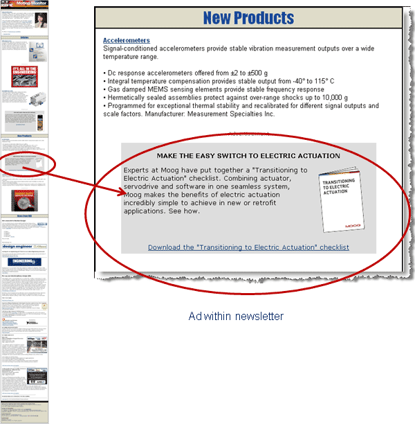
At left is the ad within an email newsletter, and on the right is the actual landing page. Audience suggestions included changing the orange color on the top banner image, including a value proposition, reorganizing the page, and revising the button copy.
Channel: Ad in Industry Newsletter
Hunter Boyle: Since this ad is just one small piece of a very long newsletter, we looked at some of the other ads and concluded that there are probably some limitations to what the site can do. They could make key improvements in their copy. This is a small ad space but they could change the grey color and see if they could find a graphic that would be more appealing.
To make the copy more compelling, consider using testimonials or quantifiable numbers to better demonstrate the following concepts:
- Credibility: Is this switch really “easy” and “incredibly simple”?
- Benefits: What’s the end benefit — cost savings or ROI increase?
- Can you quantify with a percentage or an average dollar amount?
- Call-to-action: “Download” can cause friction/anxiety (hassle, security)
- Test alternates, e.g.: “Get your free checklist” or “See how easy it is to switch”
Landing Page:
Hunter Boyle: Keep in mind that the headline in the ad was “Make the Easy Switch to Electric Actuation” but that there’s actually no headline on the page. It’s a complete disconnect from the ad. There’s no headline to introduce the bullet list or organize the page. These bullets talk about the product but you haven’t introduced what it is and how it can help or connected the product to the checklist.
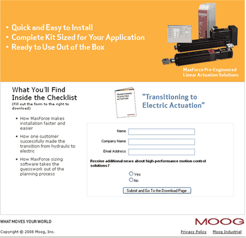
When you look at the page itself, the disconnect continues. The top of page promotes a product, but the bottom promotes the checklist that was the initial call to action of the ad that brought us to the page. There are a bunch of different elements but without a headline to tie them together they’re just kind of flying around loose and not necessarily directing people to the action.
The eyepath bounces all over the page: from the product image on the right, to the bulleted information on the left, to the graphic that carried over from the ad. In addition, your landing page copy has similar issues as the email ad. In brief, it lacks credibility, true benefits, and a clear call to action.
The terminology creates a disconnect as well. To most people, a checklist sounds like a one-page document but the image and copy suggest a document with multiple pages. Is your checklist really a whitepaper? If it is a whitepaper, then the page presents the whitepaper, but doesn’t sell it. There are several improvements you could make:
- Promote the fact that it’s FREE
- If multipage, show an example checklist or a page with a diagram
- Since it includes a case study, hint at results with a credible testimonial, pulled quote or teaser, for example, “See how Company X used MaxForce to switch from hydraulic to electric and saved $___ in one year.”
Finally, the bullet list on the left introduces a new brand name to the mix — MaxForce — more confusion about what the prospect is getting.
Landing Page: “Backdoor” download page?
Hunter Boyle: This page is either an error or an oversight — I’m not sure which one.

If prospects click on the image above the email capture form, they are taken to another page, where they can download the whitepaper without filling in any of the name and email information. Now not everybody is going to stumble upon this process but, if they do, it could be the source of a leak for some of your leads.
Recommendations:
Hunter Boyle: Try a stronger cover image on your ad and landing page. Add a headline, or at least a different headline that introduces the product, what it is, and how it can help.
Also consider the following changes:
- Include the option to get a phone call
- Sell your whitepaper: promote fact that it’s free
- Show example checklist or page with diagram
- if it includes a case study, hint at results with a credible testimonial, pulled quote or teaser
- Revise button copy to be more compelling
Contestant 3: Intel
Submitted by: Kate Blatner
Primary channel: Onsite banner
Target audience for this landing page: Reseller channel
Analysis by: Boris Grinkot
Channel and Page:
Boris Grinkot: The first page is a directory page for various reseller products from Intel while the page on the right is actually dedicated to one of the products, vPro technology.
Flint McGlaughlin: As the audience is commenting, this brings up an automatic orientation issue. The most common audience feedback on this sequence is their concern that most prospects arriving at this page wouldn’t be sure where to go or what they’re supposed to do on the page.
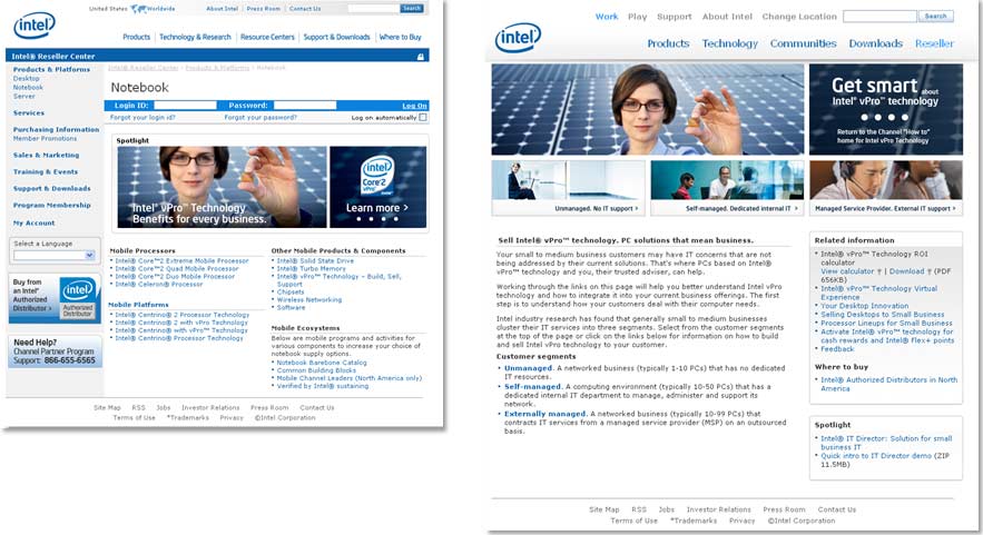
Channel: Onsite Banner
Boris Grinkot: In looking at the first page, the banner is definitely the strongest element on the page due to its size, its color, its location at the top of the content column, and the key image of the person looking forward. If the goal of this page is to get someone to notice the banner and click on it, well, you’re doing a pretty good job. It also does a good job of stating clearly what it advertises and tells the visitor what to do by clicking on the banner to learn more.

However, the two-part design is slightly confusing. It looks like two banners leading to two different pages. Also, the phrase “benefits for every business” is highly generic. Test more specific statements. Instead of focusing on non-specific benefits, utilize what you know about the channel or the visitor, what “business” and/or what “benefits” they are likely interested in, to customize the message. Instead of promising that you can help every business, which is unlikely, specify the most prominent verticals that this technology will be pertinent to.
Landing Page:
Boris Grinkot: Keep in mind that the objective of this page is a little bit different from many of the other pages we’ll be looking at today. The objective of this page is to keep the visitor on the page and keep them interested in learning more about vPro technology.
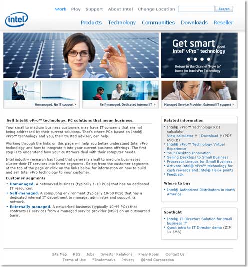
The reappearance of the top graphic from the previous page establishes continuity, but at the same time other elements are working against continuity. For example, the page header style is different, the left navbar has disappeared, and the product name is not emphasized until the content headline. An important element of continuity that is missing here is the concept of “Benefits for every business.” That’s what interested me about the ad but when I go to find out more about it, it’s not here.
Even though the headline is more prominent than the content text, it gets lost against the background of all the heavy graphics. The headline is weakened by the generic statement “PC solutions that mean business.” It is unlikely that your resellers need that level of fluff. It may work in a magazine ad, but visitors to this page came to “learn more” about vPro technology. Non-informative copy increases the likelihood of them leaving.
The secondary images that comprise an alternative nav in this section are difficult to understand without reading the bottom of the page (“customer segments”). These images either need to clearly state that they lead to information pertaining to customer segments, or be removed entirely.
Jimmy Ellis: I’d like to take a moment to speak to the relevance of the banners. The banner of the woman holding the chip, while nice for press releases, doesn’t signify any useful information to resellers looking to understand why they should invest in this product. You’d be better off without the secondary banners — just have standard blue text links, underlined, and I think you’d get much better clickability through that.
While we often recommend removing extraneous links from a page, in this case the visitor is here to explore so it is not necessary. However, while the right navbar is useful, the disappearance of the left navbar is disorienting. The “Get Smart” banner/link is highly confusing, and it leads back to this page. It should not be on this page.
The first paragraph contains little useful information but the second paragraph starts the conversation that the visitor can appreciate: an explanation of what this section can do for them. Bolding certain phrases (e.g., “three segments”) will provide cues for easier grasp of content. Giving the visitor an overview of all content, preferably in a bulleted format, would prevent unsupervised thinking.
Recommendations:
Brian Carroll: From knowing who your audience is, try putting things in language that they understand. The goal of this page is trying to sell vPro technology but what the audience of resellers is interested in is how you can help them solve customer problems and make money. It’s not clear to me that this page is presenting from a benefits language standpoint.
Boris Grinkot: Utilize what you know about your channel or your visitor such as what “business” and/or what “benefits” they are likely interested in to customize the message.
Contestant 4: Spiceworks
Submitted by: Megan Moller
Primary channel: Email newsletter
Target audience for this landing page: Small to medium business IT professionals
Analysis by: Adam Lapp
Channel and Page:
Adam Lapp: As you’ll see the biggest challenge this page has to overcome is a serious discontinuity. Any prospect’s original motivation in clicking through from email to landing page was to schedule a demonstration or learn more, but the landing page does not clearly or noticeably present this opportunity.
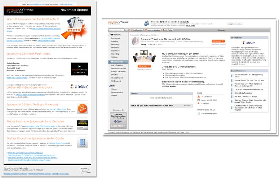
Channel: Email Newsletter
Adam Lapp: This email actually has a similar problem to an email we were looking at before in that there are so many calls to action it is hard to focus on any particular one. The headline for the email neither gives me anything tangible nor piques my interest.
The newsletter link says “LifeSize: HD Video Communications” and invites the recipient to schedule a demonstration. Yet the call to action on the landing page asks me to “download” a white paper.
Landing Page:
Adam Lapp: There is so much clutter on the page, that it is very hard for me to define a primary objective.

First, I clicked to find out information about HD video conferencing. But the page opens with “Do more. Travel less.” It doesn’t clearly mention anything about HD conferencing or any tangible benefits.
What we’re also saying is that there is just so much going on with the page: there are three columns, navigation, multiple calls to action. There’s no clear or logical fashion into which the multiple headlines, sub-headlines and paragraphs are organized. There’s no guidance from the top of the page, where my eyepath starts, to the single objective where you want me to click.
One of the biggest issues on this page is that the button says “Download” while the entire body copy and headline is saying that you want to give me a free demonstration. “Download” suggests a whitepaper and it even says whitepaper at the click trail at the top of the page. These are seriously competing objectives.
Flint McGlaughlin: The eyepath on these pages is so messed up that you’ve got a real chance to clarify your entire offer. Remember that clarity trumps persuasion. What you’re lacking at the moment is clarity. A lot of this is because of the actual design of the page and the order of the things that you’re presenting on the page.
Recommendations:
Adam Lapp: You always want to maintain continuity between the email and the landing page. Be consistent in messaging “Download your FREE LifeSize Demo” from email link, to headline, to button copy. Each step should say or convey your message.
Other suggestions:
- Use a headline that tells me what the product is and why I should buy it
- For example, “LifeSize provides HD video conferencing without draining your bandwidth”
- De-emphasize the left column by placing it on the right side of the page
- Incorporate the “About us” copy as part of your main content. This is your value proposition, yet it is not in the eyepath.
- Use a one or two-line introductory paragraph, then hit the visitor with three bullet points that are the most important benefits of the product
Contestant 5: American Trim
Organization: American Trim
Submitted by: Nicole Busenbark
Primary channel: Press release
Target audience for this landing page: HVAC and Supercharger companies
Analysis by: Aaron Rosenthal
Channel and Page:
Aaron Rosenthal: I’d like to begin by giving you a little bit of the context. American Trim is announcing a new whitepaper promoting a new corrosion resistant coating for industrial equipment. I don’t know if it is extremely newsworthy but perhaps it is for this industry.

Channel: Press Release
Aaron Rosenthal: Now, the first thing I notice about the press release is that some of the links appear to be malformed. At the very least, we weren’t able to get some of the pages to come up for us. So, first things first, make sure that your traffic gets to the landing page and make sure that you’ve got your links in there properly.
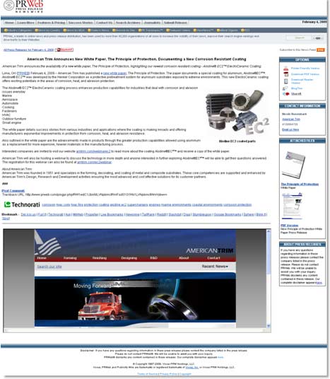
If you look at the right navbar, you can see links that look as though they might bring you to the physical whitepaper but, they are just images. Another link is just a PDF of the press release and has nothing to do with the whitepaper. So, there’s going to be some confusion if people try to click on those to get to the whitepaper.
Much as with Spiceworks, there is a grave lack of continuity between channel and page. The press release is all about a new whitepaper, and this landing page does not mention the whitepaper anywhere.
Landing Page:
Aaron Rosenthal: Bear in mind that I just came from a press release where the entire focus was a whitepaper but when I get to the landing page, there is no mention in any of these headlines that has anything to do with a whitepaper.
All the content in this primary body doesn’t talk about the whitepaper, it just talks about this protective coating. I don’t know what I am supposed to do on this page. It looks like a product information page with a video. I think I am supposed to purchase but in fact you just want me to attend a webinar. That said, the call to action in the left hand navigation gets completely absorbed by the other page elements and users end up thinking the purpose of this page is just to watch the video.
There is no site value proposition and not a great product value proposition. What makes this product special? And why should I buy it from you? The headline uses the name of the product but doesn’t say how it can help me. To further my point about the value proposition, you have told me the name of the webinar but I don’t understand how it is going to help me.
Also, the text in the left navigation is very difficult to read because of background images.
The form is not for a whitepaper but for the webinar. Before you complete the form you have to check a box that says you want to receive the webinar. And the only way to get the whitepaper is to check this small box at the bottom of the form for the webinar.
Recommendations:
Aaron Rosenthal: When I come to your site, you’ve got to meet me with my actual motivation for coming. Please let me know how the whitepaper is going to help me. Remember that when you look at the conversion sequence, motivation is the most highly weighted part of the equation. At the moment, you’re not playing to prospect motivation at all. Your response will surely increase when you can pinpoint and answer to the motivation of your prospects.
Changes to consider:
- Test removing the redundant checkbox
- Test pre-checking additional boxes within the form
- What is the value prop for the site, the product, or the whitepaper?
- The video on the site appears to be the purpose of the landing page — if so, clarify and make explicit your call to action
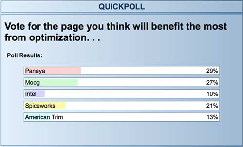
The Final Vote — Live Poll
Poll Results:
While the submitted landing pages differed in structure and presentation, the channel-to-page sequences shared the purpose of working to educate prospects about products or upgrades to products. Another shared aspect of these pages was the disconnect between channels and pages. One reason for this is the amount of information B2B marketers try to convey: when it comes to educating prospects, it’s not unusual for B2B marketing to do too much at once, such as integrating multiple offers or options onto a single page.
Our audience of B2B marketers was asked to vote for the page that they believed would benefit the most from optimization. In essence, for these contestants, their vote may have pinpointed the page the audience believed would be best able to integrate its current discontinuity.
The Winner
Our Grand Prize Winner — The Audience Favorite — will receive a free Landing Page Assessment.
What is a Landing Page Assessment?
- An intensive point-by-point breakdown of your current landing page using the MarketingExperiments Conversion Sequence
- Specific recommendations for testing and improving this page and relevant channels
- One-on-one meeting with a research analyst who will walk you through the recommendations
- A recording of the meeting and recommendations that you can share with your team
The winner of the audience poll was Panaya. Our analysts suggested that Panaya’s offer of an upgrade or a free demo could be effectively clarified by attending to the continuity between PPC ad and page.
Moog and Spiceworks, both pages with strong offers that were lost in overwhelming graphics and jumbled eyepaths, received 27% and 21% percent of the audience votes, respectively.
Finally, Intel and American Trim, the pages with the strongest educational focus, primarily offering information about new products, received 10% and 13% of the vote, respectively.
The four runners-up in today’s clinic chose either:
Two passes to our Landing Page Optimization Workshop in Miami on March 14, a $2,000 value or
One MarketingExperiments online certification course, a $1,000 value.
Finally, five audience participants — those whose comments were deemed most perceptive, incisive, and witty by our team — will receive a free copy of Brian Carroll’s book, Lead Generation for the Complex Sale.
Transferable Principles for B2B Landing Pages
- Review your channels and pages for disconnect or discontinuity between offers.
- Develop a clear flow from channel to landing page by avoiding redundant clicks, circular links, or distracting eyepaths.
- Emphasize the connection between your call to action and the benefits to prospects of following through on that call.
- Support your value proposition by including compelling copy in all aspects of your page (buttons, sub-headlines, bullets).
- Improve or remove copy and design elements that don’t help to educate prospects, differentiate your offer, or encourage action.
Related MarketingExperiments Reports:
- B2C Landing Pages
- Marketing Blueprint 2009
- A Proven Playbook for Growing Your Leads
- Filling the Pipeline
- Value Proposition
- Optimizing Headlines and Subject Lines
- Optimizing PPC Ads
- Optimizing PPC Ads, Part 2
- Clarity Trumps Persuasion
- Email Optimization
- Lead Generation
As part of our research, we have prepared a review of the best Internet resources on this topic.
Rating System:
These sites were rated for usefulness and clarity, but alas, the rating is purely subjective.
* = Decent | ** = Good | *** = Excellent | **** = Indispensable
- Landing Page Tutorials and Case Studies ****
- Podcast: Landing Pages for Lead Generation ****
- Landing Page Optimization ***
- 10 Overlooked Business Tips for B2B Marketers ***
- What to Expect After a Site Relaunch **
- Better B2B Landing Pages: A Case Study **
Credits:
Managing Editor — Hunter Boyle
Writer(s) — Anna Jacobson
Contributor(s) — Flint McGlaughlin
Brian Carroll
Jimmy Ellis
Aaron Rosenthal
Boris Grinkot
Hunter Boyle
Adam Lapp
Production — Austin McCraw
Cliff Rainer
Amanda Mehlhoff