Anyone who has set up an email campaign knows many factors need to be considered before hitting the Send button:
- Quality of leads and lists;
- segmenting and targeting;
- envelope fields;
- copy content and length; and
- where prospects or subscribers end up once they click through to the offer.
Mastering any process requires knowing where to begin, and email optimization is no exception.
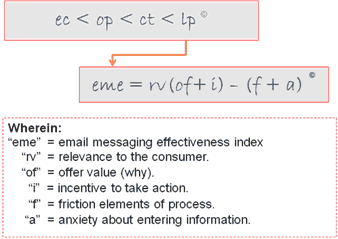
This brief introduces a symbolic notation illustrating our approach to that process: The MarketingExperiments Email Optimization Sequencesm.
We are seeking answers to two key questions:
- What is the most effective way to approach an email messaging optimization project: Where should you begin?
- As you begin, what role does Relevance play in the optimization process?
The following case studies underscore the importance of ensuring relevance between a Landing Page and the channel that brings visitors to it—in this case an email—before moving on to the other elements in our sequence.
Email Optimization Formulas
- What is the most effective way to approach an email messaging optimization project: Where should you begin?
The MarketingExperiments Email Optimization Sequencesm
The MarketingExperiments Email Optimization Sequencesm, by its structure and notation, is designed to convey this essential optimization principle: You should sequence your optimization efforts in the opposite order from the physical conversion-to-sale process.
In the physical conversion-to-sale process:
- You first identify prospects by accumulating email addresses. For house lists this is accomplished through email capture, represented in the Email Optimization Sequencesm as “ec”.
- Once your message arrives, you must inspire your prospect to open it. This is represented in the Sequence as “op”.
- Your next objective is to motivate them to “click through,” represented as “ct”.
- Finally, you must “close the sale.” For the Web site-based conversion model that begins with the offer on the “Landing Page,” represented as “lp”.
Although the Sequence symbols are listed from left to right in accordance with the physical conversion process, the “operator” symbols point from right to left: When performing the optimization process, start with the end in mind.
MarketingExperiments recommends applying an email-specific formula called the Email Messaging Effectiveness Indexsm, shown below, to each stage in the optimization sequence,
Key point: The variables in the index apply to every step of the conversion process, but the way in which they are applied is unique at each stage.
This concept is illustrated by the arrow from the Landing Page step of the Optimization Sequence formula to the Email Messaging Effectiveness Index:
Editor’s note: MarketingExperiments offers professional certification courses in Email Marketing which offer in-depth coverage of the entire process of email messaging optimization. More information is available by email.
Background
Let’s now look at the first element in the relationship between the offer Landing Page and your email’s effectiveness: Relevance, or “rv” in the Index above.
Merriam-Webster Online defines relevance as:
1 a: relation to the matter at hand b: practical and especially social applicability : pertinence <giving relevance to college courses>
2: the ability … to retrieve material that satisfies the needs of the user.
Relevance in Landing Page Optimization
Creating relevance between the Landing Page and the visitors’ motivations when they first click-through from an email is essential.
Every element of your Landing Page should either state or support your primary offer’s Value Proposition.
If a Landing Page is incongruent with what visitors expect upon arrival—if it is irrelevant or confusing—conversion rate will suffer.
The offer must satisfy the visitor’s expectation within seconds.
Relevance in Email
Email relevance consists of two factors: a list-specific factor and an offer-specific factor.
By “list-specific” we mean the reason you have the email addresses in the first place:
- Visitors who sign-up to receive offers from your company immediately establish relevance between their initial motivation and your business and products.
- Purchased or “rented” lists are obtained from companies claiming that the names on the list are relevant to your business and product.
But the list-specific factor alone is not enough. Email relevance must be offer-specific, too.
The offer expressed in your email message must be relevant to their current motivation—something they want right now. It must also be uniquely valuable and instantly credible, no matter where you got the address.
Offer-specific relevance can be intensified with urgency: The perception of an opportunity or risk related to the passage of time. Urgency can be present prior to arrival or instilled after arrival.
Key point: Even if you manage to get click-throughs to a Landing Page, unless the page immediately convinces your visitors that you may have what they are looking for, they will click away.
Case Study 1
Test Design
Subscription sales of the electronic version of a major newspaper had become stagnant.
The strategic goal of the project was to increase revenue by increasing the rate of new subscriptions.
The test’s objective was to increase paid subscriptions by using a free-trial offer coupled with specific design changes meant to reduce Friction and alleviate customer Anxiety on the Landing Page.
Editor’s note: We’ve obscured the company’s name and logo for anonymity.
Results
| Test Statistics | Regular Paid Offer (Control) | Free Trial(Treatment) |
|---|---|---|
| Unique Visits | 2,812 | 2,897 |
| Paid Orders | 19 | 29 |
| Conversion | 0.68% | 1.00% |
| Increase in Conversion | 47% | |
| Increase in Orders | 52% | |
What you need to understand:The optimized Landing Page generated 52% more paid subscriptions than the control version.
Observations
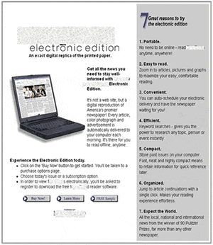
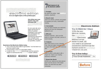
Though the pop-up to prospective customers in the “Before” version (the Control) announced an attractive free trial …
- There was only one reference to the free trial on the offer’s Landing Page;
- The reference was located at the bottom of the page in a barely noticeable color, font, and size;
- And it was also the same color, size, and weight as the “buy now” button and the “learn more” button, making it even more obscure.
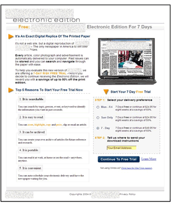
In the optimized version of the Landing Page, relevance (rv) to the offer is communicated throughout the Landing Page:
- The headline has impact. It directly expresses the Value Proposition and ties into the offer. A strong headline is the quickest way to establish Relevance.
- There is strategic use of the eye path. The offer of a free trial is repeated down the page, bulleted, and presented in contrasting colors.
- The Call-to-Action button is now larger, in a contrasting color, and the label has been changed from “Free Sample” to “Continue to Free Trial.”
Case Study 2
(Courtesy MarketingSherpa)
Eloqua is a lead generation software firm.
The email campaign’s goal was to increase take-up of Eloqua’s Web-based seminars and increase qualified customer leads.
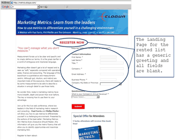
Eloqua’s strategy was to send a Webinar invitation to targeted leads on their house list. When a prospect clicked on the registration link it sent him to a personalized Landing Page with his personal information already filled in on the form’s fields. All he had to do was click the “Submit” button.
Eloqua also sent invitations to a rented list where nothing would be filled in:
Two weeks before the Webinar, Eloqua sent out a reminder email asking invitees to “respond with their biggest challenges” and “what they hoped to learn from the event.” The company sent additional reminders one week before, two days before, and the morning of the event.
After the Webinar, it sent a thank you email to the attendees and a follow-up email to no-shows, telling them that the audio from the Webinar was available.
The combination of the email series and the personalized landing pages worked very well: Eloqua exceeded its lead generation goal by 64% and exceeded its “sales opportunity” goal by 61%, converting 14.6% into sales for a 2,000% campaign ROI. 66% of those sales originated from the personalized offer to the house list.
Summary
- In any email campaign it is essential to first optimize your offer and “close” process. For website-based conversion-to-sale, that means first optimizing your Landing Pages.
- Customers must instantly recognize that the Landing Page contains exactly what they were looking for—what motivated them to click through from the email.
- Customers must instantly recognize that the Landing Page contains exactly what they were looking for—what motivated them to click through from the email.
- As you proceed with your optimization testing, continue to maintain continuity of message through every step of the conversion process, from Email Subject line to Confirmation page.
- At each step, ensure that all elements of the page or message body (copy, layout, colors, shapes, etc.) are Congruent that is, they are consistent with one another, and each element either states or supports the offer’s value proposition.
- Readers who are interested in an in-depth study of the importance of Congruence and Value Proposition may want to sign -up for our Professional Certification Courses on Landing Page Optimization. Please contact our registrar at registrar@marketingexperiments.com for more information.
Related Marketing Experiments Reports
- Landing Page Optimization: Improving Conversion 50-60% by Applying Continuity and Congruence
- Landing Page Optimization: How Businesses Achieve Breakthrough Conversion by Synchronizing Value Proposition and Page Design
- Optimizing Your Landing Pages Part One
- Optimizing Your Landing Pages Part Two
- Landing Page Optimization—Big Conversion Gains from a Little Scissors and Grease?:
- Landing Page Optimization Tested—How to Create Sticky Landing Pages:
- Optimizing Landing Pages:
- Email Marketing Tested Part One
- Email Marketing Tested Part Two
- Site Headlines Tested
As part of our research, we have prepared a review of the best Internet resources on this topic.
Rating System
These sites were rated for usefulness and clarity, but alas, the rating is purely subjective.
* = Decent | ** = Good | *** = Excellent | **** = Indispensable
- How to Test Email Landing Pages (More Easily) ***
- 8 Seconds to Capture Attention: Silverpop’s Landing Page Report ***
- 10 Landing Page Optimization Tactics **
- Study: Email Marketing Campaigns Need Better Landing Pages **
- How Crappy Landing Pages Kill Email Campaigns **
- Focus is Key for Landing Pages **
Credits:
Editor(s) — Hunter Boyle
Frank Green
Writer(s) — Peg Davis
Bob Kemper
Contributor(s) — Jimmy Ellis
Bob Kemper
Flint McGlaughlin
Aaron Rosenthal
HTML Designer — Cliff Rainer
Mel Harris
Email Designer — Holly Hicks
Testing Protocols — TP4000-11
#CS795 (courtesy MarketingSherpa)



 Landing Page for House List
 Landing Page for Rented List