Our August 13, 2008 follow–up clinic on PPC campaigns included a new case study, a review of the two types of relevance, and a live critique of five new campaigns submitted by clinic participants.
The pay–per–click ads and landing pages reviewed by our optimization team once again included a cross–section of markets: B2B, B2C, eCommerce, lead–gen and social media.
As before, the objective of these live critiques was to help marketers determine what changes to test using real campaigns. The team of Dr. Flint McGlaughlin, Jimmy Ellis, and Aaron Rosenthal demonstrated how the MarketingExperiments Conversion Sequence can be used to identify obstacles to conversion, and optimize campaigns for greater ROI.
The audio from the Web clinic on this topic can be downloaded here: Special Clinic: Optimizing PPC Ads, Part II (LIVE)
Case Study: The Impact of Relevance
We recently conducted an A/B test with a research partner to increase the conversion rate of a pay–per–click campaign.
Our primary research question was: Which PPC landing page will produce the highest registration rate?
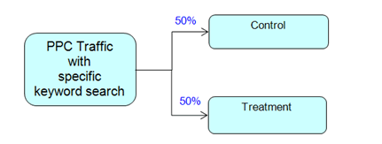
Our approach: We tested a revised landing page while keeping the ad copy intact. Traffic was split evenly between both iterations.
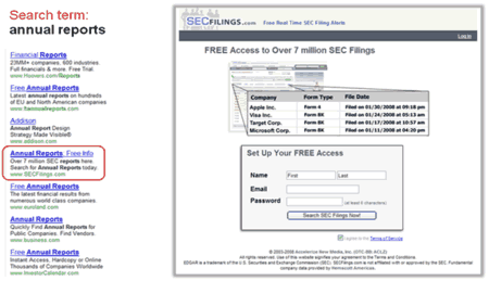
Control (landing page and PPC ad)
The PPC ad for the popular search terms “annual reports” included those terms in the headline and ad copy. However, those words were not found on the landing page.
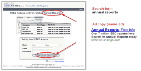
Treatment (optimized landing page, detail of same ad)
In our test, the treatment landing page changed two elements: The search keywords “annual reports” were added to the headline and call–to–action button text, replacing “SEC Filings” in those spots. No other elements were changed on the page or in the ads.
Results
| Landing Page | Conversion Rate |
|---|---|
| Control | 28.91% |
| Treatment | 36.54% |
| Difference | 7.63% |
| Relative Difference | 26.39% |
What you need to understand: The treatment outperformed the control by 26.39% in conversion rate.
Conclusions
One aspect of the conversion increase is the continuity from step to step with the same keywords used from the ad to the headline (relational relevance). Another aspect is the congruence of the landing page based on those keywords. The treatment matches the searcher’s intent — to find free annual reports — from top to bottom (necessity relevance).
Follow–up tests could further increase that relevance by adding elements specifically related to the user’s intent, such as:
- Images of annual reports
- Testimonials mentioning annual reports
- A chart showing the most popular or most recent annual reports,and
- Changes to ad copy and URL.
Two Types of Relevance
[Editor’s Note: This concept was also discussed in the Optimizing PPC Ads (Part I) and PPC Advertising—The Relevance of Relevance research briefs.] To optimize PPC campaigns for improved results, our research suggests that both ads and landing pages need to be created with two types of relevance in mind:
1. Relational relevance — This is readily identified by search engines through algorithms; it refers to matching search terms against ad content. Relational relevance is easier to achieve and, as a result, is more widely recognized and understood by search marketing professionals. It increases the prominence of ads, and their relevance to search terms is a significant factor in driving clicks.
2. Necessity relevance — This occurs in the mind of the user. This often overlooked type of relevance is closely linked to Motivation in the MarketingExperiments Conversion Sequence. Necessity relevance is the key reason why landing page copy must go beyond recycling keywords and match the user’s intent throughout the page. Repeating keywords and phrases from the PPC ad that drove traffic to the page is a good first step. However, necessity relevance goes further: The ad and page elements that are aligned with the user’s intent must carry on throughout the page and conversion funnel. These elements include copy, images, the eye path, form elements, calls to action, value propositions and sub–value propositions. In other words, all of the important elements on the landing page — not just the headline — must connect with the needs and motivation of the user who had a specific expectation when he or she clicked a specific search ad.
Editor’s Note: The MarketingExperiments Conversion Sequence is taught in full detail in our Landing Page Optimization workshops and certification courses.
Review of Submitted PPC Campaigns (Ads and Landing Pages)
Campaign 1: Booth Creek
Analysis (Aaron Rosenthal)
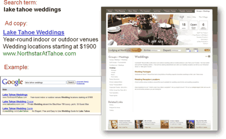
- With the ad, the first thing I’d point to is that your pricingstarts at $1,900. That sounds inexpensive enough that you are either thelow–cost leader or low enough that it’s a benefit to promote. Sotest using that $1,900 in the actual title of the ad, because in the Google
results, there are three ads that all start with “Lake Tahoe
Wedding” and you need to differentiate yourself with the title of the
ad, not just with the body.
- Test ad title iterations like, “$1,900 Lake TahoeWeddings” or “Tahoe Weddings – $1,900” or similar, tosee what fits and can make your ad title stand out more.
- Also, if you’re trying to get people to sign up for freeinformation, start promoting that in the ad copy. This is a differentapproach, so the ad wouldn’t focus on the $1,900. But if you can offersomething valuable, like a wedding day planning kit, test that in your ad
copy and with a landing page that talks about Lake Tahoe Wedding and then
starts the capture process.
Analysis (Jimmy Ellis)
- Where relevance is concerned, the landing page is where the LakeTahoe wedding has to be communicated, first in the headline. Butthere’s a huge image of a table setting, text about 18–hole golfcourses, a driving range, and so on, and nothing immediately says Lake Tahoe
wedding.
- Moving down the page, it has lodging info, but many users stillhaven’t even confirmed that they are on the right page.
- Customers are going through this page still looking for thatconfirmation that they landed on the right page after clicking on Lake Tahoeweddings, and the first headline that actually relates directly to weddingsjust says “Weddings” — very generic.
- Beneath that are two generic subheads — “WeddingPackages” and “Wedding Reception Locations” — thatare links, but that’s not immediately clear because they aren’t underlined or in a standard link color, and don’t even use a “click here” or other call to action. They appear to just be subheads, but with very little text underneath them, so many users will have to figure out that they’re supposed to click those subheads. That’s causing a lot of unnecessary friction on this page.
- To convey that this site will help you with a Lake Tahoe wedding starting at $1,900 the page should start with a very relevant headline.Mention the price because if they click on that ad, they’ve already hadthat qualifier.
- Add a quick intro, of three to five bullets of why to choose you foryour Lake Tahoe wedding, and move the simple inquiry form to this page, or atleast the email capture component.
- Consider removing the lodging toolbar from this page in favor of theinquiry form because nobody is going to use that on this page unless or untilthey’ve figured out the information they need on the weddings.
Analysis (Flint McGlaughlin)
- To summarize some of those key points and principles, I think thepoint that those links in the center are not clickable is a very importantpoint. I also think there is too much irrelevant content in the page. That is, the images, the 18 holes, the driving range, the six daily specials, etc.These are peripheral factors that get in between the person’s clicks on the ad and the person actually connecting with the meaningful content they were after about weddings.
- Another valid point that Jimmy suggested that this page needs to havethe form embedded. You need to have content that’s actually selling a simplesub–value proposition and that is — that it’s worthwhilefor you, the visitor, to provide your contact information. The page should not make them click again. You are losing perhaps 50 percent of your audience by asking them to click yet again before they can get to the lead–generation form.
- Also, bear in mind Aaron’s point about testing variations. Onemight work better than the other, but one thing you must do to maximize thevalue of your paid search campaign is understand how to test severalcategories of ads. We often focus on taking one kind of ad and trying to improve it rather than developing a whole different strategy with your ad and testing one category against another.
Campaign 2: ClearBrick
Analysis (Aaron Rosenthal)
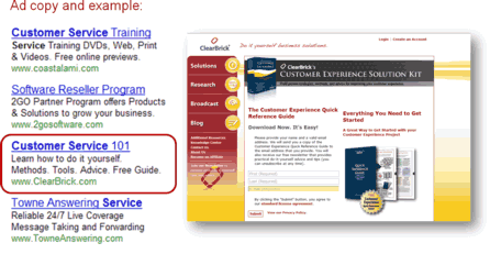
- Starting with the ad, which includes customer service 101, learn howto do it yourself, tools, advice, free guide — you are trying to sellme a lot. But the most powerful piece in that ad is the free guide. Ifit’s a free download and it’s really a value, test that in the ad
headline, build it into the body and maybe even use the URL as well. This
will set you apart from many of the competing advertisers on this page.
- Drive that traffic to a page that focuses only on that free download.One of the issues with the current page is that you are trying to do twodifferent things: there’s the free download, but as they work down the page, you’re now trying to sell them something else. That’s confusing to prospective customers.
- A better approach for this campaign would be to get them in thefunnel first, get as many leads and downloads as possible. Then, use thethank you page after the download, use the download itself, and the email address, to sell the product that’s further down on this page.
- The ad’s relevance with the landing page also needs work.“Customer Service 101” is the ad title, but it’s notimmediately clear on the landing page. You absolutely need to meet visitors with the exact same message that they click through on. Out of all these competing ads, they clicked on yours because they liked what you had to offer, but then they get to your landing page and immediately there’s a disconnect because they don’t see the message reiterated there. Reinforce that message on the landing page, and you are going to gethigher conversion rate.
Analysis (Jimmy Ellis)
- As far as how the page is communicating, and the relevance betweenthe ad and the landing page, one of the biggest problems I see is that blackbanner at the top. With banner blindness, many people won’t even readthat white text on that black pattern background.
- The text doesn’t say anything about customer service 101, orabout learning how to do it yourself. And the free guide that the adcommunicated is also competing with the $595 product lower on the same page.
- Make sure that you simplify the objectives. One objective for yourpay–per–click ad is the best approach. As Aaron suggested, abetter objective for this landing page would be to capture that lead with a free guide and then put this long letter on the confirmation page. That’s probably one of the best lead strategies we have seen for going from capturing customer information to actually selling them on a paid product.
Analysis (Flint McGlaughlin)
- Lead with the most compelling element in your copy. The mostcompelling element in this copy is actually in last place. “Freeguide” is in the last place in the ad, so test the opposite.
- Regarding the page, pay close attention to the eye path andeverything that Jimmy said about the black on gray, which is a horrificcombination. You can hardly read the word “free” because it’s red on yellow, the font is too thin, and because the text is in the wrong place on the page. You probably lost 30% of your potential conversion right there.
- Make certain that the most important elements are in the mostimportant places of the eye path. You use five elements to control whatpeople see first: size, color, shape, motion, and position. Those five elements actually impact what people see first second and third.
- Understand the objective of the page and do not try to do any morethan that. Ernest Hemingway said “make every word tell”; do thesame on your landing page. Also make certain that you understand what theobjective of the ad is. In this case, it’s to get a click. It is not to sell; it’s just to get a click. You might try to ask yourself, what’s the objective of this ad, what’s the objective of this page, what’s the objective of this headline, what’s the objective of this paragraph, and so on through this long page. When all of the objectives are serving the same foundational or master objective, you are going to see much stronger results.
- The last thing I’d suggest is to test moving part of this salefurther along in the process. We have research partners that give away freeinformation and then send a series of emails, and it is not until the eleventh or twelfth email that they engage the actual sales approach. Yet they are making more money that way than they would if they had it on the landing page. So think about the sequencing and the construction and development and building of the relationships. Sometimes there are multiple steps needed to get them in the right place.
Campaign 3: TAKKLE
Analysis (Jimmy Ellis)
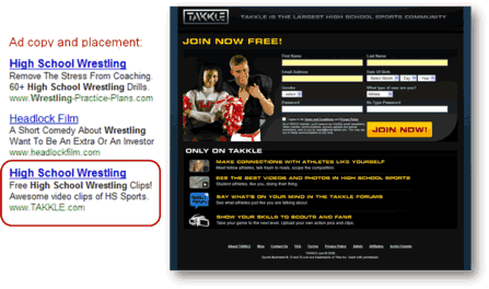
- We’ve been talking about relevance, and with this campaign,there is almost no correlation between the ad and the page besides the imagereferencing high school sports.
- High school wrestling, the primary keyword, is nowhere to be found onthis page. If you have a lot of keyword terms and ads like this, it’swhere you’ll want to use specific keyword terms and not specific pages. What you need to do is build a lot more pages or build some functionality where it customizes the content on the page to be directed all into high school wrestling.
- I would start this page with a headline like, “Get your freeaccess to over 200 high school wrestling clips” and you can includeother sports, but you want to keep it very focused on the wrestling aspect. Then lead into the sign–up form instead of starting with the form.
Analysis (Aaron Rosenthal)
- You’ve done a relatively good job with thepay–per–click ad itself. The problem really comes from thecorrelation between the ad and landing page. You might start testing iterations of the URL in the ad, whether it’s a subdomain or a file folder on the tackle.com domain, like “wrestling.takkle.com” inthe URL field in AdWords, or other sports.
- When somebody lands on your page, like Jimmy said, you need to meettheir expectations when they are coming through from this ad. So, tell themexactly how many high school wrestling video clips they are going to get, and what are the other benefits and features specific to high school wrestlers and fans before presenting the form.
Analysis (Flint McGlaughlin)
- Whether your site is about community, e–commerce, consultingsite, a service site or a lead generation site, it’s wise to lead witha problem or challenge that has to be cleared, whether it’s implied or stated. That should come first, then comes the solution, then comes the ask. That’s a big problem with pages with multiple columns all trying to work equally hard instead of a linear eye path that’s relevant to theprocess of thought in the user’s mind.
- Watch out for pages that create too much unsupervised thinking. Askyourself, is my page communicating clearly in sequence and is the problemclear? Is the solution clear? And are those two elements clear before I get to the ask? If they are not, you are asking people to raise their hand before they know what they are raising it to get. And that does not help you with conversion.
Campaign 4: Towers Perrin
Analysis (Aaron Rosenthal)
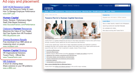
- If you look at BuyerZone.com, which is third on the screenshot in thead example, they are using free quotes from HR providers. I don’t thinkthat that’s an optimum ad, but the next ad down uses free download of an HBR article on measuring return. They are focusing on a free service. When I read your ad, I don’t exactly see what I’ll be getting out of clicking on your site. You aren’t telling me your value proposition, nor are you giving me a real benefit in clicking through because the language — human capital strategy, HR organization, organizational solutions, Towers Perrin official site — that doesn’t tell me what you do differently than anybody else.
- That copy also doesn’t tell me the real benefit is of clicking through to get, say, a free white paper, e–book or webinar, or other information to help me find what answers to the problem I’m trying to solve. Try promoting something like that within your ad, drive them to a landing page that immediately leads into that offer and go from there.
- If you are trying to get them to buy something, start your value proposition within the ad. Tell them why your company is different than ally our competitors. Then carry it over into the landing page.
- On the page, there is a lot of underlined text. They appear to belinks but there are several of them and you need to make sure you keepcustomers focused customers when they get to your page. Use it like a funnel.With this page, all the links are different, but they’re all equally weighted in terms of design, which leaves too much room for what Flint calls “unsupervised thinking.” Try to narrow the number of choices, and prioritize them to guide users where you want them to go first when they arrive at this page from this ad.
Analysis (Jimmy Ellis)
- I’d propose testing a strategy change for the entire process.When I look at this page, I get frustrated because almost everything is toogeneral. With such a general ad and landing page, you are going to get very general results.
- Because there are so many products and services and much more on thislanding page, it’s just not able to communicate effectively. Users haveto go from page to page and link to link and it just doesn’t flow right.
- I would take each one of those very specific offerings, build a valueproposition for each one, and make those into landing pages focused on whyUser X’s company should use your offerings. Then build your pay–per–click campaigns and ads based on that.
- So with that in mind, I’d take the ads and get much morespecific. Choose one service, get very specific with the ad and the keywords,relate that directly to a landing page that’s dedicated to that ad and keyword and doesn’t have all these links and extra content.
Analysis (Flint McGlaughlin)
- We all know that a business must have a value proposition. It’sthe region you deserve to exist in the marketplace. It typically answers thisquestion: If I am an ideal customer or a prospect, why should I purchase fromyou rather than anyone else in your space and/or any other competitor? If you
can answer that you have the beginning of a value proposition. Your next key
is to communicate it clearly. That is the value proposition of your business.
But most of us don’t understand that every single step we ask someone
to take has a sub–value proposition.
- Now I want you to understand that and go all the way back to thesearch ad results page. Look at “human capital strategy.” This adon the left has no sub–value proposition. It is trying to sell thewhole business’ value proposition and it’s not even doing
that. It’s just saying that you have solutions. But of course you must
propose some kind of solution. But nothing in here communicates the business
value proposition and you think that’s bad. But no, that’s not
what you really need to do with your page search ad. You need to actually
give people a reason why they should click on this ad rather than any other
ad on the page. You notice the parallels? It’s the same reason why
your business should exist in its space. So go back to the ad, compare it to
all the other ads in the page and answer one question: If I am the right
prospect, why should I click on this ad rather than any other ad on the
page?
- If you follow that thinking you are going to get the story started inthe mind of the person, then they click on this ad and go to the landingpage, where they are going to see a headline. Now the headline needs toanswer the same kind of question: Why should I stay and read this page
rather than go on and read some other page? Give me one good reason not to
hit the back button on my browser. That headline must achieve that, and if it
does not, you can’t even start the conversation. The next paragraph has
to somehow work against the implied problem or the clear problem and then
begin to give people enough reason to do whatever it is you are getting ready
to ask them next.
- What you need to understand in this sequence of thoughts is that forevery step they must take you are justifying that step by offering themsomething that is worth the risk of their cooperation. And the weakness inthis page is it does none of that. It’s like a story with no beginning
and no ending. It’s not a story anymore. Just words in a page.
Campaign 5: Front Porch Pets
Analysis (Aaron Rosenthal)
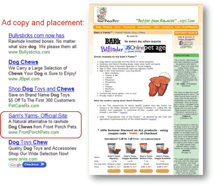
- If the user is searching for the Sam’s Yams your ad title maybe fine (Sam’s Yams official site). But the user is searching for dogchews, so you want to meet that search and that need with the title of yourad. I would test a headline with that kind of language, like
“All–Natural Dog Chews” for example, and then use the body
copy to tell them more about Sam’s Yam’s.
- When you get them to the site, you absolutely need to latch onto thatmotivation that made them clicked through the ad. But at first glance, itlooks like there are a bunch of banner ads on the page, and that will causepeople to bail on this page.
- Another way to present your offer on this page, because you havealready taken the position as a better alternative to raw hide chews, is todraw a comparison between Sam’s Yams and traditional raw hides. Pointout the benefits of Sam’s Yams compared to raw hide using a features
matrix table or checklist, or another graphic that quickly drives home the
advantages.
Analysis (Jimmy Ellis)
- Looking at the landing page, I’m thinking the same thing asAaron. As a potential customer, I’m looking for Sam’s Yams but Iam greeted with Bark, the modern dog culture magazine front and center on thepage. It doesn’t say anything about the Sam’s Yams or the natural
alternative to rawhide dog chews.
- The little text above that says, “As seen in…” sobasically there is no headline relevance on this page. That would be thefirst thing to address. On this page, I would move or possibly remove the“As seen in” text and images. They aren’t strong
credibility indicators in their current format. Maybe use a quote from those
magazines, or an editor’s review or award if they exist.
- To optimize PPC campaigns, you need to address relevance as itapplies to users’ motivations and mindsets — this goes beyondsimply using the same keywords in ad and page copy, and includes two types ofrelevance:
- Relational relevance — readily identified bysearch engines through algorithms; it refers to matching search termsagainst ad content.
- Necessity relevance — In the mind ofthe user.Landing pages must go beyond reusing keywords and match theuser’s motivation and intent.
- Don’t assume that even great results are your ultimate results.Make testing, analysis, and optimization a consistent, cyclical process.
- The principles of the MarketingExperiments Conversion Sequence can help you significantly improve the testing and optimization of PPCcampaigns. We offer more in–depth information on the sequencethroughout this site, as well as in our Landing Page Optimization workshops and certification courses.

Related Marketing Experiments Reports
- Optimizing PPC Ads (Part I)
- PPC Advertising
- Optimizing Your Landing Pages— Part One
- Optimizing Your LandingPages — Part Two
- Online Ad TestedHow Matching Ad Design toContext Improved Conversion by 127%
- Optimizing Landing Pages
- PPC Ad Copy Tested
- Google Adwords SelectTestedNew Insights from Our Sustained Testing of the Google AdWords
- Google AdSense TestedLearn How to MaximizeYour Paid Search (PPC)

As part of our research, we have prepared a review of the best Internet
resources on this topic. Rating System
These sites were rated for usefulness and clarity, but alas, the rating
is purely subjective.
* = Decent | ** = Good | *** = Excellent | **** = Indispensable
- Paid Search (PPC) ****
- PPC(Pay–per–click) Advertising****
- Search Marketing ****
- Consistency Is Key in the PPCConversion Process***
- Ten Waysto Waste Your PPC Budget***
- Profitable PPC ***
- The New Google Keyword Tool: How ToApply Keyword Research to Your Site***
- PPCCopywriting: The Evolution of a PPC Split Test***
- Using Paid Search?Here’s How You Can Maximize The Impact of Your Ads**

Credits:
Managing Editor Hunter Boyle
Copy Editor Frank Green
Contributor(s) Flint McGlaughlin
Aaron Rosenthal
Jimmy Ellis
Bob Kemper
Ana Diaz
Gina Townsend
Production Mel Harris
Austin
McCraw
Cliff
Rainer
Holly
Hicks


