

How do you know what to change, what to keep, and what really works when it comes to optimizing a Landing Page?
Online businesses searching for answers to that question submitted their Landing Pages for a critical analysis by MarketingExperiments Director, Dr. Flint McGlaughlin; Director Of Optimization Research, Jimmy Ellis; and Director of Channels Research, Aaron Rosenthal during the February 6, 2008, MarketingExperiments Webinar.
Those who submitted Landing Pages were asked for their Value Proposition as well as the primary traffic source for the page and what optimization steps they had already taken, if any.
The reviews identified areas where applying key concepts of Landing Page Optimization to both B2B and B2C product, service, and subscription Web sites could result in significant improvements in conversion for those businesses.
Editor’s Note1: Because some subscribers who submitted Landing Pages for this clinic immediately applied the advice they received, screenshots of their Landing Pages may no longer match the pages connected to the links in this brief. We view this as positive development, and encourage you to check the screenshots against their current offering.
Editor’s Note2: We recently released the audio recording of our clinic on this topic. You can listen to a recording of this clinic here:
Background
Two MarketingExperiments formulas, the Optimization Sequence and the Conversion Index, represent critical principles that are essential to the effectiveness of any Landing Page optimization project.
The Optimization Sequence

The Optimization Sequence illustrates that marketers should focus first on optimizing the Product factor (OPr). Optimization not only includes product attributes such as quality and usability, but the Value Proposition of the product: Why someone should buy your product instead of your competitors’.
Only then proceed to optimizing the Presentation factor of the Value Proposition (OPrn). For example:
- Landing Page optimization
- Sales path optimization
- Email copy optimization
Finally, drive as much profitable traffic as possible to your product by optimizing the Channels factor (OCnn).
Channel optimization must begin with basic analysis: How are potential customers reaching the offer Landing Page? Which channels are they buying through? How much does it cost? How can you maximize offer relevance by matching your value proposition to the motivations specific to the prospects you are reaching through each channel?
Remember that the highest performing Landing Pages are those that match exactly the Motivation of the customer. After Motivation, the clarity with which you express the Value Proposition is the most important factor in determining whether a customer buys from you or not.
Let’s look briefly at the MarketingExperiments Conversion Index to see where these two key variables, Motivation and clarity of Value Proposition, belong:
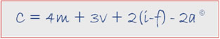
“C” represents the probability of Conversion.
“m” represents the level of match between offer and customer Motivation.
“v” represents the clarity of expression of Value Proposition.
“i” represents effective use of Incentives.
“f” represents the level of Friction in the sales process.
“a” represents the Anxiety caused by the conversion process.
Each represents a key factor in optimizing a page to get the maximum yield per visit or optimizing an event process. The numbers 4, 3, 2 and 2 are coefficients representing (from our experience working with many companies over time) the relative amount of return on investment for time and energy spent addressing each factor.
After identifying a unique and compelling Value Proposition, you must ensure that you express it throughout your sales process in a clear, consistent, and compelling way. By eliminating disruption factors related to unnecessary Friction and Anxiety, you can maximize conversion.
During the February 6th Clinic we asked our audience for their opinions on some of the Value Propositions submitted by rating them on a five point scale:
- No real Value Proposition, or stated so unclearly as to be a negative.
- Limited value to a small market.
- Substantial value to at least a medium-sized market.
- Strong product differentiation.
- Unique; highly valuable to a large market.
Using the MarketingExperiments Conversion Index as a guide, we also wanted to know which element of a Landing Page they thought needed the most help:
- Expression of the Value Proposition?
- Reduction of unnecessary Friction?
- A need for Incentives to further mitigate Friction?
- Relief of consumer Anxiety?
Case Studies
Landing Page 1

Value Proposition: “Quality you can trust since 1993 and support you can rely on.”
Primary traffic source: “Mostly natural searches. We actually just launched this new page and have not yet started any pay-per-click advertising.”
Asked to rate the Value Proposition,
- 42% of the Clinic participants said there was no real Value Proposition or it was stated unclearly.
- 45% said it was limited to a small market.
- 20% thought the Value Proposition would have substantial value to at least a medium-sized market.
Asked to evaluate which page element needed to be optimized most,
- 59% voted to address expression of the Value Proposition.
- 27% said reduction of unnecessary Friction was most important.
Following are the analysis and recommendations provided by the MarketingExperiments optimization team:
Analysis (Jimmy Ellis)
Though they have pieces of a Value Proposition listed on the page; e.g., Completely eliminate paper time card system; save hundreds in lost time or productivity each month, the Value Proposition as currently stated does not tell how this product can help the customer. Its more of a credibility indicator. The changes to test first should include:
- Writing a headline that quantifies key metrics.
- Left aligning instead of centering headlines, then drive visitors down to four or five bullets.
- Not offering so many products on one Landing Page.
Analysis (Flint McGlaughlin)
The goal of a headline is not to sell a product but to get a visitor to read the next the first sentence of the next paragraph, getting them into the body copy. As a visitor, I need to understand why I should stop clicking and stay here and give your product some attention.
Drive visitors to a place where there is not so much unsupervised thinking. Dont ask them to make choices between many options when they are still not sure they want you at all.
Landing Page 2

Landing Page submitted
Value Proposition: “We offer a fully customizable news headline feed, which we permit users to include their logo in creating it for free. This provides users a chance to make news feeds that by including their logo gives them the opportunity to create branding tools for their own site (even though the click-through goes to a news site). This is a preliminary program in advance of a hosted solution we will launch this fall in which the users’ page will be hosted by us and the custom headline feed they create would open on it (it will remain free to users).”
Analysis (Aaron Rosenthal)
- It’s not immediately clear what you are doing.
- When you say you increase traffic for free, tell me how much. If you have got a case study that proves it, show it to me.
- Increase the size of the font.
- Test something like “Increase Traffic Today” for the Call to Action.
- Add credibility indicators. There are no testimonials convincing me of the value.
Analysis (Jimmy Ellis)
- The copy does not tell me how I am going to increase my traffic. Im looking for proof.
- The next page has a simple four-field form to set up the process. Dont make them click to get there. Include the form on the Landing Page.
- Make it vertical. Dont ask visitors to read side-to-side. With a strong image on both the left and the right, visitors are confused about how to read the page.
Landing Page 3

Landing Page Submitted
Value Proposition: “We make full color direct mail envelopes that are always easy and on-time.”
Channel Information: The drivers of this Landing Page are three individual ads placed in DMA Yellow Pages, The Official Mail Guide, and the DMAW Source Books.
The audience was asked to vote on the Value Proposition.
- 18% saying it had no real value.
- 42% thought it had substantial value to at least medium-sized market.
- 28% said it had limited value to a small market.
Analysis (Jimmy Ellis)
- Ensure there is relevance to the ads. If visitors are looking for full color envelopes in three days they may have no idea they are in the right place if the primary focus of the Landing Page is downloading a white paper. It does not connect with the ads.
- Direct Mail marketers with big budgets are looking for a quality company with credibility. Offer something that makes them feel safe and secure, like testimonials or samples of your direct mail pieces.
- Depending on whether you are sending an information pack or just an e-mail, customize the form and shorten it.
Analysis (Aaron Rosenthal)
- Limit the fields.
- Greet them with a real headline and spell it out.
- Simplify, and tell them exactly what they are getting.
- Include a real Call-to-Action button.
Analysis (Flint McGlaughlin)
- The Web is not a magazine, so dont use a magazine-style ad.
- Purple on pink is bad choice for readability, and it’s a polarizing color choice: If people hate it that impacts conversion.
- Not enough information is given to visitors for them to feel they are communicating with a real company they can trust with their information.
Divide the form to collect personal information. On the first part collect only a name and e-mail address. That way you have a lead when they hit the “Submit” button. On the next page ask for the postal address, but say “Tell me where to send your ‘X’ or tell us how to do ‘Y’.” Give them the reason you are asking for it. Your most qualified leads will give you both sets. It is a big mistake to consolidate both on one form in this particular case.
Landing Page 4

Landing Page submitted
Value Proposition: “We have one of the largest investor networks and entrepreneur toolsets that will get you and your company funded.”
Channel Information: Primary traffic source for the landing page is PPC traffic.
“We always have two ads running against each other for testing and improving. Since we have optimized multiple ad groups for our campaign, we have many ads running depending on the keyword group.”
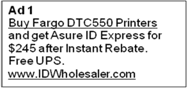
Here are the two main ads:


Analysis (Aaron Rosenthal)
- This is a good example of using the URL, the domain space, to market.
- There is a “good use” for the work in the ads. Whenever you have that in ad copy you get a higher click-through rate.
- Ensure you greet the visitor who just clicked-through on the ad with the same copy when they get to the page.
- Include credibility indicators such as testimonials.
- Add bullets explaining why you are different from competitors. If you truly are the largest network, quantify it. What differentiates you from your competitors? Why should I trust you with my time and my money versus your competitors?
Analysis (Jimmy Ellis)
- Do a better job of conveying the Value Proposition of free, instant access to one of the largest investor networks.
- The Call to Action button should be tested with “Get Free Access” versus “Find Funding.”
- Reduce Friction in the fields. You are asking for more personal information than someone should have to give to get free access.
Analysis (Flint McGlaughlin)
- Shrink the top of the page. It’s a massive waste of real estate.
- White on green is hard to read, and an all capitalized headline is also a negative.
- Include a third-party credibility indicator. Add a note from someone who has actually found funding. Done correctly, it could have a huge impact on Conversion.
Landing Page 5
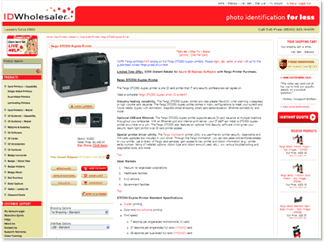
Landing Page submitted (screenshot shortened due to page length)
Value Proposition:“Photo Identification for Less.”
Channel Information: Primary source of traffic is via indirect PPC ad link to the product’s category page. Visitors navigate to the review page from there. This page ranks organically #15 on Google, which also brings traffic. “We are currently rotating & testing 3 Google PPC ads for this product’s ad group.”


Analysis (Aaron Rosenthal)
- The PPC ad versions are radically different: One promotes price, the second focuses on a rebate, and the third promotes free shipping. Test to find which one performs best, then focus on that.
- The title impacts ad Click-Through Rate more than the body, the URL, or any other element in PPC. If $245 is a great deal on this particular printer, use that in the title.
- Consider better use of the URL itself. For example, use fargo.printers.idwholesaler or fargo.idwholesalers. Google will cap or bold the keywords inside the ad copy if you match up with the keywords being searched for. It leaves you a little extra area to get a little bit more exposure and push this particular ad copy.
- Take all of the specific elements that help customers figure out if this is the right product for them and move them closer to the image: price; free shipping; warranty; guarantees. If there is a product-specific testimonial, I want it right here.
Analysis (Jimmy Ellis)
- Improve relevance between the ad to the Landing Page.
- Customer ratings for products can have a huge impact on conversion. You absolutely need a product rating close to the image so visitors can see what other people are saying.
- Add testimonials. Create a secure feeling.
- Make the headline bigger. It’s a strong, clean image, but the headline is so small that visitors will not realize it is the actual headline for the product.
- In a compelling way show why this model is the best. Two questions must be answered on e-commerce pages. First, Why should I buy from this company? Next, Why should I buy this specific product?
- We’ve tested three-column layouts thousands of times, and discovered that a two-column layout is better. If you can test two columns, do it. Elements in the third column are usually missed. Pull good product-specific and company specific value prop elements out of the third column.
- The layout of the page and the size of fonts make it hard to see the price.
- Anxiety increases when you ask visitors to create an account just to see the price on a similar product. Consider a live chat option.
Landing Page 6

Landing Page Submitted (screenshot shortened due to page length)
Value Proposition: “We provide in-depth research on small cap stocks that are generally not covered by the financial media or analysts at the big brokerage houses. These are stocks that we feel have the most potential for double and triple digit gains.”
Channel Information: Primary source of traffic is email to an opt–in house list. Visitors represent non-buyers who have expressed interest in our other products (mostly free products) that are related to the one promoted in the companys email:
Email submitted. (Click here to see the full text of the sample email)
Analysis (Aaron Rosenthal)
- You cannot click on the item in the right-hand corner. That’s a usability issue. The same for the text in the middle of the page: Underlining equates to clickable. Dont underline if you are not going to create a link.
- The form at the bottom of the page is broken up with different offers. A visitor will not know exactly what to do, creating Friction and Anxiety. Quantify the savings on subscription options.
- Many elements at the bottom of the form can be removed. Don’ ask if their credit card is a Visa, MasterCard, American Express, or Discover. You should be able be determine that by the first four digits of the credit card.
Analysis (Jimmy Ellis)
- Test a “letter from the editor” or “letter from the founder” approach. Tell the story of the once-in-a-lifetime opportunity. Make it personal; bullet the most important points of why you need this report.
- There is a huge problem with the way the form connects with the Call–to–Action. It has to say “Activate My Free Trial”; it should not refer to placing an order or make visitors feel they spent money for a free trial. This includes collecting a credit card number.
- Ask for the absolute minimum information necessary to activate the free trial. Ask for the next pieces of information on the following page. Dramatically simplify the process.
Summary
- Follow the MarketingExperiments Optimization Sequence when engaged in Web site optimization projects:
- Optimize product factors first.
- Ensure you have a “right” product-one that offers real value to at least one clearly identifiable class of customers (your “ideal” customer). There must be enough of these customers reachable to make the effort worthwhile.
- Identify a strong and compelling Value Proposition for your offer. It must meet competitors on all important purchase factors and exceed them on at least one important factor.
- Optimize Presentation factors next. This means expressing your Value Proposition effectively throughout your Web site.
- Finally, drive as much profitable traffic as possible to your product by optimizing the Channels factor (OCnn).
- Optimize product factors first.
- Use the MarketingExperiments Conversion Index to guide your decisions about where to begin and how to proceed.
- Use the cases from the live optimization clinic to identify areas for improvement on your own site, referring to the MarketingExperiments research archives and Compendium to guide testing and treatment.
- A complete, end-to-end training program on the Web site optimization process is offered through the MarketingExperiments Professional Certification program. Distinct course areas are designed for both subscription and e-commerce sites. Contact registrar@marketingexperiments.com for information on course schedules.
Related Marketing Experiments Reports
- Landing Page Optimization: Increasing Conversion by 150% and Lead Gen by 2,379% with an Effective Call–to–Action
- Landing Page Optimization: Improving Conversion 50–60% by Applying Continuity and Congruence
- MarketingExperiments Webinar–A Clinical Assessment of Your Landing Pages
- MarketingExperiments Webinar–A Clinical Assessment of Your Landing Pages — Part Two
- Lead Generation: Is Your Sign-Up Process Costing You Leads and Conversions or Maximizing Them?
- Landing Page Optimization: How Businesses Achieve Breakthrough Conversion by Synchronizing Value Proposition and Page Design
- MarketingExperiments’ Creed
As part of our research, we have prepared a review of the best Internet resources on this topic.
Rating System
These sites were rated for usefulness and clarity, but alas, the rating is purely subjective.
* = Decent | ** = Good | *** = Excellent | **** = Indispensable
- Landing Page Optimization Webinar (Omniture/MarketingExperiments)****
- Online Value Proposition ***
- How Do You Develop a Unique Value Proposition? ***
- Free Google (beta) Website Optimizer Tool ***
Credits:
Editor(s) Frank Green
Bob Kemper
Writer(s) Peg Davis
Bob Kemper
Contributor(s) Jimmy Ellis
Aaron Rosenthal
Flint McGlaughlin
Bob Kemper
HTML Designer(s) Cliff Rainer
Mel Harris
Email Designer Holly Hicks