This brief completes the review of Landing Pages submitted by online businesses for live optimization analysis by Dr. Flint McGlaughlin, MarketingExperiments’ Director; Jimmy Ellis, Director of Optimization Research; and Aaron Rosenthal, Director of Channels Research.
The reviews identified areas where applying key concepts of Landing Page Optimization to both B2B and B2C product, service, and subscription Web sites could result in significant improvements in conversion.
Editor’s Note 1: Screenshots in this brief show the Landing Pages as originally submitted. Since some businesses immediately applied the advice they received at the clinic and changed their pages accordingly, the URL links may now take readers to pages that look dramatically different.
Editor’s Note 2: We recently released the audio recording of our clinic on this topic. You can listen to a recording of this clinic here:
Background
Two MarketingExperiments formulas, the Optimization Sequence and the Conversion Index, represent critical principles that are essential to the effectiveness of any Landing Page optimization project.
The Optimization Sequence
Our research has shown it is most important to optimize your product first; then the presentation of your product, your Web site, and all the collateral around it, including e-mails; and then your channels, such as PPC ads and natural search.
In the formula above, “OPr” stands for Product factor. Optimization here includes product attributes such as quality and usability as well as the Value Proposition of the product: Why someone should buy this product instead of a competitor’s.
“OPrn” stands for the Presentation factor. Optimize every step along the conversion process, from your email copy to the Landing Page to the check-out process.
“OCnn” represents optimization of the Channel factor. How can you best match the specific motivations that brought prospects to you via that Channel?
The best performing Landing Pages are those that match exactly the Motivation of the customer coming to you from a given channel.
The MarketingExperiments Conversion Index (above) addresses the probability that a given visitor will convert (complete the entire process), where:
“C” represents the probability of Conversion.
“m” represents the level of match between offer and customer Motivation.
“v” represents the clarity of expression of Value Proposition.
“i” represents the Incentives used to counter Friction in the sales process.
“f” represents the level of Friction in the sales process.
“a” represents the Anxiety caused by the conversion process.
4, 3, and both 2s are coefficients in the index representing the relative level of return on investment for time and energy spent addressing each factor. Although the coefficients are market-specific, product-specific and company-specific, they represent our experience from thousands of optimization experiments with hundreds of companies across a broad spectrum of industries.
After Motivation, the clarity of the product’s Value Proposition is the most important factor in determining whethera customer buys from you or not.
- Why is this product different?
- Why is this product better?
- Why are you the best source, especially if your competitors offer the same (or an equivalent) product?
Only after clearly expressing the Value Proposition, offering the right Incentive, and eliminating disruption factors related to unnecessary Friction and Anxiety, can conversion be maximized.
Case Studies
Landing Page 1
Control treatment :
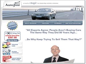
Landing Page submitted (screenshot shortened due to page length)
Value Proposition: “Better Service at Affordable Cost.”
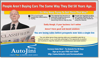
Primary traffic source:This Direct Marketing postcard:
Analysis (Flint McGlaughlin)
- The postcard should be a miniature version of the Landing Page. Its only job should be to get visitors to the Web site. Any more will interfere with the actual sale. Do the “heavy lifting” of the sale on the Landing Page itself.
- The image of the man doesn’t add anything. It’s going to be polarizing.
- Consider a letter explaining your unique Value Proposition and how your company solves the problems of your customers.
- Add testimonials from real dealerships about how this offer has helped them.
- Eliminate the navigation on the left. Have it only at the bottom, so that it does not interfere with the offer.
- Eliminate the massive waste of real estate at the top — not just the image of the man, but shorten the banner. Keep it very simple there, very clean. Make it very easy for them to get to the page, see, and understand what you’re offering and make a decision.
- Elevate the secondary offer on the left of the page. Make that incredibly attractive and capture e-mail addresses for sales that do not close. Use those for a follow-up effort.
Analysis (Jimmy Ellis)
I do not know instantly what you want me to do after I see the post card: “People are not buying cars the same way as they did 50 years ago.” You need to go directly into how Auto Genie can solve that problem.
Analysis (Aaron Rosenthal)
- The bottom of the post card mentions signing up for a free trial today, but it does not catch your eye; you have not brought any attention to it.
- Once you’ve gotten someone to your Landing Page with the offer of a free trial, you must emphasize it there. On this page there is no mention of the free trial. This is a prime example of discontinuity and flow disruption.
Landing Page 2
Landing Page submitted
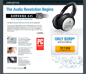
Value Proposition: “Creative’s noise canceling headphones feature Xtreme Fidelity Technology which makes music and movies sound better than the headphones from competitors at this price point.”
Primary traffic source for the page: Pay-per-click traffic via SEM campaign on Google, Yahoo, MSN, and Ask via these ads:
Analysis (Flint McGlaughlin)
- This is a Value Proposition within a Value Proposition, within a Value Proposition, so you will find it necessary to educate people before it has any impact. That mitigates conversion.
- The headline is what I call an “institutional advertising” headline. It belongs in a slick magazine, not a Landing Page.
- Pull the best sound bite from the article that named the product “editor’s choice.” If it’s a headline, put it in quotes and underneath it put PC Magazine.
Analysis (Aaron Rosenthal)
- Amazon is beating you on your search term. You are losing traffic to them because whether it is the same product or not, Amazon’s ad has given people a price.
- Move e-mail capture from the bottom of the page to the free trial button in order to build a list of people that are interested in the product even if you do not immediately convert them.
Analysis (Jimmy Ellis)
- This is a “branding” type of headline. It doesn’t work when your immediate objective is a sale. You must help visitors understand why these headphones are the “best option for me.”
- Visitors first see the price: $299. You’re scaring a lot of people away before you have a chance to help them realize that the headphones are a good value at that price.
- Don’t show visitors the $299 price and at the same time say they can try them for free.
- The Value Proposition submitted says they are “better,” but that’s not quantified. They are expensive, so list the features. Chart how they compare to other competitive headphones to justify the price.
- Add testimonials from real people.
Landing Page 3
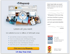
Landing Page Submitted (screenshot shortened due to page length)
Value Proposition: “Listen to any FULL song in the Rhapsody library (over 4 million songs) as much as you like. Download and buy only the songs you like. You can listen through a PC/MAC/MP3 Player/TiVO/Home Theater and Car.”
Channel Information: Three primary sources of traffic:
- Paid search generic terms like Rhapsody” plus additional pages with more specific keyword messaging for larger categories like “download music and mp3s” as well as genre pages like “country music.”
- Affiliate traffic “Most of the affiliates have their own landing pages, but we do have some that send traffic here.”
- Real.com “We have a version of this page on Real.com that gets traffic from the homepage of www.real.com.”
Analysis (Aaron Rosenthal)
- The majority of traffic is coming from your parent company, Real, or your paid search ads where you bid on the term “Rhapsody,” so you do not have to do much selling on this page.
- Introduce the 14-day free trial offer higher on the page and you are going to get a higher conversion.
Analysis (Jimmy Ellis)
- I am looking for a headline that tells me what this is or how it can help me. Add “Try it for free.” Move it to the top of the page above the image.
- Include your free trial form here. Visitors are already highly motivated, as Aaron said. They already trust you. Remember: Match Landing Pages to the motivation of the customer and the channel of traffic they are coming from.
Analysis (Flint McGlaughlin)
Capture the e-mail address right under the click and say “Tell us where to send your login information” or “Step one of two.” You can use this capture to remarket to them in the future. If you have already spent money getting visitors there, don’t pay twice to get that person back.
Landing Page 4
Landing Page submitted
Value Proposition: “Our online MBA program is supported by a 130-year foundation in academic excellence. We aren’t just a run-of-the-mill online university.”
Channel Information: “This Landing Page is the first we’ve built to advertise our general MBA degree, so we have a few ads pointing to this page. We still need to create alternate Landing Pages for testing.”
The primary source of traffic is from PPC ads:
Analysis (Aaron Rosenthal)
- What are you doing that is different? When you say “top online MBA program” in PPC ad three, quantify it.
- Try a lead capture approach. Give them a free guide on choosing an online MBA program, or a white paper, so you can capture their information on the Landing Page.
Analysis (Jimmy Ellis)
- How is it better than any other university? Show me your graduation rate. Tell me how the program is going to help me find the career that is right for me, land a job, and then help me do a great job once I get there.
- Don’t make visitors click through to fill out your form. Put it on this page. One less click means less Friction.
Analysis (Flint McGlaughlin)
I think the word “accredited” used in one of the PPC ads is vital. Many of these programs are not.
Landing Page 5
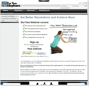
Value Proposition: “We help people and organizations to quit talking/dreaming/wishing/hoping and start doing!”
Channel Information: The primary source of traffic for the page is PPC advertising:
Analysis (Flint McGlaughlin)
- This is not a Value Proposition, it is an aspiration. What makes me (as a prospective customer) think you have the solution I need? I do not know what problem you’re solving.
- Try different Landing Pages, each one tied to a specific problem and a specific paid search ad.
Analysis (Aaron Rosenthal)
- The solutions also need to be quantified: “We help individuals meet 97.4% of their New Year’s resolutions,” for example. Be sure to specify the source.
- If you are getting a response from this page, it is because of the free trial. It is not because people understand what you are doing, and your graphic does not help that much.
Analysis (Jimmy Ellis)
It is way too generic, and that is why we are all lost: No clarity. Try something like “Let us help you get organized in less than 30 days” — something where you are clearly stating a problem and offering a specific solution.
Summary
- Use the MarketingExperiments Optimization Sequence to guide your planning as you begin each Web site optimization project:
- Optimize product factors first.
- Ensure you have a “right” product-one that offers real value to at least one clearly identifiable class of customers (your “ideal” customer). There must be enough of these customers reachable to make the effort worthwhile.
- Identify a strong and compelling Value Proposition for your offer. It must meet competitors on all important purchase factors and exceed them on at least one important factor.
- Optimize presentation factors next. Effectively express your Value Proposition throughout your Web site, and include email copy and PPC ads.
- Understand where your traffic is coming from (OCnn). Help visitors move through a sequence that will lead to a decision to purchase, and remove anything that interrupts that decision.
- Optimize product factors first.
- Use the MarketingExperiments Conversion Index to guide your decisions about where to begin and how to proceed.
- Use the cases from the live optimization clinic to identify areas for improvement on your own site, referring to the MarketingExperiments research archives and Compendium to guide testing and treatment.
- A complete, end-to-end training program on the Web site optimization process is offered through the MarketingExperiments Professional Certification program. Distinct course areas are designed for both subscription and e-commerce sites. Contact registrar@marketingexperiments.com for information on course schedules.
Related Marketing Experiments Reports
- Landing Page Optimization: Increasing Conversion by 150% and Lead Gen by 2,379% with an Effective Call–to–Action
- Landing Page Optimization: Improving Conversion 50–60% by Applying Continuity and Congruence
- MarketingExperiments Webinar–A Clinical Assessment of Your Landing Pages
- MarketingExperiments Webinar–A Clinical Assessment of Your Landing Pages — Part Two
- Lead Generation: Is Your Sign-Up Process Costing You Leads and Conversions or Maximizing Them?
- Landing Page Optimization: How Businesses Achieve Breakthrough Conversion by Synchronizing Value Proposition and Page Design
- MarketingExperiments’ Creed
As part of our research, we have prepared a review of the best Internet resources on this topic.
Rating System
These sites were rated for usefulness and clarity, but alas, the rating is purely subjective.
* = Decent | ** = Good | *** = Excellent | **** = Indispensable
- Landing Page Optimization Webinar (Omniture/MarketingExperiments)****
- Online Value Proposition ***
- How Do You Develop a Unique Value Proposition? ***
- Free Google (beta) Website Optimizer Tool ***
Credits:
Editor(s) — Frank Green
Bob Kemper
Writer(s) — Peg Davis
Bob Kemper
Contributor(s) — Jimmy Ellis
Aaron Rosenthal
Flint McGlaughlin
Bob Kemper
HTML Designer(s) — Cliff Rainer
Mel Harris
Email Designer — Holly Hicks


