

Remember the intensity of focus you had at that second-grade birthday party where you had five seconds to memorize the location of the piñata, or the donkey’s tail-less rump, before the blindfold descended?
Don’t you wish you could get that kind of focus from prospects now?
Unfortunately, the grown-ups perusing your pages are subject to endless distractions. But try applying a variation on the pin-the-tail-on-the-donkey technique to your landing pages, just to see how easy it is for the adults you’re courting to find the targets you want them to find when they’re looking at your pages.
Inspired by a new tool that provides free five-second usability testing, I decided to apply the same technique to a landing page submitted for optimization by a recent attendee of a MarketingExperiments web clinic.
How the five-second usability test works
First, imagine you only have five seconds to look at the page below. It’s not a contest, or spy training. Just relax your eyes and try to take in the page as a first time viewer would.
Second, cover your computer screen with a piece of paper and ask yourself how much you remember about what you just saw.
Structure your reminiscences with these questions:
- What is the page about?
- Which elements stood out?
- Can I describe them?
Third, pretend that the blank paper is a map of the landing page you just saw. Try and recreate the page from memory. Simply put a dot or draw a box on each section of the page and write down what you think was there.
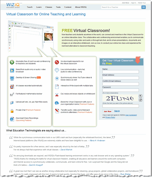
Ready? I tested it with this page, submitted by one of our web clinic participants:

Five seconds with Virtual Classroom
After my five-second stare-down with Virtual Classroom, a site that offers teachers and students conferencing, chat and customizable on-screen whiteboard options for virtual classroom experiences, here’s what I remembered seeing:

Scary, no? Give a prospect five full seconds and what he remembers most about all your hard work is “a bunch of icons.”
Still, as reality checks go, this five-second test is a useful one because it underscores the difference between marketer perception and prospect perception. I’m sure it wasn’t the intention of this page to have their verification box overshadow the value proposition.
Applying the Conversion Sequence to Virtual Classroom
Once you’ve tried the five-second test (or even pulled some innocent victim off the street to try it for you), apply what you’ve learned to your next optimization tests. Using the MarketingExperiments Conversion Sequence to structure your pages around a prospect’s thought sequence may increase your chances of being remembered, and remembered accurately, for what you want to be remembered for: the goods or services you provide.
Let’s see how focusing on three key elements from the sequence could help the Virtual Classroom landing page increase conversions …
1. Clarity of Value Proposition
Because of the size and color of the word “free,” my eye completely neglects the primary headline at the top left area of the page. Instead of instantly knowing what the product is and why I need it, I am forced to read through small copy. What’s more, the copy is in large paragraph form which many visitors will not have the attention span to finish.
Make the main headline stand out more than the sub-headline. Place the word “free” in it and make sure to communicate the essence of what your product is. You need to set a context here for how the user will experience the rest of the page.
2. Friction
I know there is a lot of good stuff adjacent to each one of the icons, but the three equally weighted columns makes it difficult to digest all of that information. I read the top two and then immediately become distracted by the icons in the next column and then the form on the right.
Each one of the benefits listed adds to the value proposition of the product, but the current design creates so much difficulty-oriented friction in the form of page flow disruption, that the benefits don’t impact the visitor as much as they should.
Instead, focus on the five or six best benefits, and make those the central message of the page. The others can be mentioned in a small chart or pop-up. If your offer is totally free, you don’t have to do too much selling. You just have to make it easy to sign up.
3. Anxiety
From the blindfolded usability test, you see that the word verification was one of the four elements that immediately stood out to me. Now this is not a bad thing. It shows that you are concerned about fraud and the visitor’s protection.
But, it is so much more prominent than the product description and benefits, my eyes are drawn to it and it’s kind of threatening me, telling me that I if I stick around, I will eventually have to sign up for something. This makes me nervous since five seconds in to my engagement with the page I’m not certain what it is I will potentially be signing up for, much less if I’m willing to.
Since this is a two-step process, can you put the word verification on the next page? If not, just make sure you control the visitor’s eyepath leading them systematically from headline to key product benefits (and after this point, hopefully, they are primed for commitment), then to the form.
Ready to take off the blindfold?
Using this five-second test will lend you the perspective of a new visitor and enable you to quickly identify elements that may be problematic to conversion: the areas you didn’t intend to emphasize but are the ones that a prospect sees first.
Sometimes we let optimization become more complicated than it really is. Essentially, we’re just trying to take the blindfold off our prospects and help them achieve their aim.
Anna Jacobson contributed mightily to this post.
You guys have been busy cooking! Great analogy, Anna. Perhaps I am not following enough ppl in the web usability circles of Twitter, but this piece highlights a usability element which I find rarely discussed in SM. The 5-second test is very telling, and “Clarity of Value Proposition’ speaks volumes to me (and presumbly just about anyone who manages or has managed web vehicles). Kudos on this piece! Look forward to seeing more. Best, Autom
Hi Autom. Thanks for the comment. We really appreciate it. I have to thank Anna for her mastery of the English language, for I’m positive it made my post much more readable. But I actually came up with the analogy. It just comes from thinking about how a landing page should have one clear objective, but so often the clutter on the page blinds the visitor from seeing that objective. Cheers, Adam.
This has confirmed my fear – I need a redesign. Thanks for the excellent post. P.S. Did you actually use the five second test tool / link?
I did not use it for the landing page featured in the post, rather I performed a “manual” version of it. But, I did test many random pages. I actually learned a lot as a tester simply by seeing what others were doing wrong. Sort of the “don’t make the same mistake” learning approach. -Adam
The 5-second test is an excellent idea for helping you get a better perspective of what a viewer sees. Great idea!
We appreciate your kudos. In busy times, we’re all for a test that’s effective and speedy! Anna
Thanks for the positive review Anna. We are still actively making tweaks and changes to both the site and test format that will hopefully make for even more useful results.
Be on the lookout for some updates soonish, I’ll be quite keen to hear your thoughts.
All the best.
Hi Matt. I love the concept of the five second test. We’ll definitely keep an eye out for the updates. Cheers, Adam.
Wow! As a beginner, this post was a real “Gasp” moment! I am about to redesign my landing page and this will be invaluable, so big thanks!