“Most email clients nowadays pull and display a preview text in addition to the sender (or ‘from’) name and subject line of an email. While all inbox fields are fertile ground for optimization and A/B testing, optimizing preheader snippet is frequently a quick win,” Laz Tyrekidis, Digital Marketing and Audience Director, Metropolis Business Media, said.
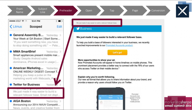
In this blog post, we’ll take a look at the quick wins from preheader testing run by Laz and his team. But first, a quick primer on preheaders in case you’re unfamiliar. Preheaders, as seen below, are frequently found in email app inboxes on mobile devices, but can also be seen in webmail inboxes and desktop email client inboxes (depending on the view settings chosen by the user). They will also appear at the top of the email itself.
If you don’t choose a specific preheader snippet to display when you send the email, a default snippet will be displayed.
(The above two slides are from Justine Jordan’s presentation Email Design: How to optimize for all environments in a mobile world.)
Laz wondered — what makes an effective preheader? And how could he use it to increase engagement?
His team ran a series of preheader tests to determine the most effective messaging for one of its magazines in the UK.
Background: As part of its email optimization, Electronics Weekly, a brand of Metropolis International Group, identified the preheader snippet on its email campaigns as a key area that can drive more email opens. Previously, there was no text in this area.
Goal: Increase the level of email engagement (as measured by emails opened)
Primary Research Question: Does more of a “keyword/call-to-action optimized content” approach in the preheader snippet drive more engagement?
Approach: A/B split test
The team tested on a list of 5,000 subscribers, randomly split into two segments.
“We applied four series of tests before picking the winner for the next treatment, always reversing the order of the A and B lists. We applied eight series of tests for the final treatment — no snippet versus winner of all snippets,” Laz said.
All test emails were sent for the same type of campaign — a daily newsletter — at the same time and following the same subject line structure. There were no new data imports during the testing phase, which lasted three weeks.
The “from” field (Electronics Weekly <dailynews@electronicsenews.com>) and subject lines (which were personalized, for example: Your Top Story Laz — N3XT carbon nanotubes stack ICs) were consistent between the Control and the Treatment. The only factor that changed was the preheader.
The team created five different scenarios to test. The goal was to create a line of text after the subject line that was relevant and had useful information. Some marketers go for curiosity clicks, but as you’ll see in the results below, this utility-based approach was successful for Laz’s team.
Treatments
Treatment #1: Second-most popular story. Always displayed the headline of the second most popular story in the newsletter (the most popular story had already been used in the subject line).
Treatment #2: Usage of prefix. Displayed “Read also:” or “Just in:” in front of the snippet followed by the second most popular story.
Treatment #3: Usage of a default snippet. Used the same snippet “Breaking news from the Electronics industry” on all daily newsletters.
Treatment #4: Usage of ASCII Symbols. Displayed a generic ASCII symbol in front of the snippet to generate attention.
Treatment #5: No snippet (in that case, here is an example of the default content that would show in an email reader).
Results
By using a prefix and an ASCII symbol to call attention to the second most popular story in the newsletter, The Metropolis International digital marketing team achieved a 4.9% higher open rate — a relative increase of 30% — over a newsletter with no snippet. This increase primarily came from smartphone users (which accounted for 72% of the increase); however, there was also improved performance with tablet and desktop users (because preheader snippets are displayed in webmail clients like Gmail and Outlook.com).
As I said, Laz ran multiple tests for each scenario. Below you can see the average open rates along with example preheaders following the format tested. The team would find a winner that had the best performance (which included not just opens, but clicks as well) and then challenge that winner with a new treatment.
“We didn’t have any breaking or big stories during the testing period that affected opens/clicks more than the regular campaigns,” Laz said.
Laz’s team generated an increase in clickthrough rate as well. The newsletter with the optimized snippet got a 17% higher clickthrough rate — 3.77% versus 3.20% — than the newsletter with no snippet.
“While the inbox is the first thing a subscriber sees, it’s often the last thing considered when creating an email,” Laz said. “The preheader snippets are an extension of your subject line message that you should take advantage of, using the extra space of characters that most email clients make visible.”
Laz will be presenting his case study — “Getting off the Blacklist: How a publishing company cleaned and optimized its database to increase online revenue 8%” — at MarketingSherpa Summit 2016 in Las Vegas.
You can follow Daniel Burstein, Director of Editorial Content, MECLABS Institute, @DanielBurstein.
You might also like
Email Preheaders Tested: The surprising sensitivity of a single line of text
Email Marketing: 24% higher CTR for CareerBuilder’s responsive design [From MarketingSherpa]
MECLABS Email Messaging online course [From MarketingExperiments’ parent research organization, MECLABS]


