Sometimes getting consumers to the landing page is the easy part.
The ingrained friction the buying, and even registration, processes create for users can cause them to hesitate in completing the process. After all, you don’t visit a site to register; you come to consume whatever information they have to offer. The registration part gets in the way.
When the registration process seems unusually long, you give up and leave the site. The value beyond the registration no longer outweighs the time and effort needed to get to it.
The same goes for purchases. When we create additional friction through design, copy and overall experience, it can push a customer to abandon their cart instead of pushing through the mental resistance certain elements create in their mind.
The good news is that we can indeed reduce the friction present in the conversion process. We can do that in two ways: length and difficulty.
For length-oriented friction, look at:
- the length of your process as a whole
- the layout of fields
- the number of fields
For difficulty-oriented friction, examine:
- the format of your pages
- the number of options provided and how they’re displayed
- the button design and placement
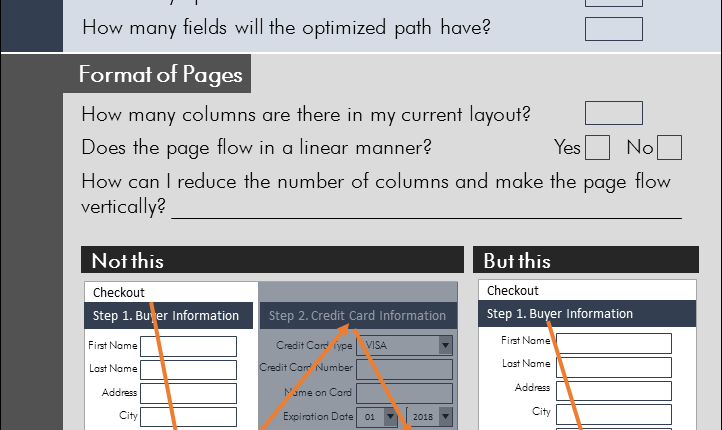
Sometimes it can be hard to look at a page and immediately pinpoint these things, so we’ve designed a checklist of sorts for you to go through while analyzing your processes.
We’ve also included some “Not this, but this” examples to show you possible alternatives. Remember, what might work with one audience doesn’t always work with another. That means you’ll want to test your changes to make sure you’ve found the best process for your customers.
To learn how to reduce friction on other parts of your website, check out the MECLABS Landing Page Optimization online course, which provides deeper insight into friction and experiments demonstrating real-world success.
You can follow Selena Blue, Manager of Editorial Content, MECLABS Institute, on Twitter at @SelenaLBlue.
You might also like
Optimizing Subscription Paths: Recent research reveals a radical webpage redesign that produced a 173% lift in customer response [MarketingExperiments Web clinic replay]
Lead Generation: Is your registration form part of the customer journey? [From the blogs]
How Design Impacts User Experience: Reducing anxiety by infusing your page with value [From the blogs]
Web Optimization: Ancestry.com improves conversion 20% by reducing choice barriers [From MarketingSherpa]


![How to Reduce Friction in Purchase and Registration Processes [Checklist Infographic] from MarketingExperiments Reduce Friction in Purchase Process Infographic](/wp-content/uploads/fg.png)
Hi Selena, thanks for sharing this infographic checklist. Good reminders to keep in mind as we build and optimize everything.
What I’m curious about, in the Field Layout section, “but this” recommendation is to use placeholders and stack fields next to each other to make it appear shorter. However, I noticed that on MECLABS checkout you’re using top and left aligned labels in the forms. Was that tested or pretty much left as a default setup? I’m curious if there was a reason for that.
Screenshot of MECLABS checkout in case anyone is curious:
http://share.projectarmy.net/072220158xqav
Thanks.
*Very* informative post Selena,I never realised there was so much theory behind developing effective UIs