Last month, I sat down with Dewayne Hankins, Vice President of Marketing and Digital for the Portland Trail Blazers NBA team, to talk about how they leveraged dynamic ticket pricing in the purchasing process for single-ticket buyers.
We talked a lot about the effort as a whole, which involved launching a brand new site and optimizing various elements to provide fans with an experience that was relevant to them.
Testing, instead of relying on gut feelings and instincts, is the only way to truly know if your efforts are making an impact.
The team at the Portland Trail Blazers took testing to heart, and experimented on even smallest elements on the single-game ticket pages — the order of pricing.
Here are the details on one of those tests:
Control
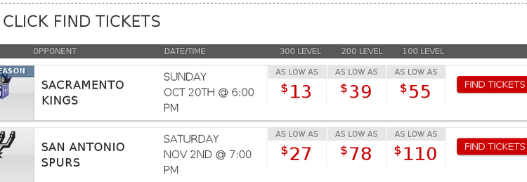
On the ticket pages displaying the upcoming games, pricing was listed in ascending order from left to right, with the highest price next to the “Find Tickets” button.
Treatment
On the treatment ticket page, the team reversed the order of pricing. The lowest prices were now next to the “Find Ticket” button.
Results
By simply testing price order, the team discovered the treatment, which placed the lowest prices next to the CTA, led to a 51% increase in revenue-per-visitor.
What you need to understand
A call-to-action cannot be viewed in a vacuum; it must be viewed in context of the entire conversation that is occurring in the customer’s mind.
By placing the lowest ticket price next to the “Find Tickets” CTA, customers looking at the surrounding offers and prices were more apt to click and convert.
For single-game purchasers, they may be more motivated on price rather than having courtside tickets. By appealing to that need of finding the lowest ticket prices quickly, customers were more likely to convert.
Having a higher ticket price next to the CTA may have also induced anxiety and friction for the customer. Seeing the highest price next to the CTA subconsciously hindered the purchasing process, but seeing the lowest ticket prices near the CTA invited more interest.
Anxiety is lethal to conversion, and it can often be corrected with a simple, yet strategic, change to a product page element.
Using proximity, the team placed the lowest price next to the moment of concern — the next step in the purchase process.
The keys here are to take a step back, look at your pages from your customer’s point of view, and test all elements of a page. This testing may lead to increases in sales like it did for the Trail Blazers, but more importantly, you’re learning more about your customers.
You might also like
Landing Page Optimization Online Course
The Most Effective Calls-to-Action: 5 principles discovered for increasing customer response [Watch the Web clinic replay]
Turn Your CTAs Into Helpful Tools: 5 CTAs that dramatically increased page performance [More from the blogs]
Landing Page Optimization: 5 factors that lead to (and prevent) conversion [More from the blogs]


