What else can I test … to reduce shopping cart abandonment rate?
At our web clinics and optimization training workshops, two of the most frequent questions are: “What else can I test?” and “Do you have a good example?” To answer these queries with practical test ideas and examples, we’re pleased to present our new “What else can I test?” column.
More than 60% of US online retailers are seeing shopping cart abandonment rates of over 20% this year, according to a recent eMarketer article. Among the most cited and common reasons for that abandonment: just doing comparison shopping, lack of money, looking for a coupon, and no alternative payment methods available.
In a recent survey with one of our research partners, we found that the number one reason for abandonment was shipping prices, followed by “I did not intend to purchase at this moment.”
Here are a handful of ideas, drawn from our research, that can help combat those issues and decrease your cart abandonment rates:
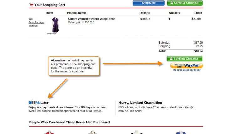
1) Offer alternative payment methods. Credit cards are still the most popular method of payment with about 55% of online retail purchase volume in 2008 (eMarketer), followed by debit cards with 27%. The forecast for next five years shows credit cards as the #1 payment type. However, alternative payment types like debit cards, Bill Me Later, PayPal, and Google Checkout are growing fast in popularity.
Test offering any of these alternative methods and don’t forget to promote them in your shopping cart as well as on your homepage and product pages. It’s important to let visitors know all the payment options available as soon as they land on your website. See examples:
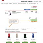 |
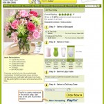 |
Note: Some online retailers are seeing a significant improvement in average order value by providing a Bill Me Later option.
2) State your shipping prices or rules upfront. Simply state your shipping prices or rules in a visible area in your website and cart page. The best locations are next to the shopping cart, page header or footer or within content in the product pages. See examples:
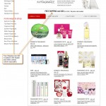 |
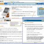 |
3) Offer exclusive products online. These can help with shoppers who are just browsing and researching. You may need to do some research to find attractive products that you won’t lose money on if you only offered them online. See example:

4) Put your nav bar to work for your cart. It’s a common mistake to think that the navigation bar needs to stay the same in your cart page. I understand usability might be the reason, but you don’t want to offer more links to your visitors to abandon the cart. Instead your nav bar can become your center of “anxiety relief.” Use it to state your shipping prices, customer support options (phone number, email, chat), method of payments available, and security seals. The nav bar can help reduce your visitors’ anxiety by making them feel more secure and comfortable with your checkout process. (If you don’t have a navigation bar use the bottom section of your cart page). See example:
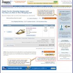
5) Promote your promo codes. The feeling of missing a promotion because you don’t have a promo code can be frustrating. It actually can lead to abandoning the cart to go and search for promo codes online. Instead of wasting your visitors’ time, offer them a way to get promo codes directly from you. GetElastic provides a great example of how to do this. Another option, if visitors come from a channel that you can control (email, PPC, banner, affiliate), is to have the promo code prefilled for them. You can use the visitors’ session or URL to carry over the promo code value and use it right in the shopping cart page.
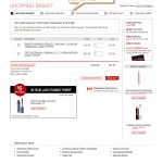
6) Plug in a progress bar. This is a very simple and easy update to your cart and checkout pages. Especially for those online retailers that have a short (two to four steps) checkout process, having a progress bar can help reduce visitors’ anxiety and encourage them to continue. For longer checkouts (more than four steps), I’d recommend testing first reducing the number of steps and then testing a progress bar. See example:
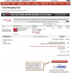
7) Brand your checkout process. Along with the progress bar, naming your checkout process can reduce visitors’ anxiety. By naming I refer to using adjectives to describe the nature of your checkout process. For example, “easy checkout”, “1-2-3 checkout”, “express checkout”, etc. Test different names powerful enough that can create a sense of relief in your visitors’ mind. See example:
For more tactics and suggestions on how to optimize an eretail website, join us for our Sept. 30 web clinic: Ecommerce Optimization: A holiday playbook for procrastinators.


Great article, Gaby, and I am impressed that the post appears to be ranked in order of importance to both retailers and consumers. You’re right, alternative payment options are growing in demand, especially given the credit crisis.
Here’s one more to consider in your list of APMs like Bill Me Later, PayPal and Google Checkout – it’s ILD Teleservices – bill to phone payment options are so convenient for consumers checking out – it’s a simple “no credit card required” option.
Thanks, Ilona. You are right; I tried as much as possible to prioritize the ideas in terms of their impact to abandonment and conversion rate. Thank you for providing another payment method to the mix.
Excellent use of examples.
I’m currently recoding and then redesigning my entire site. It will be good to build in some of these examples right in from the start.
Thanks!
Thanks. Glad to hear these ideas are helpful. Please, let us know how they do for you. Don’t forget to test them
Gaby,
Thank you for the list! Good stuff.
I have been thinking about promo codes a lot lately, and what that box actually means in checkout. I know when I see it, it’s a call to go find an extra few percent off… I’d imagine it’s the same for most seasoned online shoppers.
I have a client that is one of the biggest retailers online and we’ve been noticing an interesting trend – a massive increase in [coupon|promo|discount code] keywords. The majority of the time those searches are executed, the sale gets tagged to an affiliate. Often they don’t have an active promo code available so I would have to believe that there is a significant count of abandoned sales.
Here are my thoughts on countering… hopefully it’s helpful for some of the other retailers that might be reading:
– run a campaign (paid and natural) to capture code-searchers
– hide promo box when there are no active promos
– hide promo box if cart is not eligible for promos
– create an onsite/inline mechanism for searching for promo codes
I’m going to do a post this week at checkoutoptimization.com with further follow up, let me know if you have any more ideas!
Great article! I’m just getting my feet wet in web analytics and this post is a great read for novice people like me. The images made it an easy read with the commentary next to it. Keep it up!
Thank you. Good to hear the format of the examples are helpful.
We have done an experiment for customers trying to abandon their cart. We offer them a 10% discount on the whole order if they stay and complete. This has been quite good and may be worth trying. After our initial trial last summer it is now a part of our e-commerce platform and is now offered to 1/3 of the customers abandoning their carts.
Great article. Since a couple of months I do have a website aimed at the Dutch market in the mental self-help nice. Since I’ve implemented Google Analytics in both my website and webshop a couple of weeks ago, I’ve noticed the abandon rate.
First thing I’ve done, is send an email too shoppers who did enter their info but didn’t purchase. I’ve send them a offer with a free manual included. Within 5 minutes I did have the first to complete their order.
Thank you, Jan. Good thing you put Google Analytics. Keep using it together with testing to reduce your cart abandonment rate.
Thanks for the article. We just completed a redesign, and was able to up the add to cart button by 2.4%. OUr conversion rates have not increased for some reason. We have a branded checkout, which is streamlined, it has most of the suggestions we can install with a yahoo store. We can’t offer coupons due to MAP pricing, so I’m running out of idea’s.
Hi Gaby,
My current shoppingcart has got a 4 page checkout. Now I’ve found a new paymentprocessor that allows me to setup a one page checkout. I’m still in the testing phase, I do it slowly because I don’t want to loose my current income, but results do look promissing. Down side is the steep order processing fee.
promoting promo code .. is the most important thing for consumers.. especially those who really need discounts to fit their budget.. thanks for this info.
What about not having customers register before checkout ? I find that to be one of worse reason.
I really enjoyed your article, but it is important to note that one thing that will affect your abandonment rates is the layouts of the page. When you go through your checkout process are the proceed buttons prominent? Are there too many buttons? Also, load times can be a major factor. If it is taking a million years to get to the next step then a lot of people will move on. I just posted a blog about this very thing with some other very helpful tips. http://goo.gl/1c99p