The majority of B2B organizations are increasing their marketing budgets for inbound marketing tactics. One of the most popular of those inbound tactics is virtual events and webinars, with 60% of marketers increasing their investment according to the MarketingSherpa 2011 B2B Marketing Benchmark Report.
“It is essential for organizations to gain the trust of their buyers before they can hope to convert them,” said Jen Doyle, the Benchmark Report’s lead author. “Webinars offer an effective platform to improve thought leadership and reputation, both essential components to winning trust. The cost effectiveness of webinars is just the icing on the cake, so many organizations are shifting to include webinars as part of their marketing plans.”
Of course, a webinar isn’t very effective if no one attends. So in today’s MarketingExperiments blog post, Gaby Paez and I will give you some test ideas for those all important webinar invite emails (and if you’d like to see how we craft our own webinar invite emails, just sign up) by reviewing a live optimization submission from The Chronicle of Philanthropy.
Gaby is associate director of Research at MECLABS, and you can hear more of her test ideas in the Web clinic replay, Email Messaging: How overcoming 3 common errors increased clickthrough 104%, along with some of the audience’s optimization advice for this submission.
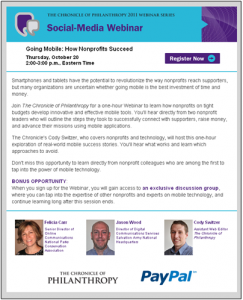
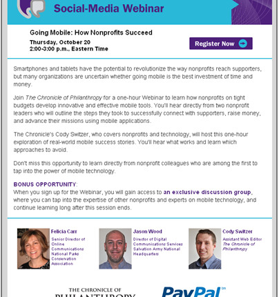
Here’s the submission (and you can view it online as well) …

BACKGROUND
Email – Invitation to a paid social media webinar, “Going Mobile: How Nonprofits Succeed,” which features a bonus opportunity to gain access to “an exclusive discussion group” and three speakers:
- Felicia Carr, Senior Director of Online Communications, National Parks Conservation Association
- Jason Wood, Director of Digital Communications Services, Salvation Army National Headquarters
- Cody Switzer, Assistant Web Editor, The Chronicle of Philanthropy
Audience – Nonprofit professionals in fund-raising, marketing, social media and development
Objective – To get registrants for a paid webinar
TEST IDEA #1: Increase the force and clarity of the value proposition
Many webinars are “free.” I put that in quotes because, dear reader, as I’m sure you know … nothing in life is free. Your attendees are actually paying for that “free” webinar with an hour of their time, which, for a busy professional, is a very high price indeed.
This webinar has an extra high bar to cross in that it is, in fact, a paid webinar. So attendees must pay not just with their time, but with their wallet as well. With that in mind, here are a few test suggestions …
Test Suggestion #1: Add a headline. While the body copy is strong in this email, keep in mind that many recipients do not take the time to read every word in every email they receive. You’re lucky to get a quick open and a two-second scan. One possible headline pulled from the email’s body copy and tweaked a little – “Hear what works and learn what to avoid from nonprofit colleagues who are among the first to tap the power of mobile.”
Test Suggestion #2: Increase scanability. While the copy in this email is written quite well, it is mostly a big block of undifferentiated text. To reiterate the point above, very few of your recipients will read your email word-for-word. Maybe your mom will. If you told her you wrote it. And you catch her on a quiet day when her soaps aren’t on. One key test that could help this email decrease friction a lot is increasing scanability by adding bolding, subheads, and/or bullets. “They could add bullet points with questions that the webinar will answer to increase the value of it,” Gaby said.
Not only would this increase the value communicated to the audience, it would decrease the friction the recipient experiences while trying to decipher the value of this webinar. “There is good sequence in the copy, but some of the paragraphs are long. They could test shortening the paragraphs as well,” Gaby advised.
Test Suggestion #3: Drop the call-to-action to the bottom. “The email is asking too much of the recipient at the very beginning – register for a webinar – without giving enough value,” Gaby said. A so-called “best practice” is that it’s always better to put key information above the fold. We’ve discovered, through our testing, that many times placing key information to match the customer’s sequence of thought is more effective than just slapping everything “above the fold.” After all, an email isn’t a newspaper, and really doesn’t have a “fold” anyway.
Test Suggestion #4: Clarify the messaging. You likely understand what you mean by each and every word in each and every email you send. After all, you eat, sleep and breathe your messaging every day. But what about the potential customer who was thinking about 10 other things in his day … and then gets exposed to your message for half a second? Utmost clarify is key. In this case …
“The message is not clear,” Gaby observed. “The banner says ‘Social-Media Webinar,’ but the webinar title is about mobile.”
I’m just guessing here, but they likely can’t change the banner because this is part of a series. However, adding social media references in the title and body copy could help (if it truly reflects the content of the webinar).
TEST IDEA #2: Increase the force and clarity of the incentive
When you use an incentive in your marketing, it can be a double-edge sword. When done well, it can almost be done too well. The incentive can outweigh the value proposition of the product itself to the point that the customer simply refuses to buy without an incentive (for example, GM in the 90s and early 2000s sold more on incentive – cheap financing, cash back – than on the value proposition of its actual product – the cars).
On the flip side, if you offer an incentive that costs your company money but doesn’t have a clear and powerful value proposition to potential customers, all you’ve done is drain your budget without boosting sales.
Test Suggestion #5: Clarify the value proposition of the incentive. In this email, the incentive is a “BONUS OPPORTUNITY.” Attendees receive “access to an exclusive discussion group.” Well, who wouldn’t like to be given a bonus? And other than Groucho Marx, who wouldn’t want to be in an exclusive group?
The only problem is … what does any of that really mean? Marketers have so overused the words “bonus” and “exclusive” they no longer have meaning. “The bonus is not clear. When will the extra session happen and how large are the groups?” Gabby questioned.
I would suggest testing messaging that would quantify the value of this incentive. For example, “Past discussion groups have averaged 60 active, VP-level members from leading nonprofits such as the American Red Cross, the Sierra Club and the United Way.” Now that’s a group even Groucho would like to join.
Bonus Test Suggestion #6: The early bird. For a paid webinar, an excellent incentive is an early bird discount. And in looking at the landing page for this webinar, The Chronicle of Philanthropy did offer one. In fairness to The Chronicle, we don’t know if they sent this email before or after the early bird expired. But we did want to add this test idea in here, as a bonus (see what I did there) for our readers.
TEST IDEA #3: Reduce anxiety
Any time there is a call-to-action, your potential customers have some anxiety about what will happen if they take that action.
In this case, The Chronicle of Philanthropy makes a good use of its presenters to help reduce that anxiety. After all, if professionals from such reputable organizations as the National Parks Conservation Association and the Salvation Army are willing to take the time to speak on this webinar, it must be somewhat legitimate.
There are, however, a few tests The Chronicle could run to help reduce anxiety for its recipients even more …
Test Suggestion #7: List the price. This is a paid webinar, but nowhere in the copy do they mention the price … or even the fact that the recipient will have to pay to attend. This could greatly increase anxiety. Since so many webinars are free, the recipient may click on the “Register Now” button thinking she will get to a signup page for a free webinar, only later to feel duped when she is asked to enter her credit card info and pay $75 or $96 (depending on if she gets the early bird discount).
While this will likely greatly reduce the clickthrough rate for the email, it should also increase conversion on the landing page which, after all, is the overall goal.
Test Suggestion #8: Test the price. How did they determine that $75 or $96 are the optimal prices? Maybe $99 is? Or $100? Or maybe they can increase attendance, overall revenue and brand exposure by dropping the price to $49.
Test Suggestion #9: Clarify PayPal’s relationship. “Why PayPal?” Gaby asked. “What do they have to do with the webinar?”
At first, I thought that PayPal was an option for payment. But after going to the landing page, I did not see that option. It turns out that PayPal is the webinar sponsor. Fair enough. Add the words “Sponsored by:” above the logo to clarify.
In fairness, the webinar platform they used probably did not allow them the opportunity to add those words. It probably only allowed an image upload. In that case, I would add the words in a graphic editing program (such as Photoshop) and save an image (such as a .jpeg or a .png) with those words in there to make the sponsorship relationship clear.
Test Suggestion #10: Add info about the host organization. This last test suggestion depends on which list(s) this email is being sent to. If it is only being sent to a house list, it is probably not necessary. However, if that is not the case …
“Who is The Chronicle of Philanthropy? If this email is sent to rented/purchased lists, it could help to add a brief ‘about The Chronicle of Philanthropy’ section at the bottom,” Gaby suggested.
Related resources:
Our own upcoming (free) webinar – How to Increase Conversion in 2012: The last 20,000 hours of marketing research distilled into 60 minutes
Webinar How To: The 8 roles you need to fill to make your virtual event a success
New to B2B Webinars? Learn 6 steps for creating an effective webinar strategy
Marketing Webinar Optimization: Five questions to ask yourself about webinars


