Toward the end of last year, Active Network, a technology and media company specializing in online registration and event management software, began a testing and optimization program on the website of one of its brands, RegOnline.
This week’s MarketingSherpa B2B newsletter article is a look at that entire program, but for this blog post I want to highlight an interesting test conducted in the middle of the cycle. This particular test deserves a closer look because it created impressive results, but more importantly, it illustrates why it is important to be flexible with a testing program.
At the beginning of Active Network’s testing cycle, the tests were conducted on the RegOnline homepage. The problem was that tested treatments were not producing positive results — and the homepage accounts for about 90% of RegOnline’s revenue.
Essentially, with the treatments being outperformed by the control, the homepage tests were hurting RegOnline’s bottom line.
This caused concern and discouragement with both the testing team and top-level management at Active Network.
A decision was made to begin testing other channels, such as landing pages, PPC ad copy and email messaging, to hopefully find some learnings that could inform future homepage tests. Another benefit was because these other channels had a more singular purpose than the homepage, it was easier to design a test to get a “win” and ease some of the discouragement.
Lauren Guinn, Director Online Marketing, Active Network, explains, “Because there is so much business risk testing on our homepage, we shifted to smaller tests on other channels and then applied these learnings to big tests on our homepage.”
Testing a landing page
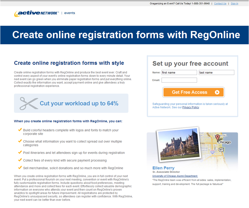
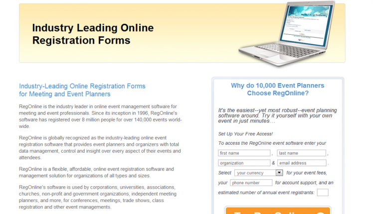
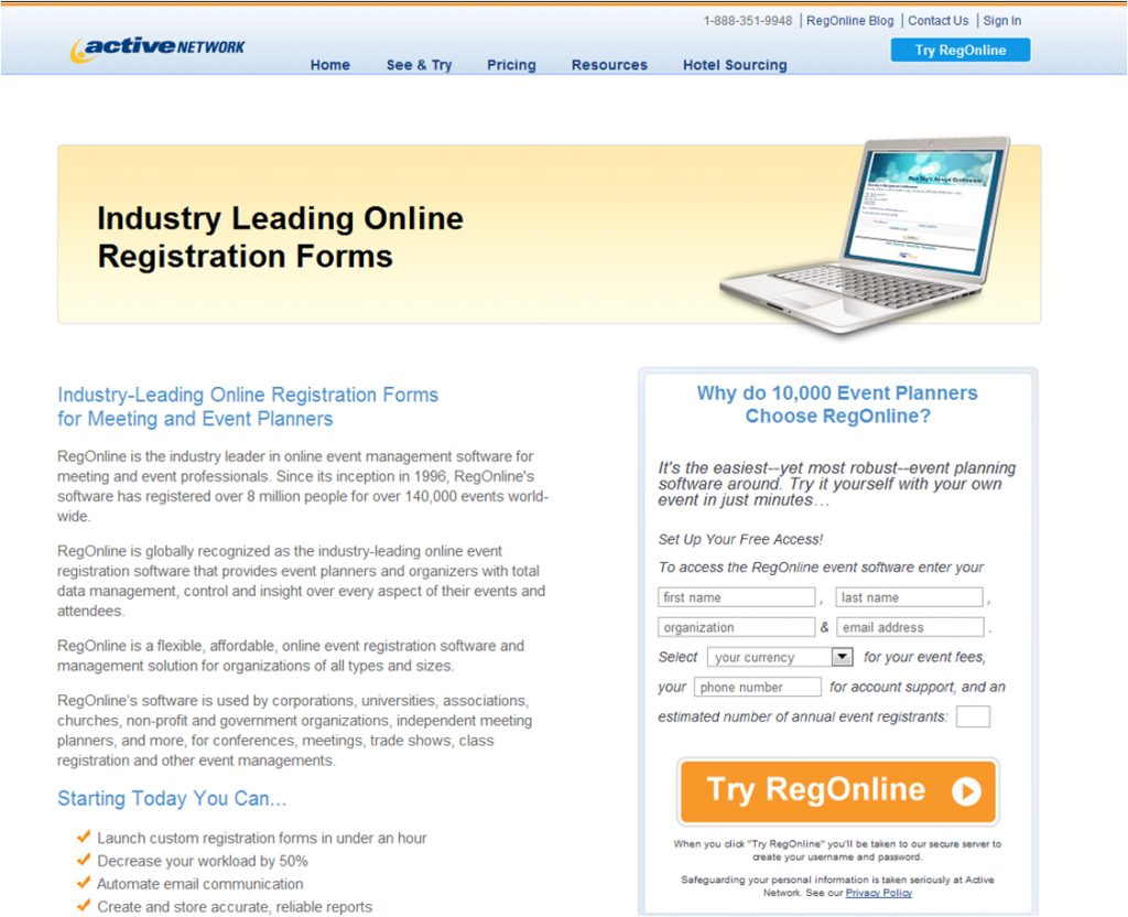
After two rounds of homepage testing that produced learning, but no lift in results, the next test was conducted on an SEO landing page, pitting the existing page as the control against one treatment featuring a radical redesign.
The control:
–
–
The treatment:
–

–
The goal of the test was to increase qualified new accounts at RegOnline, the main research question was: what combined effect do on-page presentation elements and sign-up process elements have on conversions? The key performance indicators for this test were start rate and conversion rate.
The redesigned treatment featured a number of changes from the control:
–
- Navigation at the top of the page was removed, and key links were added to the bottom of the page
- Multiple calls-to-action were removed in favor of a single CTA
- Unsupportive imagery was removed
- The headline was changed to point-first based
- The body copy was optimized for readability
- The testimonial was updated
- A three-step sign-up process was utilized, compared to two-steps in the control
–
Results
–
–
As you can see, the treatment beat the control in both start rate (the rate at which visitors started the multi-step process) and conversion rate (how many visitors actually finished the entire process).
The reason start rate and conversion remained the same for the control is that page featured a two-step sign-up process with literally no drop off on the second step (user name and password creation.)
The treatment added a third step before the user name and password creation asking for a phone number.
The test found that RegOnline visitors responded positively to an optimized presentation of value and process.
The testing team took this insight and utilized it in the next homepage test and finally achieved positive results in that channel, too. This winning outcome provided relief for the testing team, and helped get top management at Active Network back supporting the overall testing effort.
–
Related Resources:
Website Testing: IBM’s navigation elements test leads to 128% increase in clickthroughs
Page Tests Lift Site Registrations and Conversions: 3 Examples that Stopped Site-Design Bickering
How to Plan Landing Page Tests: 6 Steps to Guide Your Process
Landing Page Optimization: Is it actually possible to optimize a landing page?
Test Plan: Build better marketing tests with the Metrics Pyramid
Website Redesign: Wondering what to test? Just ask your customers
–


What a great case study. Thanks for sharing. One thing that really puzzled me was that you didn’t give due diligence to the copywriting of the original or the treatment in your analysis. It was radically changed (for the better, I might add).
I walked through this aspect of the 2 pages in a blog post for my readers:
http://www.marketingwords.com/blog/?p=1571
As you can see, altering the entire focus of the copy makes it more engaging, enticing and – no doubt – successful. Kudos to the copywriter who created this piece and contributed his/her 2 cents to the overall 548% conversion boost!
Thanks for this story. Fantastic improvements.
I have to ask though- did you keep the phone number step in the final version?
In the control, there was no drop-off in the second step (no kidding, they’d already filled in 7 fields – quite a commitment), in contrast to the 5.5% drop-off in the treatment between start and conversion on the treatment. Interestingly, of the 7 fields in the control, phone number wasn’t one of them. Phone numbers are such a dicey thing – so many people don’t want a sales call – that this variable maybe messed up things a bit.
In fact, I wonder if you didn’t start the test just looking at conversion rate, then had to add the Start rate numbers to see the actual impact.
548% is wonderful, but the data looks like it could been better without that phone number request!
I agree with Karon and Lisa…this is a really useful demo, thanks.
I notice you said the testimonial was ‘updated’, but I don’t see a testimonial on the control. I’m assuming the testimonial on the control was cropped off here? I’m a strong believer in the power of a good testimonial and I love the way you gave this one super-cred by adding visuals to support it. I’m definitely going to try that now!
I’m also curious to know if you kept the phone number in the final version.
In response to Karon:
• The copy was adjusted mostly in presentation, and not so much in actual content.
• We did do a follow-up test and saw that the on-page changes (in aggregate) did attribute more to the big gain but not entirely
• We didn’t have the priority after that to A/B test every element, as the business wanted to focus its resources on other tests
In response to Lisa:
• Yes, we did keep the phone number as it was a required field for the lead to be Sales Accepted (a minimum for the test)
• Phone number was actually required in the control the same as the treatment
• I agree that results would be higher without the phone number, but the quality of those particular leads would not be acceptable
• The difference in total leads (counting those that dropped off at step 2) was like 1300%
In response to Caro:
• The testimonial WAS there on the control – just cut off on the design comp used
• We did keep the phone number in the final version. Without it, the test would not be a success to the partner.
I hope this additional info helps!
If anyone would like some more detail on this particular test or sequence, definitely let me know. My team worked on it so I am familiar with the details 🙂