One of the classic Web usability “best practices” is to put the call-to-action above the fold. I did a little research (thank you, Wikipedia) and apparently, the term dates back to the mid-90s – practically the Paleozoic era of Web marketing.
So, is above the fold still a best practice in 2013? Let’s take a look at a recent discovery from our lab …
Background: Sierra Tucson is an addiction and mental health rehabilitation facility
Goal: Increase the total number of leads captured
Primary Research Question: Which page will obtain the most form submissions?
Approach: Multi-factor split test
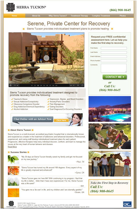
CONTROL
The control was an average, short-form page template with a rotating banner. The call-to-action was above the fold on the right-hand side of the landing page.
After analyzing the control landing page, the MECLABS team identified a few possible areas for optimization:
- The page layout causes friction because elements of the value proposition are hidden within the navigation.
- The lack of value proposition on the page does not encourage users to contact the facility.
Based on this analysis, the team crafted the following hypothesis …
Hypothesis: If we increase the value proposition throughout the copy on the homepage and decrease friction with a long-form page layout, then users will be more likely to convert.
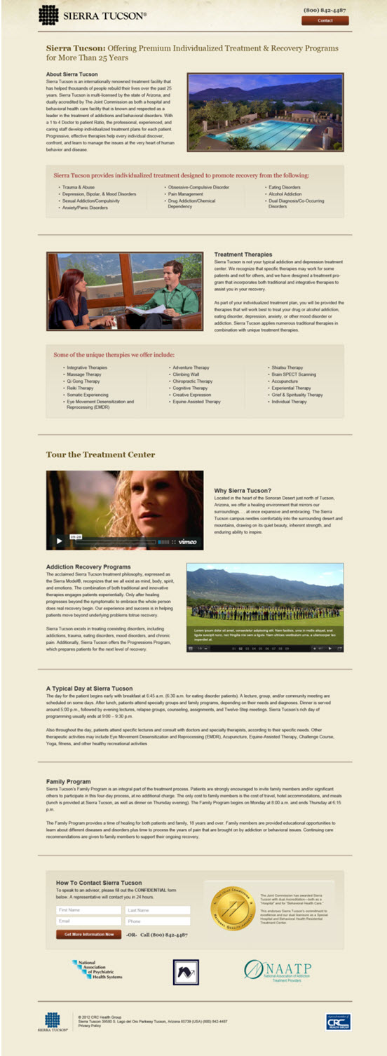
TREATMENT
Navigation was omitted (“Web Usability: When should you avoid navigation?“) and a long-form format was used to include all of the information a visitor might want to know on the first page.
The value proposition was also emphasized in the headline and the body copy to boost exclusivity, appeal and credibility.
Essentially, this is a single-column, long-form structure with the call-to-action down at the bottom. The treatment is nearly twice the length of the control and the call-to-action is at the bottom of the page.
RESULTS
The Wichita State of Web marketing, “below the fold” routed the “above the fold” control. In a shocker, this Cinderella story generated a 220% higher conversion rate with a 98% level of confidence.
By utilizing a single-column, long-copy approach, the treatment better guided the prospect’s thought process.
The below the fold discovery is interesting in and of itself, but when I discussed this experiment with Jon Ciampi, Vice President Marketing, Business Development & Corporate Development, CRC Health (parent company of Sierra Tucson), he had a deeper discovery for his business.
“The fact that a below the fold form worked better than an above the fold form was a secondary learning for us,” Jon said. “The primary learning was that the biggest question customers had about our health care centers was around trust. ‘I’m handing my healthcare to you; can I trust you with my life?’”
A complete marketing transformation
Now, here’s where the story really gets interesting. Jon didn’t just settle for a simple discovery in one experiment. I’m going to interview Jon about the full story behind this marketing transformation during a transferable case study session at Optimization Summit 2013 in Boston, but here’s a quick look at the story.
“This learning transformed our marketing department, and led to many more lifts. For example, a 14,000% PPC ad improvement that our Google rep called ‘the highest clickthrough rate the Google healthcare team had ever seen,’” Jon said.
“Beyond our marketing department, this learning transformed our entire business. For example, we have an 85% increase in paid search revenue across 300 websites. These numbers are shocking to me. We have an unfair advantage,” he added.
Previously, the marketing department focused on features of the healthcare centers, like the secluded location. From this discovery, the team focused on the issue of trust.
This changed everything the team did – not just the way they wrote their landing pages, but the way they answered the phone, how they handled reputation management, their use of social media, and the list goes on.
Related Resources:
Optimization Summit 2013, May 20-23, Boston
Web Usability: The Squint Technique and other insights from your peers
Marketing Questions: Making claims for new products, e-commerce landing pages
Online Testing: 6 test ideas to optimize the value of testimonials on your site
Marketing Campaign: Landing page optimization can help improve the return on your media spend


Surely this one page layout change will create problems for SEO?
I remember this case study from the web clinic.
Great reminder about the importance of understanding your product and market…opposed to relying on statistics alone.
Who would have thought longer copy + almost hidden sign-up = better conversion.
Excellent case study.
@Chris Marsh
It’s a valid concern.
But in this particular case, the page was developed as a paid search landing page. Since we controlled the traffic through paid ads, we could focus completely on conversion optimization without worrying about affecting search rankings.
As we evaluate what worked for this page and begin to transfer learnings to other pages that may receive organic traffic, we’ll have to consider the SEO implications and strike a balance between attracting high quality traffic and having a high converting page.
Great question.
Nathan
@Nathan Thompson
Well, if your traffic was not Organic, and was driven through PPC, it might be a function of “pre qualified buyers” coming in on branded terms. (obviously a bit more depth than can be included here).
The other factor is the type of product you are selling. Rehab treatment $30,000 conversion, takes a unique selling proposition. Creating a conversation with the customer, and making them feel comfortable and at ease, is certainly better than a 1 click free app download, which is the realm where, many online marketing metrics are born from.
Have mitigating factors been considered? Removing navigation would force visitors to a CTA, which would improve conversion. Also, where does the “Contact” button at the top of the page direct? Is it counted as a conversion? This is definitely a great example of landing page optimization, but does it offer enough evidence to refute the idea of a prominent CTA?
@SEO Manager
It’s true that branded vs. unbranded terms often drive users with different motivation levels to your page and could play a factor in “pre qualifying” them. That’s one of the primary reasons we prefer to run split tests as opposed to sequential tests—to ensure we are doing everything we can to get the same type of traffic to both pages and mitigate against any validation threats caused by outside influence.
@High Impact Designer
The “Contact” button at the top of the page anchors down to the form at the bottom of the page. So clicking on that particular “Contact” button did not count toward conversions. Other factors such as removal of the navigation likely played a role in the increase. But in seeing the two drastically different pages tested, it was a reminder that getting the thought sequence correct is more important than following simple “best practices” such as putting the CTA above the fold. If we wanted to find out the specific impact that moving the CTA had on conversion, we would want to isolate that variable specifically, leaving everything else the same.
@Chris Marsh
If you’re trying to Optimise a single page, your SEO strategy is all wrong, so like Nathan said, landing pages should be for paid advertising and SEO should be for your website.
Understandably, you’ve got a valid point though, since the first example was more of a website, than a landing page (which is also kind of unfair to compare the two, since much of the traffic gets lost in the pages and your message is diluted), in which case, it’d be best to have your SEO focussed around a website (like the first example), then creating a second page for paid advertising traffic if you’re concerned about organic traffic.
I personally think a 2.48% conversion rate is still relatively low, and considering the first example wasn’t a ‘landing page’ per se, I’m more inclined to say that it’s less about call to action being above the fold for the increase in conversion rate, than it is about creating a clearer value proposition (which the article and Nathan implies somewhat anyway I guess).
I’d like to see a side-by-side example of the new landing page and an a/b split test of the CTA being above the fold or below.
Good case study on improving a landing page based on walking a prospect through the decision making process. However, I tend to agree with Uli that this wasn’t really an experiment on the location of the call to action. If you really wanted to test that, simply do a split test by moving the call to action and leave all other variables in place. This was really about taking a sub par landing page and improving the entire page.
You’re exactly right, Nathan and Uli, this was not an experiment on the location of the call to action.
This was a multi-factor split test, and one of the biggest (and more complex) discoveries was about value. A discovery so big, it changed the way the marketing department, and in some ways the business operated. That’s the story Jon and I will be discussing at Optimization Summit 2013 in Boston.
However, for a simpler lesson here on the MarketingExperiments blog, I thought this was a great example of how putting a form above the fold is not a hard law (or even perhaps a “best practice”) marketers should blindly follow. As you savvy readers point out in these comments, there are many more factors. Which is exactly the point I was trying to make in this blog post (and perhaps poorly did so).
This blind allegiance to above the fold is a shortcut that can create needlessly underperforming landing pages for marketers. And, heck, it’s a mistake even marketing industry experts make, as we discussed in Even Marketing Experts Can Be Wrong (A behind-the-scenes example).
There are way, way more variables changed between the control and the final winner, so I’m hesitant to automatically attribute it solely to the form being moved below the fold. Though I don’t doubt that it was a contributing factor if not THE contributing factor, I just don’t think it can be fairly attributed given the scope of this test (or at least the parts we’re seeing in this post). That said, it just goes to show that we should be testing everything – even things that buck conventional wisdom about forms above-the-fold.
@Daniel Burstein If I could “Like” that reply of yours I would. Very well said. I’m so sick of seeing people paint a broad brush over things in marketing and advertising – and I think it’s done because people want to keep their efforts low and leverage themselves (for example selling a product that says you should always put the CTA above the fold).
If it worked for someone else, yes it CAN work for you, but it doesn’t mean it necessarily will. Like it’s been mentioned above, there are so many factors to consider for your own business. The only way you’re going to know is if you actually THINK about your business, then test and measure the heck out of it 😉
It’s nice to see others out there that aren’t following things blindly – nice work Daniel 🙂
Landing pages make your business grow & help in reaching to new customers.
@Sandy
Yes you said it right that landing pages can help a lot in reaching new customers.
Yes. I have tested this myself and I was surfing on the internet to find anyone who has talked about this and I landed on the perfect page. I have shown 80% increase in my leads by making the pages long.
The principle of psychology also works with this accordingly. People tend to believe that if the landing page is long that signifies the value offered is much more.
@Chris Marsh Not necessarily, if you use an index page you can still have individual page titles on a long form page.
Some time the bigger the landing page is, the better the conversion is. I am using longer landingpages on all my websites.
Landing pages are a key component of online marketing campaigns. Since landing pages are focused on conversions, improving their performance can lead to significant improvements in business results. Landing page optimization can help you lower your customer acquisitions costs, acquire more customers, and maximize the value of your ad spend. I am obliged for sharing those suggestions for landing page optimizations. It will encourage entrepreneurs to work more effectively on digital marketing and gain potential results from it.