Color can be used to guide customer thinking on a landing page by placing stronger emphasis on particular elements in your offer, and less emphasis on others.
Today’s MarketingExperiments blog post will show how the MECLABS research team discovered the impact color emphasis has on conversion.
Background: Company provides educational resources for health and fitness professionals who subscribe to one of its online memberships.
Goal: To increase number of membership sign-ups.
Primary Research Question: Which landing page will generate the highest clickthrough rate?
Approach: A/B split test (Variable cluster)
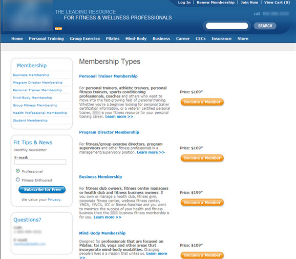
 Control Control |
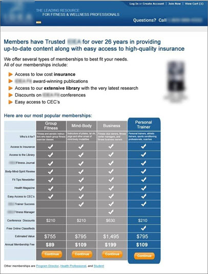
 Treatment Treatment |
The research team hypothesized the control did not place any emphasis on distinguishing between price points in the offer.
In the treatment, the team simplified and sequenced the pricing, and used a color design to emphasize the value of the offer.
Results
What you need to know
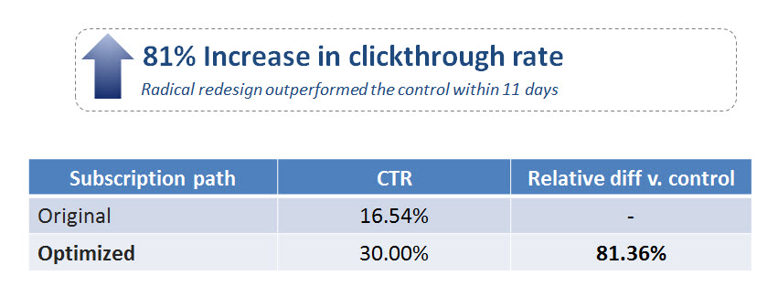
By strengthening the communication of the offer’s value through color, copy and layout changes, the treatment increased clickthrough by 81%.
You can watch the full free Web clinic, “How Do Website Colors Impact Conversion?,” to see Flint McGlaughlin , Managing Director, MECLABS, reveal four more surprising findings from our optimization testing and experimentation.
Related Resources:
Landing Page Optimization: Simple color change increases conversion 10%
A/B Testing: SAP increases conversion 62% by using images
Web Usability: The Squint Technique and other insights from your peers


Very interesting. Thanks for sharing!
That would be pretty cool if you dynamically highlighted each subscription option based on the source of the visit. Nice organization!
Being in marketing for nearly 15 years now, it still amazes me how so few people do the necessary testing to ensure colors and layout are truly optimized. Recently we ran a test ffor a client that conclusively showed that a green button outperformed the existing orange 2 to 1. As much as you think you know what impact a design change will have on the data, you truly never know until you run a test.
Although A/B testing is effective, we’re starting to look into more multi-variate tests. This is because we can test many criteria simultaneously and find a winning combination of factors that significantly improve conversions.