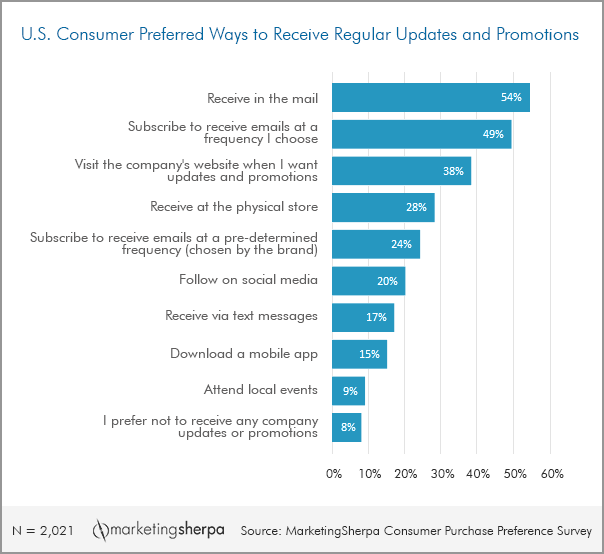
It might come as a surprise, but according to research conducted by our sister site MarketingSherpa, 54% of U.S. consumers would prefer to receive regular updates and promotions in the mail. That’s the highest percentage of any other method.
While we know stated preferences and actual behavior can differ, it’s still extremely interesting that physical mail ranked higher than email.
This means consumers are open to receiving your direct mail pieces. It’s just now up to you to send them engaging and effective content.
To help you in this effort, we’ve compiled three ways you can optimize your next direct mail campaign.
Tip #1. Direct customers toward the logical next step, not necessarily a purchase
If you’re a regular reader of MarketingExperiments, you have likely heard something along the lines of, “The goal of an email is to get a click, not a sale. The goal of the landing page is to get the sale.”
The same could be said of a direct mail piece.
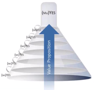
Think about your buyer journey. What steps do they take up the funnel? There are multiple micro-yes(s) that lead up to the macro-yes or conversion.
For some buyer journeys, a jump from postcard to purchase might be asking for too much too soon — especially for longer sales cycles.
Try using the direct mail piece as a chance to message your value proposition and encourage customers to learn more through a next action.
That leads us into the next tip.
Tip #2. Clearly message the call-to-action and make it easy to complete
 Like many of you I’m sure, I receive at least five pieces of direct mail each week (not including the credit card applications that just won’t end).
However, I’m always shocked by how many have no call-to-action. They list services, contact information and sometimes a map — but they never directly ask me to use any of it. If you don’t know why I should visit/call/email you, then I certainly don’t either.
This is one of the common mistakes in the copywriting of online banner ads as well. You must clearly “ask” for consumers to take some sort of action. It must also be easy.
You don’t want to leave your customers unsupervised in their thinking. If they have to determine what their next step should be, they might give up and throw away your mailer, or they might take a different action that won’t effectively guide them to an eventual conversion.
You also want to ensure they can easily complete the action.
If you’re sending them to a specific landing page, don’t make them type in a long, complex URL. Instead, use a short but still descriptive vanity URL.
Not this: www.[companyname].com/products/[category]/[productname]/FreeTrial
But this: www.[companyname].com/FreeTrial
If you’d like them to visit a store, provide a map of the closest location to them, or a list of nearby options. This will potentially require multiple versions of your piece, but the ease the personalization will provide could very well be worth it.
Tip #3. Be more than a postcard
If you can create some function to your piece, it has a much higher chance of avoiding the trash can. Whether it’s in postcard form or an enveloped packet, you have the opportunity to really work your creative gears.
For me, one company’s direct mail always stands out when it arrives in my mailbox: home improvement store, Lowe’s.
Typically, its sends have consisted of an envelope or folded piece that included a coupon card to be used when you spend a certain amount and a useful content piece. The $10 off is nice, but that’s not what makes me keep the rest of the mailer.
With the coupon, Lowe’s has included some checklist or small idea flipbook.
The one that really stands out in my mind despite receiving it almost three years ago (and I wish I could find an image of it) was a three-part checklist. The first list was of normal yearly upkeep chores that the average homeowner should do. Next came a list of minor upgrade projects you could do, and the last included bigger updates around your home.
The checklist idea does two things.
First, it provides me some value, especially the list of yearly maintenance projects I would probably have forgotten about. Second, by providing a list of projects, even without naming the tools or products I’d need to do them, Lowe’s has effectively made a connection between what I need or need to do, the items I need to do those things and its store and products.
If it had just provided the coupon, I would have probably pinned it to the fridge and waited until I came up with a reason on my own while the coupon expired.
It doesn’t have to be a checklist, though. You could incorporate some other physical keepsake. Items could related directly to your campaign (e.g., packet of seeds for Earth Day), something to remind them of an event they participated (e.g., a tiny billboard created from a photo booth) or something like just a simple fun game.
You can follow Selena Blue, Manager of Editorial Content, MECLABS Institute on Twitter at @SelenaLBlue.
You might also like
Who Said Nothing in Life is Free? — Lowe’s mailer photo credit
Direct Mail Marketing: Multi-channel approach achieves 700% ROI [From MarketingSherpa]
Multichannel Marketing: Direct mail, phone and email combine to lift executive briefing calls 50% [From MarketingSherpa]
Lead Generation: Simple text change leads to 104% lead capture increase


I’m impressed that 54% of U.S. consumers prefer getting mail promotions. I would have thought that most people would prefer getting e-mails about promotions. In any case, I do think that you are right that any type of coupon or flyer sent in the mail should be useful for something other than a coupon. The longer I keep it the more likely I am to use it.