Email Marketing: 7 (more) testing opportunities to generate big wins on your next email test [Part 2]
Does your email audience prefer short or long emails? How about images versus GIFs?
If you don’t know the answer to any of these questions, it’s OK. All you need is an A/B email test.
Testing allows us to better understand our customers, and determine ways we can better engage them.
Last week, we detailed nine experiment ideas for you to try on your next campaign. If those weren’t your style, we have seven more for you — for a total of 16 testing opportunities.
Today, we’ll be reviewing opportunities in your body messaging, calls-to-action and design.
Email Body Messaging Testing
Testing Opportunity #10. Messaging tone
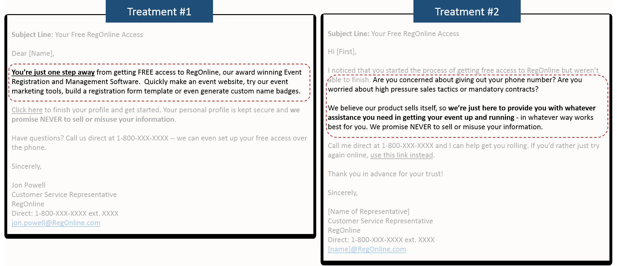
In this test, from the Web clinic, “Email Copywriting Clinic: Live, on-the-spot analysis of how to improve real-world email campaigns,” researchers used two treatments to increase total lead inquiries from visitors who abandoned the free trial sign-up process.
The first treatment was designed based on the hypothesis that visitors did not convert because the copy didn’t engage them enough, so it took a direct response tone. The second treatment was based on the hypothesis that visitors experience high levels of anxiety over potential high-pressure salespeople or spam phone calls. This treatment took a more “customer service”-oriented tone.
By serving the needs of prospects, Treatment #2 increased the lead inquiry rate by 349%. When emailing those abandoning your trials or purchase process, they could be dropping off for particular reason that a simple email could address. By testing different tones and messaging, you can reduce their anxiety and close the deal.
Testing Opportunity #11. Email length
When testing the length of your emails, particularly ones linking to pages where conversion happens, keep this in mind: The goal of an email is a click — the goal of the landing page is a sale.
If you give all your value and information away in the email, where is the incentive for readers to click? This can even apply to newsletters.
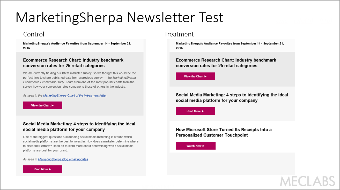
The team at our sister research company, MarketingSherpa, ran a test on its Best of the Week newsletter at the end of last year. The newsletter features the three most shared articles and blog posts from the previous week. Each post had a summary, previewing what readers would find. However, we wondered if the added length caused friction, causing readers to only click on the one or two posts they could see above the fold.
The treatment eliminated the summary, allowing all three posts to be seen quickly when opening the email.
The result? Both total and unique clickthrough went up. When we ran the test, I fully expected total clickthrough to increase. However, the 24% increase in unique clickthrough was a great bonus.
Call-to-action Testing
Testing Opportunity #12. The right CTA ask
The objective of an email is get the click; let your landing page do the selling.
You want to ensure you’re asking only for the next step in the path to conversion.
Here are a few alternatives to test:
· “Learn more,” not “Buy now”
· “Browse [product],” not “Shop now”
· “See event agenda,” not “Purchase ticket”
· “Explore plans,” not “Subscribe now”
· “Get pricing,” not “Buy online”
Using your email CTA to ask for a macro-yes could turn off subscribers. While they might not be ready to “shop now,” they could be willing to “browse the latest collection.”
Testing Opportunity #13. A single ask
Some marketers like to add a number of calls-to-actions throughout their emails. At MECLABS, we refer to this as “conflated objectives.” You throw out as many options for them, hoping they like at least one enough to click.
However, when you start asking for too many things, customers get confused and don’t know what they should be doing. By deciding on a single goal for your email, subscribers know exactly what’s being asked of them.
If you have multiple calls-to-action in your email, try dialing it back to the one main CTA you want them to take.
If you absolutely need more than one call-to-action, use some sort of design to clearly show what the main action you want them to take is. If you have the options of downloading a trial and getting a quote, you have to decide which one is the objective of the email. From there, you can use a button to highlight the main CTA and just use a simple hyperlink for the secondary CTA.
Design Testing
Testing Opportunity #14. Responsive email design
Some might assume that responsive design will hands down beat non-responsive every time. However, best practices don’t work for everyone.
While CareerBuilder saw a 24% increase in CTR with its responsive design, a test on MECLABS Institute’s managing director and CEO Flint McGlaughlin’s email newsletter, FlintsNotes, ended with interesting results. While total clickthrough decreased with the responsive design, unique clickthrough resulted in no significant difference. Additionally, the responsive design saw a higher read rate.
How will your audience respond? You’ll only know by testing.
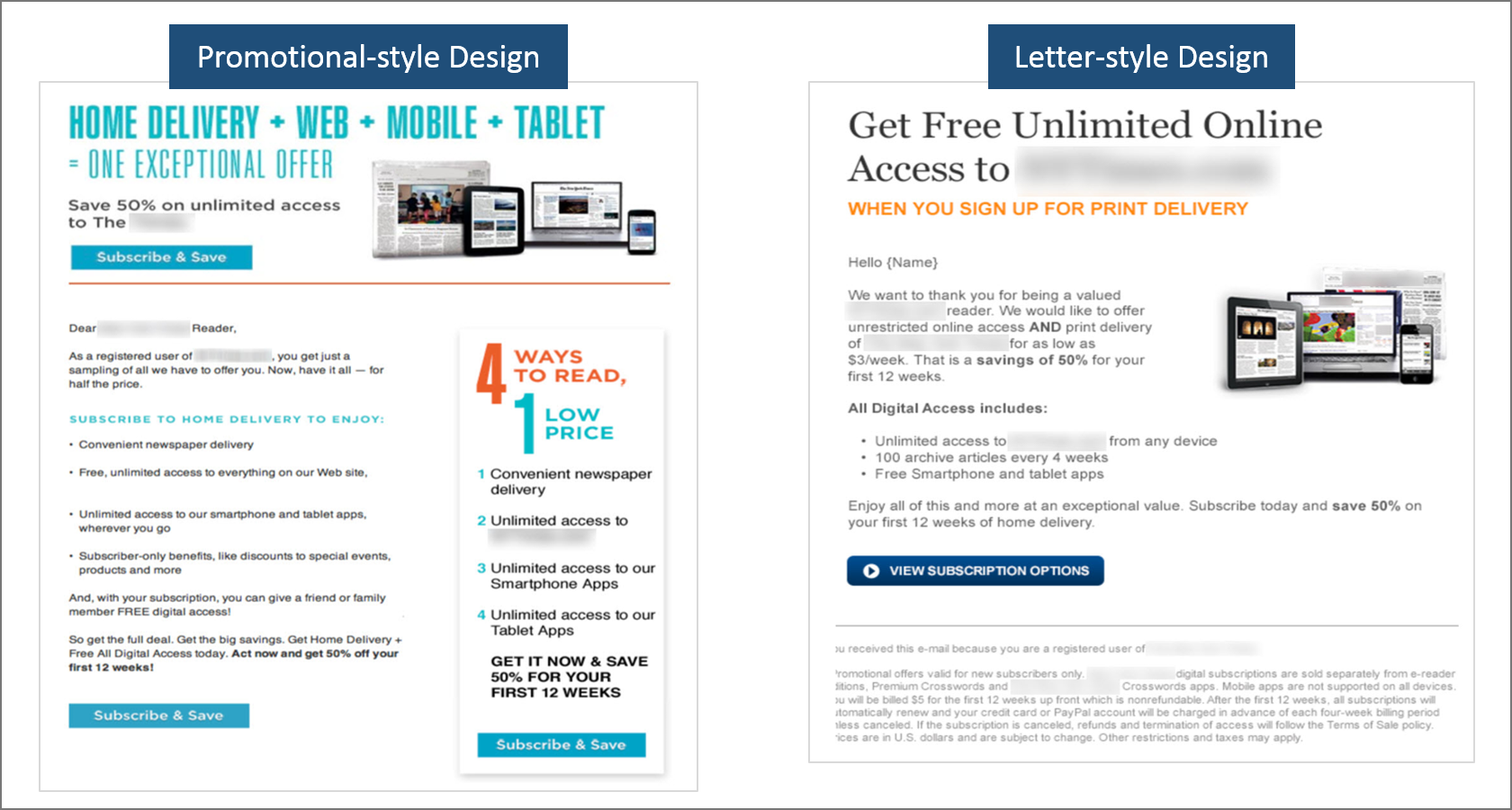
Testing Opportunity #15. Letter-style design versus promotional-style design
Designing emails can be fun — from finding the right graphics or images, to choosing different layouts. However, does your audience want those design extras? Or do they just get in their way?
A MECLABS Institute Research Partner tested a typical promotional-styled email against a simpler letter-styled email to see which design resulted in more engagement.
The letter-style design generated a 181% increase in conversion over the standard, promotional-style email.
Testing Opportunity #16. Imagery and graphics
Once you know your audience more actively engages with emails that use graphics or imagery, the next step is the find the most effective imagery or graphics.
For example, if you sell software, does your audience respond better to an image of someone using a computer or of detailed screenshots of your product in action?
Or is a static image best at all?
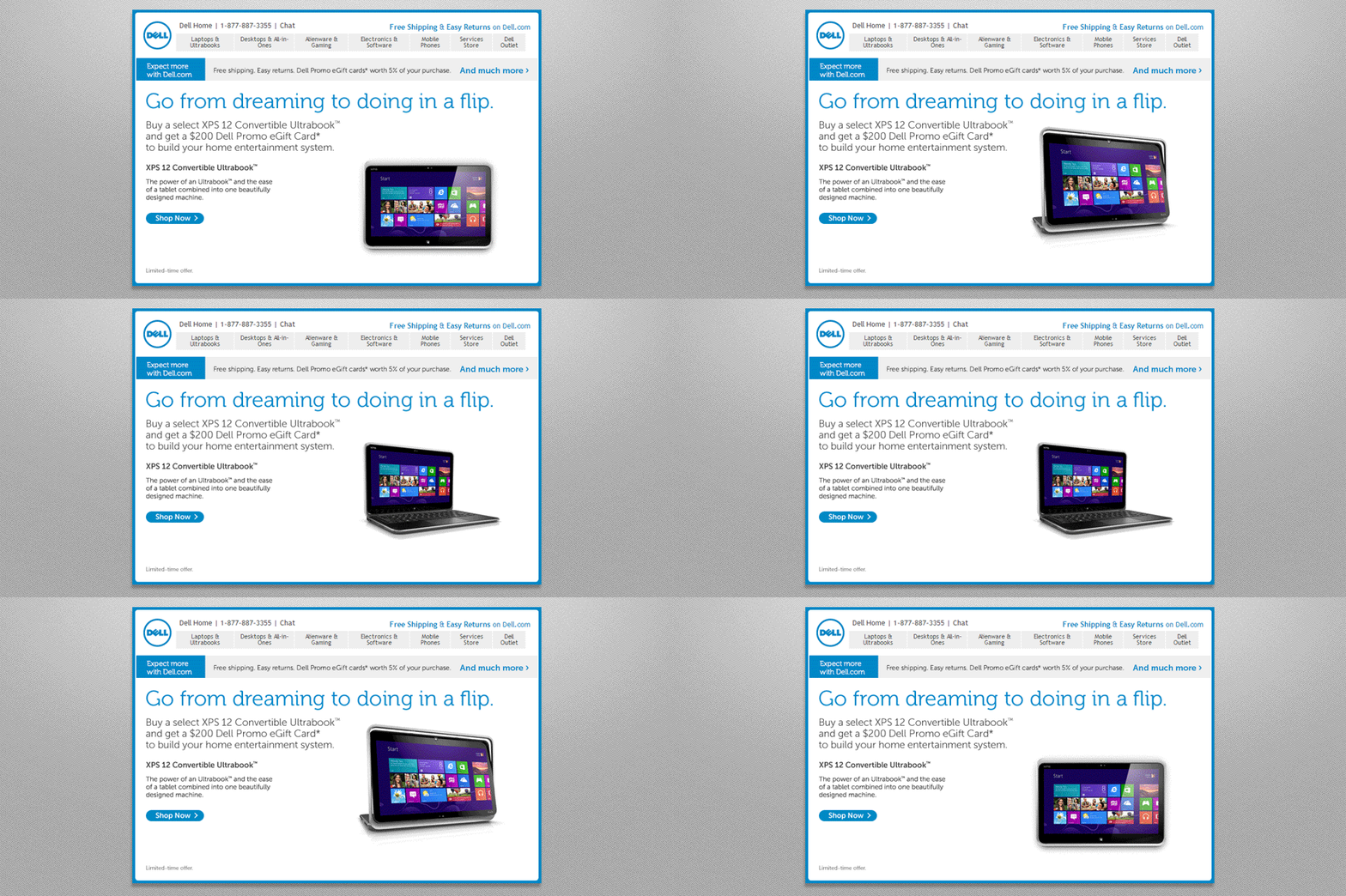
When Dell set out to market a new laptop that could convert into a tablet, an image just didn’t seem to do the transformation justice. The Dell team came up with the idea of utilizing a GIF to illustrate the morphing computer.
“I think [GIFs] are a good way for people to communicate what their main story is very quickly,” said David Sierk, Email Strategy and Analytics, Dell. “People are visual learners.”
When compared to quarterly benchmarks, Dell’s first GIF-centric email resulted in these lifts:
· 6% increase in open rate
· 42% increase in clickthrough rate
· 103% increase in conversion rate
· 109% increase in revenue
And the list could go on
The list could go on for a good long while, but hopefully these 16 opportunities can get your started. And that’s the important part: getting started. You don’t have to start big, and you don’t have to completely redesign every aspect of your email in one go. You can design a series of experiments to slowly build your customer theory and knowledge.
I’d also love to know what email tests have worked well and provided you with insight about your audiences. Leave your testing ideas in the comments below. And if you find success with any of these testing opportunities, let us know at editor@marketingexperiments.com.
You might also like
MECLABS Email Messaging Online Course [From MECLABS Institute, parent company of MarketingExperiments]
Email Marketing: Template test drives double-digit increases for Dell [MarketingSherpa case study]
Marketing Research Chart: How do customers want to communicate? [MarketingSherpa chart]
Tips for Incorporating GIFs in Email [From MarketingSherpa Blog]


