At our web clinics and optimization training workshops, two of the most frequent questions are: “What else can I test?” and “Do you have a good example?” MarketingExperiments research analysts provide practical test ideas and examples in the “What else can I test?” column.
According to the “2010 Media Planning Intelligence Study” from the Center for Media Research, email marketing is still the most preferred and effective way channel marketers have to communicate directly with their customers. It is also the preferred method of communication by consumers as well. In its Email Benchmark Guide 2009, MarketingSherpa reported that consumers overwhelmingly identify email as the ‘best way for companies to communicate with me’ (see survey results).
In this post, we are going to review several tactics you can consider to improve the look and feel of your emails and, in so doing, increase clickthrough rate. However, please remember that improving email response starts even before designing the layout and content of your email. It’s very important you look at how to increase qualified opt-ins, rate of deliverability, quality of rented list, etc. These are topics we will review in future posts. Improving the content and layout of your emails can give you quick a win. Also, if you start testing now, you can be ready for great a performing email template for the holiday season.
Note: most of the email examples I’m using are from ecommerce retailers, but the same principles apply to services or B2B emails.
Here are eight tactics that you can use or re-visit to increase your email clickthrough rate:
1) Analyze and segment your list. No matter when or how frequently you send emails, if they are not relevant, you will never achieve the highest possible response. A customer segmentation analysis will help you increase relevance by identifying the number of unique customer segments and their main product/service interest. With this information, you can not only target the content of your emails better, but also reduce the number of calls to action per email; preferably to only one call to action (see NextStage Evolution study results of ‘Raising clicks: Reduce the Number of Actions‘).
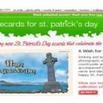
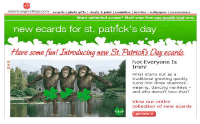
As an example, I can cite a recent case study from MarketingSherpa that explains how The American Greetings team got a 70% lift in conversions from a simple email test that matched subscribers’ preferences to content in the offer. In short, they started from zero by analyzing the lifecycle of their subscribers, type of ecards they sent, and type of senders they were. For St. Patrick’s Day, American Greetings team designed two versions of the email – one promoting a traditional St. Patrick’s Day e-card, the other promoting a humorous St. Patrick’s Day e-card. Conversions, in this case, were people who went to the site after seeing the email and purchased the e-card or a $15.99 annual subscription. See email designs below:
 |
 |
FYI – If you are interested in reading more about segmentation analysis, here is a great article from iMedia with application examples: Email Segmentation for Success
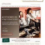
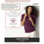
2) Maintain continuity from subject line to headline to call to action. The role of the subject line is to either match a specific motivation of your customers or spark it. In any case, once they are motivated by your subject line, the role of your email is to maintain and strengthen that motivation. Therefore it is important to re-state or support the offer in the body and call to action. However, don’t go overboard with long copy. Remember that the goal of the email is to get a click, not to do the sale. Short copy and bullet points are usually all you need to support the offer. See ‘not this, but this’ examples:
 |
 |
 |
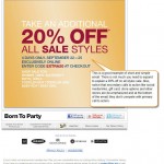
3) Use simple and vertical layouts. As mentioned before, try as much as possible to design your email body for one specific call to action. Secondary calls to actions and support links can be present in the email but they need to be clearly de-emphasized. Consider always an email template that guides the eye path from top (headline) to bottom (copy and call to action). The same principles that we recommend to landing pages apply to emails (see Optimizing Offer Pages). In case you have seen that presenting multiple offers works better with your target customers, then I recommend using a vertical layout; list offers in order of profitability for your business. Usually the first offer on the email is the one that will receive the most clicks. See examples:
 |
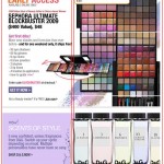 |
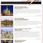 |
4) Make sure your CTA stands out. Although you can design emails to be clickable anywhere in the body, it helps if you drive customers’ attention to a specific call to action. The more you can guide your customers’ eye-path to certain action the better the chances they will perform that action. At the end it is all about reducing unsupervised thinking! See ‘not this, but this’ examples:
 |
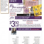 |
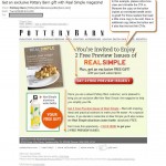 |
 |
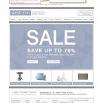
5) Offer alternative-view options. In cases when images are blocked or customers are checking the email from their cell phones, it helps to present the offer with simple text links at the top of the email. Just adding clear, easy-to-follow text links can increase the opportunities for your customers to read and act on your emails. See ‘not this, but this’ examples:
 |
 |
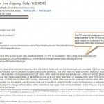
6) Try a PS note. A PS note is a great resource to complement the offer or add an additional incentive for customers to click. In terms of usability, PS notes are not only effective with those customers who were not sold initially and needed an additional push, but it is also effective with those customers who open the email and scan it from top to bottom to get a sense of what the whole email is about. When they scan from bottom up there is a chance they will act on the PS note of the email. See example:
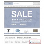
7) Leverage the footer for social media. We all want our customers to follow us in any way and everywhere. However, most of the time calls to action to become fan or followers are secondary goals on most email campaigns. The footer is a great place for secondary objectives like this one. The calls to action are not in the way of the main offer and do not compete with the primary call to action. See example:
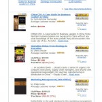
8 ) Advertise other products or present up/cross sells subtly. The same way visitors are used to identifying the left column of a web page as an advertising area, they identify the left column of an email or newsletter as another advertising area. As a result, the effectiveness of the advertising in your emails is minimal. Customers learn to automatically avoid this area. The most effective way to fight banner blindness is to place advertising in unusual places or use uncommon formats (atypical banner sizes and contextual text links instead of banners). See examples: (Amazon.com, 1-800-Flowers).
 |
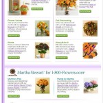 |
Let us know if you test any of these variations with your email campaigns and how they do. Also, feel free to share with us any other ideas that you have seen working really well.
Not sure what you should test next? Want to share your testing ideas, questions or feedback on this topic? Use the comments section below or tweet me at: @anagabydiaz


Outstanding article, Gaby. Love the use of good and bad examples. I posted a blog about the importance of sementing an audience but you just put me to shame. Time to take my post down and rework it!
Thanks a lot, Tyler! Glad you enjoy it…
“segmenting” not sementing in my previous comment
Thanks for the nod to our research. For those interested, you can find our full report at http://tinyurl.com/nseemail1
Thanks,
Joseph Carrabis
CRO, NextStage
Great advice…I’ve never done any segmentation analysis, that seems like some awesome stuff