Friction: 3 simple optimization tactics to get more customers from headline to call-to-action
You might have a highly optimized headline …
And you might have a highly optimized call-to-action …
But if customers never get from the headline to the call-to-action, what’s the point of that optimized headline and call-to-action to begin with?
Dr. Flint McGlaughlin, Managing Director, MECLABS, discusses the major impediment that stops your customers from ever seeing your CTA — friction — in this video recording of a recent Web clinic planning meeting.
For the purposes of the MarketingExperiments testing methodology, friction is defined as a psychological resistance to a given element in the sales or sign-up process.
There are three basic elements you can optimize to reduce friction and get more customers from your headline to your CTA. We’ll take a quick look at these basic elements, and then dive into seven more commonly overlooked causes of friction in our next free Web clinic – Silent Conversion Killers: How overcoming hidden friction boosted conversion 166%.
There are three types of low-hanging fruit to look for when optimizing to reduce friction:
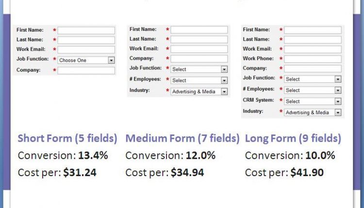
1. The number of form fields
Less form fields usually equals more form completions. Here is an example test run by Marketo:
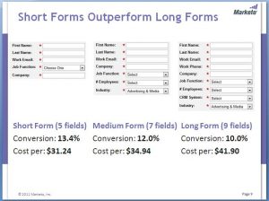
And a deeper look at the results…

2. The number of steps in a process
The more hoops you make your potential customers jump through, the less customers that will stick around until the end of that process. Here’s an example …
Before: The first page of a three-step process
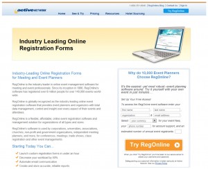
After: The first page of the optimized, two-step process
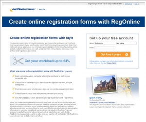
Results

3. The length of the page itself
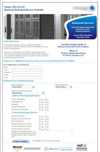
All other things being equal (and we’ll get into the deeper complexities of this on the Web clinic), a shorter page tends to be easier to get through for customers, and therefore, less customers tend to bounce on shorter pages.
Here’s an example test with a Research Partner:
Before (please note, the creative sample has been anonymized to protect the Research Partner’s competitive advantage)
After

Results
The new page outperformed the control by 188.46% with a statistical confidence level of 95%.
Related Resources:
Next Web clinic – Silent Conversion Killers: How overcoming hidden friction boosted conversion 166% — Wednesday, Mar 14, 2012, 4:00-5:00 p.m. EDT
Minor Changes, Major Lifts: How headline and call-to-action optimization increased conversion 45% (Web clinic replay)
Landing Page Optimization: Identifying friction to increase conversion and win a Nobel Prize


Interesting article, I’ve recently been optmising my website and one of the areas of friction that I’m considering is multiple calls to action.
My site has several calls to action in different places on the same page – is this likely to cause friction meaning it would it be better to have max two calls to action (a “Submit button” and some text calling for the submission?) Or is it a case of the more calls to action the merrier?
Perhaps this could make an interesting case study for Marketing experiments?
Many thanks for all the case studies so far,
Sam