Quick Lift Ideas: How switching a headline with a sub-headline could increase conversion (+6 more ideas)
In an ideal world Dr. Flint McGlaughlin’s memorable testing quote would be true 100% of the time: “The goal of a test is not to get a lift, but rather to get a learning.”
But in the real world where marketers are faced with deadlines, tight budgets, and skeptical superiors, sometimes you have to design a test for the purpose of a lift so that you can THEN start testing for learnings.
So how do you get a quick lift on your pages?
Well there’s no catch all answer for every page. If you’ve been hanging around MarketingExperiments long enough, you know that. And when there’s no catch-all answer, the best way to learn is through examples.
With that in mind, here’s an example of an email and landing page combination that Senior Research Manager Jon Powell and Managing Director Flint McGlaughlin gave quick suggestions for in a recent web clinic – Crafting an Engaging Email Message: How a properly focused email message can increase conversion by 85%…
Background Info:
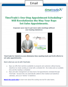
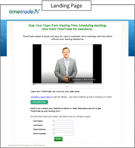
The page was submitted by Kathy of TimeTrade.com. TimeTrade is an Enterprise-class online appointment scheduling software solution. The goal of the email is to get the reader to click the link and watch the video. Then, once on the landing page, the goal is to fill out the form and become a lead.
Email:

Quick Lift Idea #1: Switch the Headline with the Sub-Headline
One idea for a quick lift would be to switch the headline with the sub-headline. As Dr. Flint McGlaughlin pointed out, the sub-headline is actually a stronger headline than the current headline.
This is because the sub-headline actually communicates the real value of the product rather than announcing some intangible future value the reader could get.
Granted, as Flint further clarifies, both headlines could be improved and re-worked but switching them is a great place to start.
- Transferable Principle – Headlines that communicate what the visitor will get tend to outperform headlines that tell the visitor some intangible piece of information.
Quick Lift Idea #2: Make “Play” button more visible
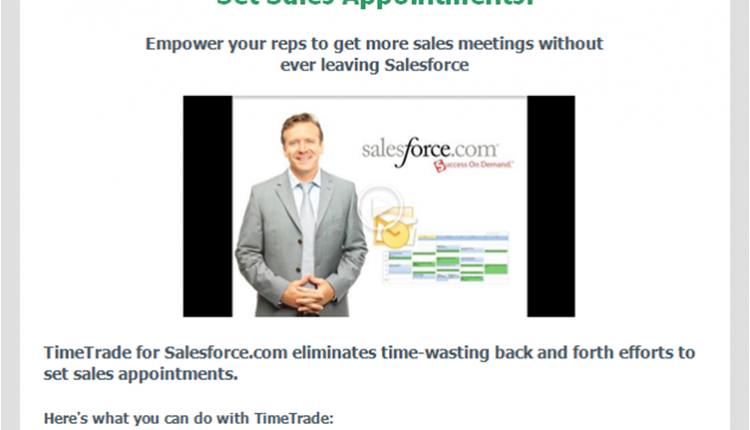
One of the first things Jon pointed out is the visibility of the “play” button. If the goal of this page is to get a click on the video, then making the picture look more like a playable video could potentially increase clicks.
As it stands, the “play” button looks more like a watermark. It’s hard to see and as a result it’s hard to tell the picture is supposed to be a video.
The way to fix this and potentially get a quick lift in the conversion rate would be to make the “play” button more visible.
- Transferable Principle – Clarity trumps persuasion. Making elements of the page clearly communicate where the customer is, what they can do, and why they should do it will probably give you a boost in conversion.
Quick Lift Idea #3: Change the screenshot for the video
Making the screenshot for the video a little more exciting could generate more clicks to the landing page. In the clinic Flint mentioned that “the first frame should be so exciting they have to click to see what happens next.”
- Transferable Principle – Giving your videos an exciting first frame could help your conversion rate.
Landing Page:

Quick Lift Idea #4: Add a step in the form
As Jon pointed out on the Web clinic, one way to improve conversion on this landing page might be to add a second step to the form.
As it stands, the form takes on some friction when it asks for a phone number. In this case many of the visitors might be leaving the form unfilled because of it.
Assuming TimeTrade really needs a phone number from their leads, taking that phone field off the first and making it a second step on a second page could help capture more total leads.
This way the people that aren’t willing to fill out the phone field could be captured and, as Jon puts it, “re-marketed” to. While the people that are willing to give out their phone number could be asked something like, “How else can we contact you?” or even “Can we contact you by phone?” on the second page.
- Transferable Principle – Adding a second step in your form process can potentially help you capture both lower-quality and higher-quality leads instead of just the higher-quality ones.
Quick Lift Idea #5: Provide continuity from email to landing page
Every time a reader transitions from one page to another on the Web, there is a moment of orientation. And as Jon mentioned in the Web clinic, if the recipient of the email clicked on the play link in the email, the first thing he or she would expect to see on the landing page would be the video playing.
Having the video auto play the moment the visitor lands on the page could increase conversion in this case.
- Transferable Principle – Providing continuity between the channel and the landing page almost always increases conversion because the visitor can quickly gather where they are and what they’re supposed to do.
Quick Lift Idea #6: Improve the Call to Action Button
Another way to quickly get a lift on this page is to improve the copy on the button.
Buttons that communicate value are often clicked on more than ones with simple messages like “submit” or “send.”
Not only that but as Dr. McGlaughlin often points out, “submit” has a lot of connotations that can influence the potential visitor in a negative way.
- Transferable Principle – By communicating value in your buttons, you’re giving your visitor a better idea of what is on the other side of the button and what they will get in return for clicking that button. This strategy often increases conversion rate in our tests.
Quick Lift Idea #7: Eliminate multiple calls to action
Multiple calls to action almost always mitigate conversion. Because there are two CTAs on this page, it is probably creating confusion in the mind of the visitor. They won’t know which button to click.
Eliminating one of those calls to action is likely going to be one of the best ways to get a quick lift on this page.
- Transferable Principle – On a landing page, you usually want to guide your visitors to a single decision. Anything else usually hurts conversion.
[Author’s note: Thanks for reading. Could you do me a favor and leave me some feedback in the comments about whether or not this “quick lifts” type of post was helpful? I’m thinking of doing more in the future, but if you don’t think it’s valuable I would obviously want to focus my energy elsewhere. :)]
Related Resources:
Banner Ad Design: The 3 key banner objectives that drove a 285% lift – Our next Web clinic including live optimization of audience banners.
Website Optimization: 7 ways to reduce the perceived cost of lead generation offers
Website Optimization: How you can improve conversion by finding your buried treasure
Email Testing: More specific subject line improves open rate by more than 35%


yes I found these quick life ideas to be helpful.
oops meant quick lift
Extremely helpful in providing both a possible “fix” and the rationale. Please do more.