The first week of a new job can fill a person with anxiety. I should know, as I recently finished my first week as MECLABS’s new Junior Copy Editor. Lucky for me, any concern was answered by just a quick question or click of the mouse. The proximity (a click or call away), specificity (resources like previous articles and a company Style Guide) and intensity (“reply all” gets answers from multiple people) of each answer eased my anxiety. Optimizing your landing page can do exactly the same for your website visitors.
One of the many things I did during my first week was complete the MECLABS Landing Page Optimization Online Certification Course. While I enjoyed all of the sessions, the section on anxiety most stood out.
Like many of you, I have left websites on which I didn’t feel safe entering my information. Sometimes, I could easily pinpoint my anxiety. But other times, even as a visitor, I didn’t know what specific factors left me with such concern. This session of the course helped quell my doubts, from both the customer and marketer points-of-view.
Anxiety about entering information
As part of the MECLABS Conversion Sequence, anxiety refers to the psychological concern stimulated by a given element in the conversion process. In other words, people are concerned about whether they will receive the value promised and if they will be abused in the process.
While the Conversion Sequence can be used a fully functioning equation, it acts more as a framework that brings clarity to analysis of the conversion process. It pinpoints where to spend your optimization energy to improve your conversion rate.
C = 4m + 3v + 2( i-f) – 2a
Wherein:
C = Probability of conversion
m = Motivation of user (when)
v = Clarity of the value proposition (why)
i = Incentive to take action
f = Friction elements of process
a = Anxiety about entering information
Anxiety can stop website visitors in their tracks – the back button makes it ultra easy. Thinking of their concerns in rational terms may not help you either. Fortunately, the LPO course delves into each of the three different levels you can seek to relieve or correct anxiety:
- Specificity
- Proximity
- Intensity
Specificity
In order to counteract customer anxiety, you must first identify the source of the anxiety, and effectively address each concern. Depending on the website, different sources of anxiety will arise for the visitor. However, there are some common concerns you may need to address:
- Quality
- Reliability
- Security
- Price
The secret to effectively resolving customer anxiety rests upon the source of your answer. There are many ways to make specific corrections to these common concerns. However, simply tooting your own horn won’t work with customers. Today’s Internet consumers have become wary because of Internet scams and fraud. Consumers must trust in you to do business with your company.
Using third-party seals and customer testimonials will speak volumes more than the claims you make yourself and help establish that much needed trust. Choose customer reviews showcase answers to possible consumer concerns. If you want to resolve anxiety about product quality, provide a testimonial that focuses on the high-quality construction of your products and the helpful step-by-step instructions that were easy to follow.
Proximity
After you’ve found a way to specifically address every source from which a customer could experience anxiety, you have to figure out where to place these anxiety reducers on your page. Proximity is about placing the corrective measures you formed with specificity in a place where a visitor will experience them simultaneously with the source of anxiety.
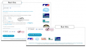
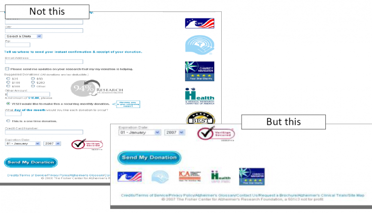
If the solution to the anxiety is out of the eye-path of the anxiety source, the solution isn’t going to do you much good. Proximity and specificity go hand-in-hand. You can’t do one effectively without the other. Below is an example from the LPO course that I identified with having previously worked in the nonprofit field.

If you follow the eye-path in the “Not this,” you land at the “Send My Donation” call-to-action without seeing any third-party confirmation of the organization’s credibility. By moving the credibility indicators closer to the call-to-action, like in the “But this” example, you correct customer anxiety about credibility.
You want to reinforce the fact that other people are doing this, and that it is a good thing to do.
Intensity
The intensity level of corrective measure must address two things: the substance and perception of the concern. The substance requires you to address the rational foundation of an anxiety source on a realistic view of risk.
However, you must also overcome perception, as it requires extra attention because of the amplifying affect fear-borne anxiety can produce. Because a customer’s perception of a particular anxiety can extend beyond what you would evaluate as realistic, you must over-correct for each source of anxiety.
There are many ways to affect an over-correction; below are just a few listed in the LPO course.
External factors
- Security Seals
- Testimonials
- Third-party ratings
Internal factors
- Copy
- Signatures
- Privacy Policy
One of my biggest online anxieties comes from free trials requiring my credit card information. These days, to locate a free trial that doesn’t have this requirement is like finding a needle in a haystack. Most times, I leave without a free trial because the website doesn’t sufficiently meet my anxiety level.
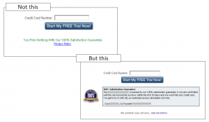
The below “Not this, But this” example shows how intensity could have corrected my anxiety and gained conversion for those missed free trials.

The “Not this” example does try to relieve anxiety about giving a credit card number. However, the one line of text does not meet the amplified anxiety that perception can produce. The consumers need to know, in no uncertain terms, that their card is safe from charge if they are not happy with the trial.
The “But this” example does just this. Plus, the guarantee is electronically signed by the co-founder. Key point to remember, according to Flint McGlaughlin, Managing Director, MECLABS, “People don’t buy from companies; they buy from people.” This electronic signature gives customers a person to buy from, to associate with the company. It also gives their concern the extra attention it needs, and it comes straight from the top of the company.
The more thorough explanation with a person standing behind it helps to overcorrect any possible consumer anxiety.
Lesson of the day
To successfully optimize your landing page, you must incorporate all three levels of correcting sources of anxiety. Utilizing any one without the other two will compromise your optimization efforts, and possibly limit your ROI.
More than landing pages and anxiety, the foundations you learn from this online course extend to other areas of marketing. For instance, as a copy editor, it’s important to recognize the marketing department’s reasoning behind certain copy. Understanding all parts of the Conversion Sequence (e.g., value proposition, motivation, anxiety, friction, etc.), helps me make effective edits in all channels of communications.
But you don’t have to take my word for it. To discover more about anxiety, LPO and the other courses offered, check out MarketingExperiment’s paid Online Certification Courses.
Related Resources:
Landing Page Optimization: Test ideas for B2B lead capture page
Webinar Replay – Maximizing the ROI of website traffic by reducing visitor anxiety
2011 Landing Page Optimization Benchmark Report


Nice post Selena. Welcome to the blog!
Good post. In addition to diffusing anxiety, I think there are a couple of other factors that must be addressed with landing page optimization:
1. Removing distractions: All navigation away from the landing page should be stripped out. This includes top and side navigation that may be part of the template of every other page on the website — this is counter-intuitive for most web developers who have been schooled in enabling free flowing traffic across their websites. Also, I recently optimized a page that cited editorial reviews of my client’s product, and I stripped out the hyperlinks connecting to those reviews. Your landing page should function like a cattle chute with the only possible path through the page being your call to action. (Sorry, I know that is a crude analogy for your prospects and customers!) Also, strip out unnecessary copy and graphics, less is more.
2. Creating a compelling call to action: Sometimes you get so focused on selling to get the click (on a PPC ad, banner design, or website copy on an inbound page) that you forget to sell on your landing page to get the conversion. As you say in your post, you must convince them they will receive value, and don’t assume you have done that sufficiently just because you convinced someone to click through to your landing page.
I just completed a landing page optimization project where I doubled the conversion rate and reduced by half the cost per converted lead. Check out the SlideShare showing how I did it here: http://bit.ly/hebeisen-landpg-s
Why won’t you post my simple questions?
@Sean Golliher We wouldn’t do that. We always want to hear and learn from our readers. You will find your questions posted on the blog post that you originally posted them on.
This article is absolutely fantastic!!! I totally concur with this information and find it a very valuable lesson to learn… in fact I am taking the Landing page optimization certificate course and will use this knowledge as another tool in my tool box of business knowledge… Thanks.