Recently, MECLABS Institute, parent company of MarketingExperiments, distributed an internal survey to find out what elements or factors people consider when evaluating a website for the following attributes:
- Appearance of the website
- Clarity of the information provided
- Timeliness of completing purchase
- Ease of placing an order or making account changes on the site
- Ease of navigating the website
To do this, the team that distributed the survey asked five open questions and allowed responders to answer them as they chose. After each question, they asked the responders to rank their top three factors or elements that correlated with the question asked.
In total, there were 13 anonymous responders that the team estimated were almost evenly split between MECLABS’ content production team and our services department, which actively builds, tests and evaluates websites on a daily basis.
After the distribution team received the results, they looked at the most commonly mentioned element or function and determined which elements are the most important when reviewing a website.
They took the results and used a word cloud to visually represent the answers. To that end, the three most commonly mentioned factors on the whole survey were:
When looking at the totality of a website, people want information that is clear and easy to understand while allowing them to see the value of the website and its services.
In order to find out the important elements or factors that affect the evaluation of a webpage, the distribution team asked the following questions and received the following answers.
Note: The answers to each of the following survey questions have been broken into categories. These categories were not part of the survey’s original questions but are themes determined by the distribution team in order to organize the results.
Also, the question and answers concerned with layout (located under “Appearance of the website”) are different than the category layout. The question and answers refer to the layout of a webpage as a whole, whereas the layout category refers to the layout of that specific element of a website.
Appearance of the website
What factors or elements do you consider when judging the appearance of a website?
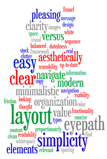
- Whitespace, visual spacing of elements, balanced elements, minimalistic, simplicity, organization of information, clear eye path, easily scannable
Navigation/Navigating
- Clear funnel, easy to find what I’m looking for, clean navigation, thought sequence
Content
- Value, clarity, typos, readability, clear and concise copy, clarity of message
Aesthetics
- Color, real versus stock images, pleasing to the eye, aesthetically pleasing, datedness, modern
Functionality
- Functionality, up-to-date framework
The most common factor when determining the appearance of a website is its layout. It’s important to balance visual elements with the whitespace of the webpage to create a clear eye path that directs you into the elements you really want people to spend more time viewing.
Layout was the most commonly used term when answering this question, but another equally important factor mentioned by the responders was how dated versus how modern a website is.
You can have a great layout, but if it doesn’t age well, it will negatively affect the overall feel of your website. Be sure to talk with your designers about new design trends and which ones you should incorporate into your webpage.
Clarity of information provided
What factors or elements do you consider when judging the clarity of information on a website?
- Easy to read, language used, confusing words, voice, language that is easy to understand
Format/Design
- Size and spacing, proper use of spacing, format and layout of text, presentation of content, aesthetically pleasing, organization of content, images and illustrations to understand complex information
Credibility
- Syntax and grammar, credibility, evidentials, quantification
Amount of content/Flow of content
- Amount of detail, value, brevity, relevancy, simplicity, scannability, clear headlines/sub headlines and supporting content, bold messaging/hierarchy of content
The most common factor in determining the clarity of information on a website is (no surprise here) content.
One responder stated:
Is the content legible and easy to read? If we don’t have this, then internalizing that information will be much more difficult. Typography choices can affect this significantly. Serif fonts are better on the eyes for large blocks of text versus titles, for example. If the material is dense, is it digestible through use of appropriate headings and sub headings? Voice is also important. Generally speaking, a message that can be conveyed in few words is better than more as well.
Make sure your writing is easy to read, and placed in a layout that allows the website visitor to easily scan the page for the most important information to them.
Timeliness of completing purchase
What factors or elements in regards to time on a site affect your satisfaction with that site?
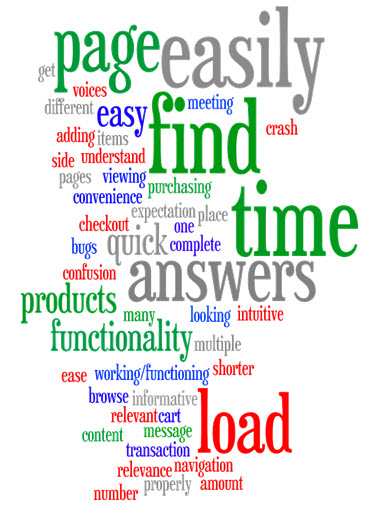
- Does it work, load time, intuitive functionality, quick load/response times, working/functioning properly
Pages/Time to complete transaction
- Page numbers required, quick checkout, time to complete transaction
Ease of navigating
- Easy to find what I’m looking for, get what I was looking for, relevance, easily find answers, ease of adding to cart, ease of finding product
Convenience
- Other relevant products to browse, allows for easy viewing, purchasing multiple items in one place
Clarity
- Amount of content, informative, confusion, quick and easy to understand message
The most important element that affects the time users spent on the site was functionality. Does the site work? How quickly can I find what I am looking for? Does the site use breadcrumbs to lead users to answers of frequently asked questions about your products or services?
To that end, another important factor is convenience:
I will spend much more time on a website if I am also interested in other products that I may not need, but I may as well purchase them now while I’m here. The convenience is a huge factor here, and the ability to make one purchase for all of my needs will trump nine out of 10 websites, as long as the cost is within a feasible range.
Ease of placing an order on a website
What factors or elements do you consider when judging the ease of placing your order or making account changes on a website?
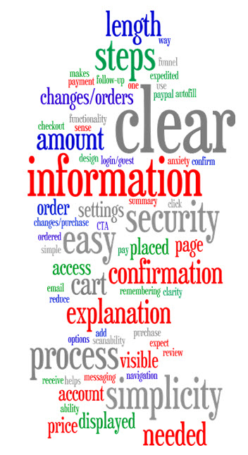
- Does it work, expedited payment options, one-click purchase, ability to autofill information, remembering my information
Credibility
- Security and validation issues, security, protected information, security of process
Process
- Easy to pay, easy to add to cart, length of process, amount of steps, simplicity of process, easy access to account settings, asking necessary information for order, clear steps and navigation
Layout/Design
- Design, scanability, spacing and clarity to avoid clutter
Clarity
- Visible cart, clear summary of when I should receive my order, clear price displayed on my charge, review order page, confirmation page, simplicity, CTA clarity
The shopping cart adds factors from the three previous elements, with the most important factor being functionality.
Does the website make it clear what I have to do in order to purchase a product? Is what I have to do and why easily displayed in a correct layout that leads you down the purchasing funnel after you’ve decided to make a purchase?
These elements affect bounce rates as well as the time it takes to complete an order. Invest in making your shopping cart experience as seamless as possible.
Ease of navigation on a website
What factors or elements do you consider when judging the ease of navigating on a website?
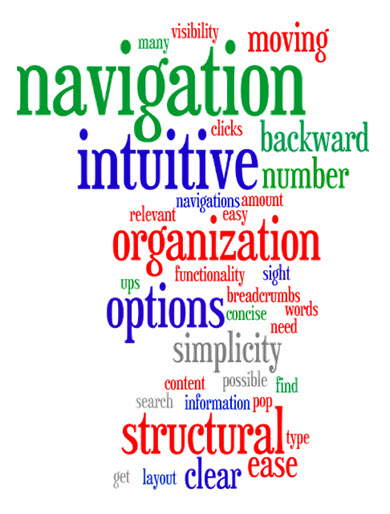
- No pop ups, search functionality
Organization
- Visibility of all relevant content, clarity of what the categories are for navigation, number of options, type of options, sequence of options, hierarchy, few clicks as possible to get to what I need, simplicity, sight navigation, structural organization, easy to find navigation tool
Logic
- Breadcrumbs, amount of information, concise words, clear, intuitive, ease of moving backward, simplicity
According to our responders, a website’s navigation should be intuitive without the use of pop-ups or java over-lays. It should be logical with clarity concerning what the categories are for navigation, and the user should able to easily find the main navigation piece of the website.
Simple navigation is key. It should appear throughout the website regardless of what page it’s on.
Note: The internal survey mentioned in this post was based off of a 2015 J.D. Powers survey on wireless purchase experience.
You might also like
B2B Web Optimization: 140% surge in mobile transactions through responsive design effort (MarketingSherpa case study)
New Chart: Best website design, management and optimization tactics for 2011 (MarketingSherpa case study)
20 Steps to the Perfect Website Layout (from Creative Bloq)
The Big Web Design Trends for 2015 (from 99 Designs)
40+ Best Examples of Shopping Cart Page Designs (from MonsterPost)


