In a typical Landing Page Analysis, I methodically walk through a page identifying problems and providing potential solutions for testing. But for the landing page featured in this post, I’d like to recommend a more radical solution.
My primary recommendation: Get rid of the first step altogether!
The landing page was submitted by a recent attendee to a MarketingExperiments webinar, ShrinkYourself.com. The site’s name is a pretty clever pun as their primary product is a 12-week weight loss program that focuses on the connection between emotional health and dietary improvement.
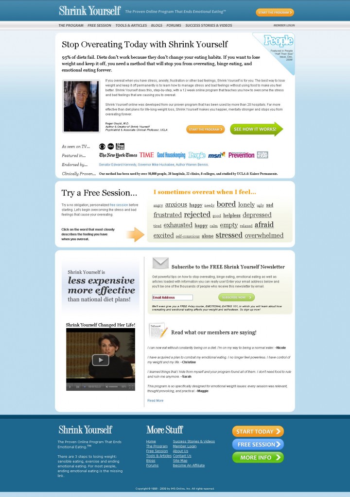
Here’s the page the site submitted:

A landing page walk through includes identifying friction, anxiety, and ways to improve communication of the value proposition but one of my favorite parts of the analysis process is to explore calls to action to see where they’ll take you.
What happens when I click the button?
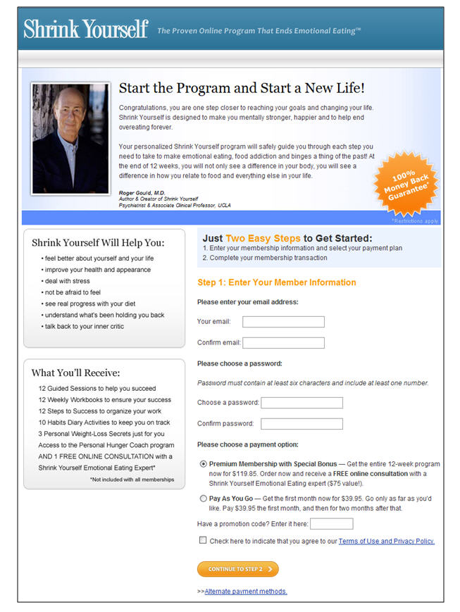
In this case, the landing page sends visitors to a second page that, with a few tweaks, could take the place of the first page. Check out the next page:

That first landing page is really nothing more than an extra step prospects must take to get to the primary offer and an extra step in a sales process, much like extra pounds, can be a big source of friction.
In addition, the second page has some key elements that would actually be more effective on a first page:
- 100% money back guarantee starburst
- Specific bullet points about the product components
I’m not suggesting entirely eliminating the first page. Instead, use aspects of it to modify the second step to make that one a legitimate landing page. Modification includes using the headline, sub-headline, and copy from the first page, all of which are pretty strong. On your revised landing page, consider placing the credibility indicators on the left column as well.
Combining the two pages would take a process that’s currently a little top-heavy and make it leaner. Keep in mind, it may be that your current landing page works well. Perhaps your ideal prospects need a longer period of discovery before signing up for the program. Or it may be that a unnecessary steps mean that folks abandon your pages in favor of a program whose streamlined single-page registration form suggests quicker weight loss results.
But you’ll never know unless you test it.
Good luck! Let us know if you decide to test this strategy and what your results are.


I like the idea of condensing/combining the two into one page but what about the potential length of the page and/or information overload? Is there an ‘optimum’ length or a point where people stop scrolling to get to the bottom?
Hi Kris,
Optimal page length is something that will vary from site to site. We’ve tested short copy, long copy, medium copy, and they all work equally well depending on your target audience. Before we run a test, we do a data analysis first. What is the key demographic? Depending on age, occupation, and gender,we make an educated guess about how long a page should be. Does the audience like to read or do they respond well to lots of images? Are they quickly sold on something or do we need to provide them with ample facts?
But I will say this, CONTENT is king. If you have great content on your landing page, your ideal customers will read almost any length. If you don’t, then a short page that highlights only the key points may perform better. The best thing you can do is test. A test will objectively provide the answer.
For this particular landing page, I would not make the second page any longer. I would just adapt the top area and left column to communicate to the prospective customer as though this was the landing page. And as always, I hope they don’t take my word for it, but instead test it and let the results speak for themselves.
Thanks,
Adam