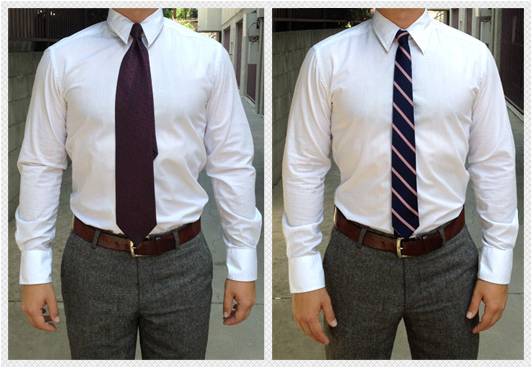
Now I don’t know very much about fashion, but I’m fine with this ignorance because I’m a guy. No offense to my co-worker, Thomas Southworth, who never ceases to amaze me with his contemporary style:
However, I have observed several fashion ideologies that are transferable to what I do every day between the hours of 9-5.
- Fashion trends change regularly
- Fashion is in the eye of the beholder
- Fashion is enhanced by accessories
The Volatility of Fashion Trends
Oscar Wilde once said, “Fashion is a form of ugliness so intolerable that we have to alter it every six months.” Indeed if you are not wearing a skinny tie then you are simply out of touch, which is funny because the skinny tie was all the rage 50 years ago.
Fashion changes in a flash, so what worked for you six months ago may be utterly inept today. In the same way, the webpage that you recently tested and validated as an optimized design may be outdated and ineffective a year from now.
What can the marketer learn from the fashionista?
Testing is a never-ending process. And you cannot expect something that worked last year to work today. People change, your competitors get stronger, technology improves, market values shift, and so on and so forth. So keep testing and always revisit previously optimized pages to try new and innovative ideas.
Also, don’t be afraid to try what may be considered “antiquated” ideas. Just because the current design trend is short, above-the-fold pages, that doesn’t mean that the long copy pages of the ‘90s can’t make a comeback.
Embracing Your Unique Style
“The best color in the whole world, is the one that looks good, on you!” This statement by Coco Chanel about fashion resonates even more loudly when it comes to website optimization. I can’t tell you how many times we’ve presented a treatment of a homepage to be tested and the Research Partner says, “But that doesn’t look like a homepage.”
Exactly! I’m not trying to create a homepage that adheres to the current trend, I’m trying to create one that works for you. Sometimes they are one and the same, and sometimes we have to break the norm and tell “Best Practices” to kiss off.
Marketers that mimic their competitors’ websites are simply pooling each other’s ignorance together. I’m sure my father’s response “If everyone was jumping off a bridge, would you?” is not an isolated one.
But that’s what we do. We look at websites and say, “they’re doing it so it must work” and copy it blindly.
So what if your homepage looks different than everyone else’s. If it works for you, then it is the best looking homepage in the whole world.
Accessorize Your Outfit
The great Giorgio Armani said, “[Accessories] can completely change the look of an outfit, and women like the idea of having a wardrobe that’s versatile. For instance, a strong piece of jewelry can make a simple outfit look elegant.”
In the same way, we should always “accessorize” our testing. Let me explain.
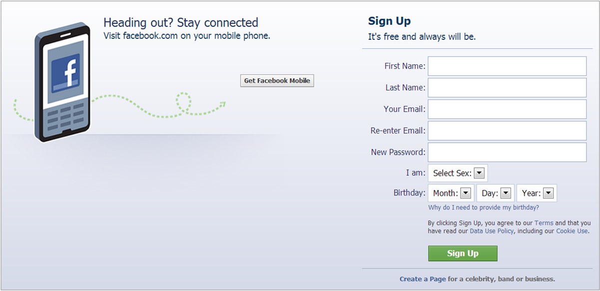
A well designed test always has a hypothesis. For example: “Reducing the sex and birthdate form fields on the Facebook registration page will reduce anxiety and thus increase the conversion rate.” And the treatment that reflects this hypothesis will either prove it to be true, or disprove it.
Example control page:

Example treatment page:

This is a simple enough test, right? If the treatment wins, then we know that asking for sex and birthdate had an adverse impact on conversion.
But to take a lesson from Armani, we can take this simple test and make it much more sophisticated by adding an accessory. This will come in the form of a secondary hypothesis that is proved or disproved by a second treatment: “Adding a security seal will reduce anxiety about information being used for marketing purposes and thus increase the conversion rate.”
Example treatment 2:

We just added an accessory to the treatment page and maximized the learnings we will get from a single test. Not only will we learn if a shorter form is more effective, but we’ll also learn if prospects are concerned about the security of their personal information.
I hope this analogy helps your optimization and testing efforts and remember to always be testing, design pages that work for you not your competitors, and maximize the learnings of each test.
Related Resources:
Landing Page Optimization: 4 test ideas for a free-trial, lead gen form page
Infographic: Landing pages for the complex sale
Landing Page Optimization: For the best test ideas, look beyond yourself
Homepage Optimization: 5 questions every marketing team should ask themselves


