This post picks up on the ideas we covered in part one and our ADMA webinar and applies them to an example page submitted by a webinar attendee.
Homepages that must speak simultaneously to multiple audiences are notoriously difficult to optimize. This is the main reason why you are better off driving traffic to channel-specific landing pages whenever possible.
Still, as long as you are getting uncategorized or direct traffic to the homepage, you will need to be able to detect the visitor’s motivation on the page.
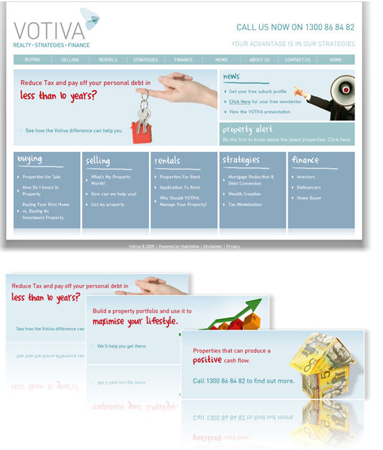
Let’s take a look at the opportunities for optimization on the homepage of one of our web clinic attendees, Votiva. The company provides several distinct real estate and related financial services in Australia, and it’s a challenge to communicate the right offer to first-time visitors.
In this post, I’ll walk through Votiva’s homepage with our three-question checklist in mind.
What’s the primary objective of the page?
Before we start optimization, we must identify the page’s objective, for which we’ll optimize. Judging from what I’m seeing on Votiva’s homepage, I’m assuming that the objective is two-fold:
- Communicate and support Votiva’s company value proposition, and
- Guide the visitor to the right category page.
My other assumption is that each category page, in turn, communicates the respective product value proposition.
I believe Votiva is on the right path with five prominently displayed category boxes. However, the lack of a conversation with the visitor on the page makes these boxes more prominent and lets them guide the visitor to the appropriate category.

Question 1: Where am I?
Of the three questions, Votiva does the best job on this one. The tagline (Realty * Strategies * Finance), top navigation link names, and the five boxes at the bottom do a good job of communicating almost instantly what Votiva is about.
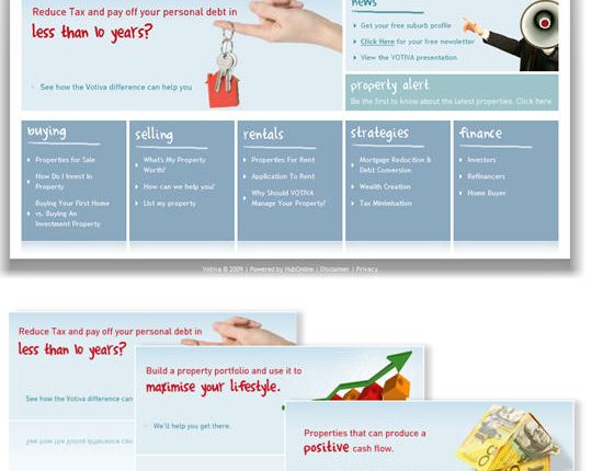
The animation on the left also provides useful information, but that information is only as useful as the likelihood of a visitor noticing the one frame that connects with his motivation. Expecting your visitors to wait for the entire animation to play out is wishful thinking. You haven’t given them enough reason yet to give you that much of their time.
The megaphone graphic on the right is possibly the single most visually prominent element on the page, and it’s entirely irrelevant to what Votiva is. It ultimately draws attention to the News box, which doesn’t help answer any of our three questions.
Question 2: What can I do here?
The answer that would help meet Votiva’s second objective — to drive visitors to the appropriate category — should be “I can click on a category that represents my potential (or existing) relationship with Votiva.”
The clearest answers to this question are the category and sub-category links at the bottom. Their prominence helps mitigate an otherwise unguided user experience.
This page has far too many options that compete with the category links. The animation and the graphic on the right also compete with calls to action. To add confusion to the choices, none of the three links under the prominent “News” heading are, in fact, “news.”
Question 3: Why should I do it?
This is fundamentally a value proposition question and is therefore related to the page’s first objective. The answer must address both the “why” of the click you’re attempting to get and the “why” of doing business with you in the first place. Votiva fails to give its homepage visitor a reason to do business with them. The conversation never starts.
The “why” of the first three category links (buying, selling, rentals) is self-explanatory. The “why” of the other two (strategies and finance) is less clear, but some support is provided by the sub-category links below. The “why” of Votiva as a company, on the other hand, is almost non-existent.
The animation on the left is the only thing on the page that attempts to communicates Votiva’s value proposition, but again it depends on the visitor noticing the right frame or waiting through the whole thing. Items linked in the right column may support the value proposition, but they are an unlikely click away (the visitor isn’t given a reason to click on them).
Conclusions and recommendations
The biggest opportunity for Votiva on the home page is to express its value proposition more clearly, giving the visitor a reason to interact with the site. At the same time, it’s important to focus visitors on the specific actions that you’d like them to take, without confusing them with competing choices. The best way to accomplish this objective is with a conversation that starts with a headline and ends with a call to action (or a minimum necessary number of choices).
Here are my recommendations for testing potential improvements to this homepage:
1. Test starting a conversation with your visitor using the value proposition statements from the animation and About Us page in your headline and introductory copy.
- The introductory copy could contain links, in case the visitor is ready to jump to the corresponding section of your site.
- Quantify! Tell your visitors how many loans you have closed or how many properties you have sold last year, how many dollars you have saved or generated for your customers, or how many years you have been in business.
2. Test reducing or re-formatting the multitude of competing choices on your homepage.
- Use your three trademark areas: realty, strategy, finance; and then, under realty, list buying, selling, and rentals.
- Test introductory copy before these three choices.
- Test using just a strong headline before these choices, and no copy at all.
As it is now, Votiva’s page communicates the company value proposition. However, prospects may be reaching specific areas of the site from the homepage more by accident than design. Look at your home pages — especially the ones that are doing double, or even triple, duty for multiple audiences — to see if you are clearly directing diverse audience members to the show they want to see.


