Generating more revenue from your pages requires more than learning optimization theory. It requires you to apply that theory to your own particular situation.
At MarketingExperiments, we hold live optimization sessions during our Web clinics to help you bridge the gap between theory and practice, by giving marketers the opportunity to have their landing pages reviewed by our optimizers and their peers in the audience.
“During live optimization, people are able to see the principles we teach in a transferrable format from one site to another,” said Flint McGlaughlin, Managing Director, MECLABS.
So today’s MarketingExperiments blog post is a written version of that live optimization, using a landing page we didn’t have time to optimize on a Web clinic. Our goal is to share a real-world example to help inspire test ideas for your own sites, as well.
Also, feel free to share any optimization suggestions you might have for this homepage in the comments section below.
Now for a little back story …
Before

After

Results
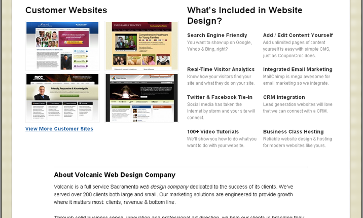
Melvin Ram, Volcanic Web Design, redesigned Volcanic’s homepage after watching the “Quick Win Clinic (Part I): The 5 easiest changes to make to your landing pages right now.”
After testing some variations, Melvin’s team put together the above redesign that far outperforms the original control.
“What we have right now converts four times higher than the original version,” Melvin said.
Test ideas for further improvement
I took Melvin’s homepage redesign to one of our peer review sessions for optimization suggestions. Here were some of the recommendations from the session …
Suggestion #1: Test the photo
One of the first suggestions the group had was to test the stock photo. A previous experiment tested the use of real people vs. stock photos, and the results suggest a strong relationship exists between photos and relevance.
From those experiments, we were able to discover three key questions you should ask yourself when using images:
- Is the image RELATED to our core value proposition?
- Is the image RELEVANT to my visitor’s current situation?
- Does the image bring a REALITY to my offer that words cannot deliver?
Suggestion #2: Headline
Volcanic’s headline is “What’s most important to you?” and, like the stock photo, it does little to effectively convey the value proposition.
“The focus of the headline should be on what you do as a company,” said Lauren Maki, Optimization Manager, MECLABS.
Try testing headlines — for example, “Get Web design solutions specific to your needs” or “Get custom solutions for your Web design needs“— that focus on what a potential customer “gets” instead of asking them an empty question.
Suggestion #3: Call-to-action button
At first, the “Free price quote” call-to-action button color is green; however, when you scroll across, it changes to red.
Webpage design often overlooks the element of color and the impact it has on site performance. In a recent Web clinic on how color impacts conversion, Flint further emphasized this issue: “Most of us don’t know how to use the elements on the page to control the eyes so that the eyes go across a set of visual cues that are synchronized with the ideal sequence of thoughts.”
One of the mistakes featured in the clinic that designers make with color is the wrong emphasis, which matches closely to the call-to-action button on Volcanic’s homepage.
The group suggested testing against the color-changing button or perhaps testing a different second color that is less discordant with the green currently in use.
Related Resources:
Images vs. Copy: How getting the right balance increased conversion by 29% (Web clinic replay)
Headlines on Deadlines (Part 1): How to consistently write effective headlines without working late
Headlines on Deadlines (Part 2): How to consistently write effective headlines without working late
Website Optimization: 3 quick win changes you can test right now


Hi everyone, I’m Melvin Ram from Volcanic Web Design, the company mentioned in this post. If anyone has questions about how we achieved the approx. 400% increase in conversion rates, feel free to ask and I’ll try to answer as openly as possible.
Also, thanks to MECLABS for the suggestions. I plan on running the tests in the near future and will report back on how it goes.