

This post is the fourth post of a five-part series on B2B landing pages.
Analyst Adam Lapp reviewed this landing page, submitted by Nteractive for our Feb. 25 live optimization web clinic.
Thanks to Nteractive for entering our contest — in addition to being selected for this review, you’ve won a free on-demand certification course of your choice.
Analysis of channel
So, let’s assume that I am a mayor of a small town on the email list for propective CouncilView customers. The headline for the email is simple, yet effective. It tells me exactly what CouncilView can provide for me: streaming video of meetings over the internet. You have captured my attention and if I really do need the product, I am ready to click.
But there is a problem here. At this point there is no call to action ready to meet my so-called “click readiness.” Instead the email continues to sell, sell, sell.
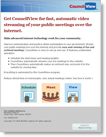
The primary goal of this email should not be to sell the product. It is to get a click.
Compelling readers to click
Optimize the email to get the click by clarifying what the product is and piquing interest in it. Consider testing an incentive such as a free trial or discount.
You cannot inspire a click without providing a “place” to click. In this email, the banner is the only place to click. There needs to be an intuitive, instantly recognizable button or link for users to identify as a page objective. Emphasize it and make it stand out with elements that guide the eyepath such as color, size, and shape.
I would also consider making the entire email clickable.
Analysis of landing page
Now that you’ve got them in the door, it’s time to optimize the landing page to advance the sales process that the email started. Unfortunately, this landing page technically does not greet the potential customer nor tell them why they should purchase the product.
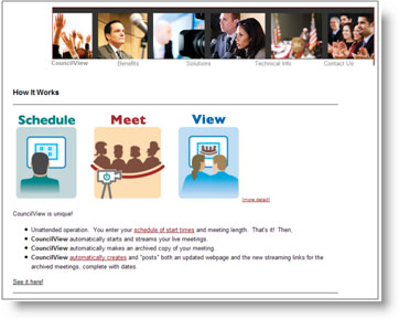
Think of your landing page as a salesperson calling a prospect. Would the first thing they’d say on the phone be, “How it works: Schedule, Meet, View”?
Just as this type of dialogue would immediately result in a hang up, you can expect a number of visitors to such a landing page will immediately “hang up” — that is, exit the page.
Making the connection
Your page needs to meet these visitors with a headline that welcomes them, maintains continuity with the email, and is congruent with your value proposition. Follow that headline with a short paragraph that educates them about the product and establishes its credibility.
Credibility is key! You can tell me all you want about the product, but it’s useless if I don’t believe it. If you’ve won an award, or if well-known people or companies use the product, then say it.
We are now leading the potential customers down a logical road from introduction, education, and establishing trust. They are almost ready to click forward, but need just one more push. Help them take this leap with three or four bullet points of the most desirable aspects of the product.
But just like the email, I don’t instantly recognize anywhere to click. It appears that the primary call to action is the small text link at the bottom left of the page that says, “See it here.” Make this a button that draws the eye with color and looks clickable by having some drop shadow. But most importantly, the button copy needs to convey something tangible that the visitor will receive by clicking. Consider something action-oriented such as “Get FREE Access Now.”
Right now, the link takes the visitor to an inconvenient and confusing new page where you can view meetings in progress. I also searched through all of the top navigation and nowhere do I see a place to buy the product. Our goal as internet marketers is to make it as easy as possible for our customers to buy from us. Test making the purchase option the primary call to action of this landing page.
I believe this product is a software package, so it could lend itself perfectly as a free trial. A free trial can significantly reduce the anxiety visitors have about buying a product they don’t know everything about.
By optimizing this page, there is enormous opportunity for you to improve your sales. Good luck with testing these recommendations and keep us in the loop with your results.
Audience: What do you think? Use the comments field to post your suggestions for this landing page, agree/disagree with Adam’s assessment, and let the Nteractive folks know what you would do.
We’ll post our final landing page winner on Tuesday…