“It’s right there, just click on Company, then About the Team, and then Areas of Expertise.”
“We need the form to capture the Social Security number, because then our phone reps won’t have to ask for it when they call.”
“All they have to do is set up the domain name first, and then they can complete their Web hosting order.”
Our analysts hear this all the time—how marketers justify not immediately and clearly communicating their company’s value proposition to the visitor, requesting personal information that stops the visitor from submitting the lead form, or requiring full account setup before the sales transaction can be completed.
Those marketers are right. Not just because the value statements are indeed there or because the personal info will be provided by phone, or because account setup will be completed later anyway. They have hard numbers to show that visitors do jump through these hoops and conversions do happen.
The problem is that they are right only a tiny fraction of the time—measured by a metric we know and love: the conversion rate.
Climb every mountain
Yes, 0.5% of your visitors figured out a reason and a way to buy from you. Maybe it’s 10% or 30%. Whatever that number is, it may only represent what we call highly motivated visitors. But what about the rest? That other 99.5% that didn’t convert?
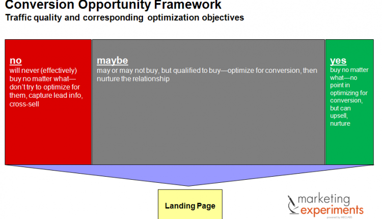
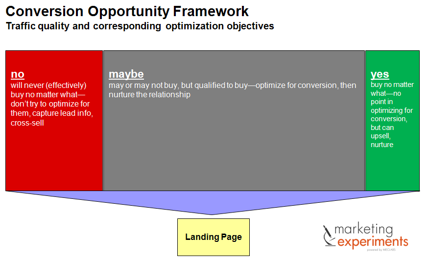
This brings us to a communication gap. The marketers and the optimization analysts are talking about two different types of visitors; they are making two different sets of assumptions. To explain what we mean when we say “a visitor isn’t given a reason to buy from you, as opposed to your competitor” or “this form creates too much anxiety for a visitor to complete it,” I wanted to put together this simple (if not over-simplified) diagram.
Of course, for each site and traffic source, the relative size of each segment is going to be different. However, the “maybe” group is typically the largest, and is the primary focus for optimization.
The green segment? They’re already converting. Yes, there are things to optimize for them—engagement, re-marketing, even immediate upsells. However, all of these things happen after they converted or made an unequivocal decision to convert: the typical optimization objective has been achieved.
Wrong turn
The “no reason to be here” red segment? Your ads might be leaking serious money because they’re bringing you visitors that will never convert within a realistic time frame. You need to optimize how you get traffic, not the page, to fix this. Trying to optimize a page for this group is not only a waste of resources, but can mess up the page for the “maybe” folks—the bigger and better opportunity. One example of this is trying to squeeze every product you have into your landing page and praying that visitors will bite on something.
By default, optimization is all about the gray “maybes.” The huge segment of your site visitors that are in the market for what you’re selling, but they have not made a decision to buy from you. You have to give them a reason and make it easy, or at least manageable, to convert. How well you do this is going to be reflected in the conversion rate, and all the subtle—or not so subtle—changes that can sway these grays to convert or to click on the “x” button is what optimization methodology delivers.
Meet them halfway
So, next time someone tells you “well, we have all these testimonials in the fourth sub-section under the Company page that’s in the footer”—don’t get angry. Just explain that people that figured out where to find this information either have too much time on their hands or are your Aunt Sophie.
They want to buy from you already, and no matter how difficult you make it for them, they’ll figure out how. If you want the rest of the visitors to buy, you’ll need to do some work too.
Related Resources
Conversion Rate Optimization — How our test site improved its overall conversion rate by 41.8%
Ecommerce Holiday Playbook: 13 ways to maximize revenue and beat the downturn


Boris, does landing page solves the problem of conversion rate which is the high priority for me. if so, what all must be included in landing page, length and what else you recommend. My site is for online market research and not sure how to get good conversion rate though i do internet marketing myself.
Hi!
I really like that simple yet very eye opening way of segmenting the visitors. “Yes”, “No” and “Maybe” people brilliant.
Mentioned you in my latest news roundup on theblackboard.net: http://ow.ly/32qsU
Thanks!
I have another one… “We’ll use the lead form to educate our visitors about what we offer.” Basically, this translates to “let’s not allow anyone to give us their information until they have made a final decision about which of our products/services they want from us.” The “yes” people may make it through, but forget about the “maybe” people.
Thanks for sharing this view. I went back to one of our popular marketing pages and revisited it with a perspective on “what info do we really need here?” I decided to remove a few of our registration fields that provided no value to us, and likley detracted some of the visiting audience.
Some of our site papges do require registration, but more often than not as of late, we are not requiring people to register. We have decided to offer more and more info for free, and to have people voluntarily opt-in rather than being forced to sign-up.
I find the worst sites for requesting personal information are the online IT magazines. I find that I am interested in their content, but when they ask fifty questions about me and my organization, I generally go to Google and find other sources for the info. I feel like it wastes my time to fill in all of that info.