There will always be new marketing technologies, strategies and tactics that promise to lure more customers than ever into the sale funnel. But here is what remains constant: No matter what tool you’re using, marketing must communicate the value that the customer wants.
This was underscored by the latest MarketingExperiments Web clinic which looked at this year’s five most important marketing discoveries. You can watch it here.
All of these discoveries make it easier for customers to understand value.
Discovery #1: The impact of immediate authority on content marketing
People always pay for your content with their money or time, and quickly decide whether it’s worth the cost. Show them it’s worth it by immediately building your authority.
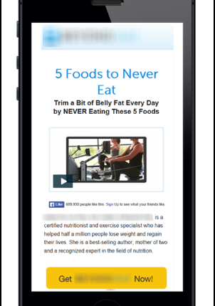
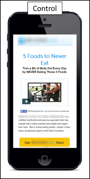
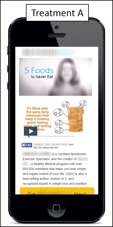
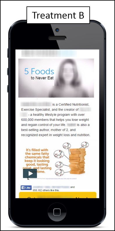
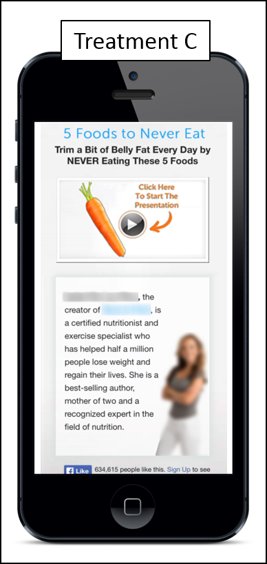
This is illustrated by a diet and nutrition company that was optimizing its site for mobile. The company tested three versions of its site, each with the same video.
The Control headline orients the reader and builds the problem, but there is no connection to authority — the personal source behind the content — to motivate the reader to play the video.
Treatment A immediately establishes the problem in the headline, builds authority by leveraging a photo of the company’s well-known founder before the video and then adds more details about the authority’s credibility below the video.
Treatment B does the same as Treatment A, but places the copy before the video.
Treatment C does not place the authority figure’s image at the top and, instead, focuses on her after the video.
The result: All treatments outperformed the Control. The reader valued the credibility of the authority behind the product. Conversions increased 14% for Treatment C, 22% for B and 35% for A. We believe Treatment A came out on top because it was more aligned with how the reader wanted to be presented the information: provide authority, then the video and then supporting information.
Discovery #2: The impact of navigation
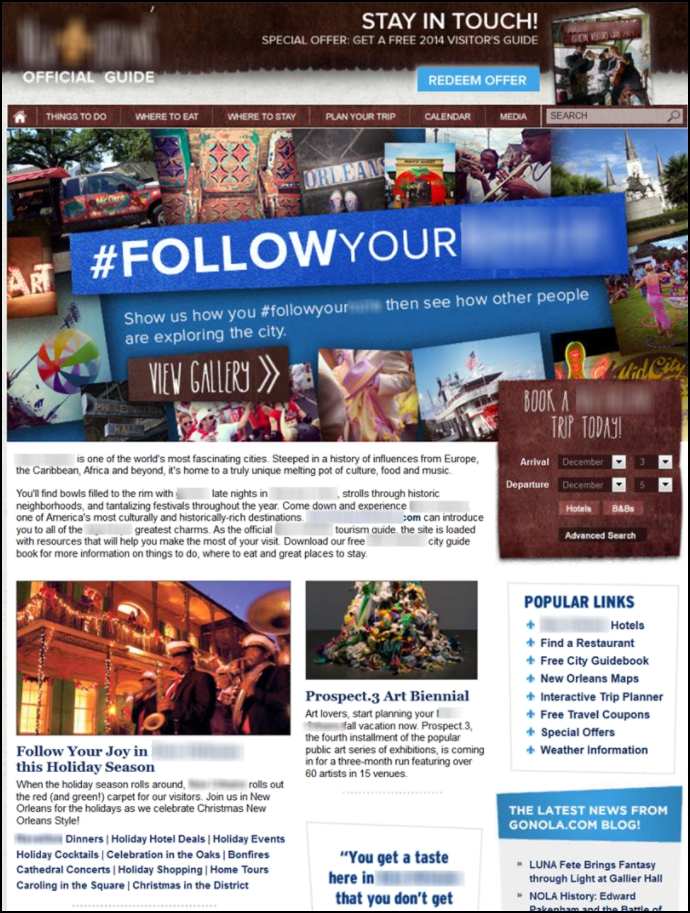
When given the choice of what to test on this homepage, it was decided that navigation would be the best choice. Here’s why: When faced with such a cacophony of image and text, visitors will rely on page navigation to quickly find the value they’re looking for.
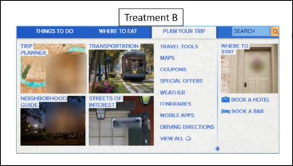
Treatment A streamlined navigation based on how visitors interacted with the site over the year; the less-popular content was removed to reduce friction.
Treatment B added secondary information such as advertising-related content.
The result: Treatment A, which simply made it easiest for visitors to find the value they were looking for, outperformed both the Control and Treatment B by 35%
Discover #3: The impact of proper specificity in the subject line
Quit focusing on persuasiveness or length; instead, focus solely on how well your subject line emphasizes the value your customers care about most.
Consider a subject line experiment by a regional tourism board (Boston is being used in this example to protect the board’s identity).
Here’s subject line A: “Holiday shopping, historic tours, pops orchestra concerts and more Boston traditions.”
Here’s subject line B: “Book now to save up to 30% on hotel stays this December in Boston.”
The result: Subject Line A achieved a 9% increase in opens and a 26% increase in clickthrough. The readers valued specific experiences associated with visiting Boston far more than saving money on a hotel room.
Discovery #4: The growing effectiveness of an informal, friendly tone in email
No one wants to be marketed to; they value personal, direct communication.
Consider this email test MarketingSherpa conducted with an email requesting recipients complete a survey.
The first version was written and designed like an advertisement.
The second was written like a personal email.
The result: The second email received 60% more clicks with 159% more completed surveys.
Discovery #5: The impact of brand standards on consumer behavior
Ensure that the brand elements help, not hinder, people from attaining the value they want from you.
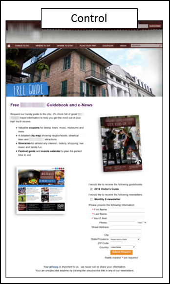
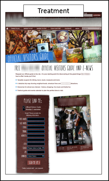
A tourism organization wanted to make sure its brand identity was cohesive across its website. Therefore the company changed one of its landing pages from this:
To this:
The result: a 34% decrease in conversions. The Treatment asked too much of the readers even though the exact same information was being presented. But the design made it seem like so much more was being asked of the reader; in the readers’ minds, that outweighed the value they would receive from filling out the form. So fewer moved forward.
You might also like
35 Key Principles to Boost Your Marketing Campaigns: 2015 Web clinic year-in-review
How to Avoid Losing the Value of Your Value Proposition
Discovering Your Value Proposition: 6 ways to stand out in a crowded marketplace [MarketingExperiments Web clinic replay]
MarketingSherpa Summit 2016 — At the Bellagio in Las Vegas, February 22-24


