When it comes to how color use can impact the performance of a landing page, some of the least intuitive changes can produce a significant lift.
So, in today’s MarketingExperiments Blog post, we’re going to look at how the MECLABS research team used a simple pop-up overlay on a landing page to increase account sign-ups 63%. But first, let’s look at the research notes for a little background …
Background: Company provides educational resources for health and fitness professionals who subscribe to one of its online memberships
Goal: To increase the amount of free debt consolidation sign-ups without additional traffic
Primary Research Question: Which page will generate the highest completion rate?
Approach: A/B split test of three different versions of a homepage
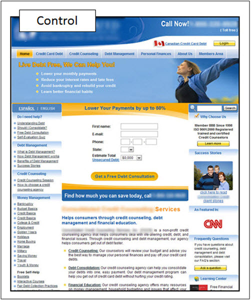
Control
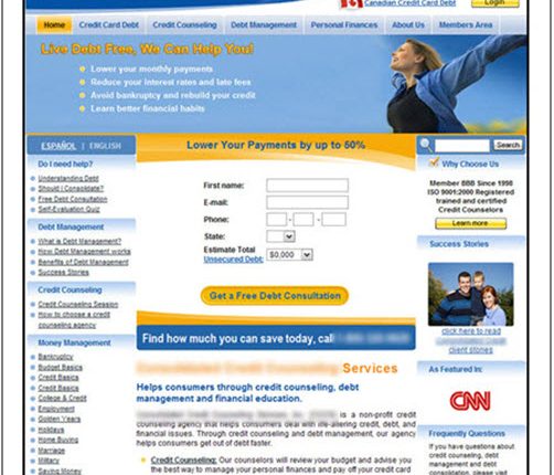
The research team hypothesized the main objective of the page was lost in all of the color design of the landing page.
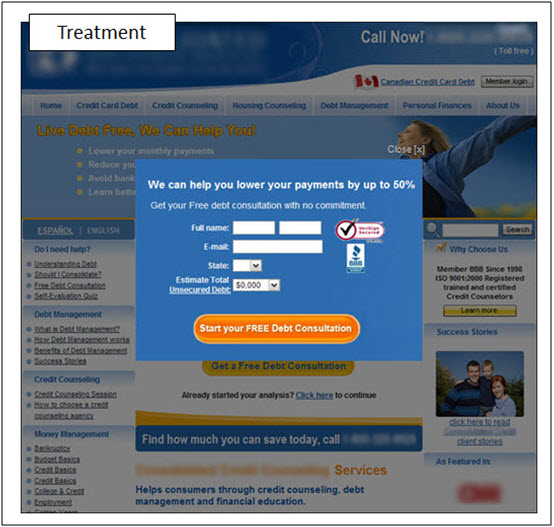
Treatment
In one of the treatments, the team created a pop-up to eliminate all color distractions.
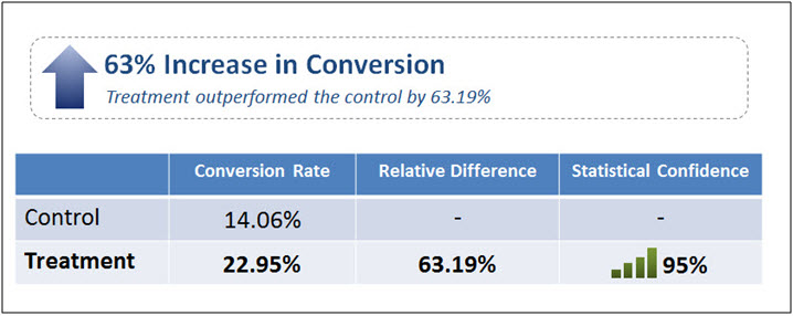
Results
What you need to know
By eliminating all color distractions, the pop-up overlay version of the form received 63% more completions than the control.
You can watch the full free Web clinic, “How Do Website Colors Impact Conversion?,” to see Flint McGlaughlin, Managing Director, MECLABS, reveal four more surprising findings from our optimization testing and experimentation.
Related Resources:
Landing Page Optimization: Simple color change increases conversion 10%
Web Usability: Long landing page nets 220% more leads than above the fold call-to-action
Web Usability: People don’t need many options, they need the right options


Oh that is a VERY interesting application of popups. I hadn’t considered that. I always learn so much from you guys. Thanks!
*
The minute those pop ups, well, pop up, I’m out of there.
Spammy and scammy.
*