When looking to generate more leads from a landing page, make sure your objective is well defined on the page. A small, hidden call-to-action may not be seen by visitors, leaving potential leads unsure of the next step.
If this is the case, you may not need a radical redesign on the page. Instead, a simple and small change — highlighting the form as the next step in the visitor’s thought sequence — could increase the number of leads you capture.
Wanting more prospective students to fill out its lead gen form, American Sentinel University worked with MECLABS as a Research Partner. Read on to learn how a small change to the page increased the form completion rate by 40%.
Background: American Sentinel University, an accredited online university.
Objective: To increase the number of leads captured to speak with an advisor.
Primary Research Question: Which treatment will yield the highest conversion rate (i.e., form completion)?
Test Design: A/B test
When looking at the data analytics for its website, American Sentinel found that just 8% of unique visitors make it to a “Request More Information” form page. However, once a visitor arrives at a form, the data shows a completion rate of 43%.
“So we saw that there was motivation to fill out; the challenge was getting them there,” said Warren Staley, Research Manager, MECLABS Institute.
Previously, there were two ways for visitors to get to a “Request More Information” form page:
- A short form on the homepage, which leads to a second, longer form to acquire additional information from prospects
- Links throughout the site, including on each degree overview page and in the top navigation bar
The MECLABS research team wondered if there was enough value on the homepage to entice people to fill out the lead capture form at that point in their thought process. Thinking this approach might be a case of the cart being presented before the horse, the team developed an experiment to test this hypothesis.
(Editor’s Note: For your convenience, we’ve provided creative samples in two formats – SlideShare and thumbnails that expand when you click them.)
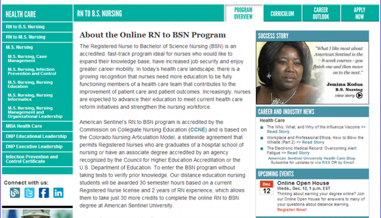
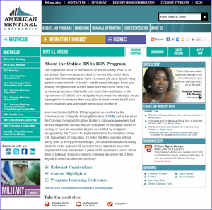
The degree overview pages have a wealth of valuable information, and the next step in a prospect’s thought sequence is to request more information before making the ultimate conversion of applying.
However, the page didn’t generate the clickthrough or completed forms the university wanted.
The MECLABS research team identified a few value and friction issues that potentially hindered the pages’ effectiveness:
- There is no value regarding why a visitor may want additional information.
- The page doesn’t effectively guide visitors through a logical thought sequence.
- Current “Request More Information” call-to-action (CTA) is buried and may not attract user attention.
- The request link in the header is lost due to multiple navigation bars.
- With multiple columns and navigations, too many competing objectives make it difficult for visitors to know what they’re supposed to do on the page.
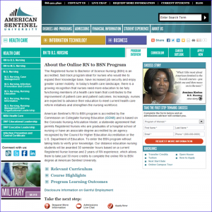
This Treatment brought the same short form on the homepage to the degree overview page, creating a two-step process for prospects. The form replaces the “Career and Industry News” and “Upcoming Events” sections, slightly lowering the number of competing objectives.
The form now grabs attention and enters prospects into the form process on the page, taking advantage of the motivation on the degree page.
Treatment 1 includes three key changes:
- The short “Request More Information” form is located in main eye-path of the page.
- The value of the information request was added to the headline.
- The large, red CTA draws visitors’ attention.
“The second Treatment was bullet points talking about the value you’ll get from filling out the form,” Warren explained. “You’ll talk to an admission advisor, and they can walk you through the process, answer any questions you have.”
The team used Treatment 2 to mitigate anxiety some prospects may experience when asked for their information. What would happen after they hand it over? A phone call? An email?
“Basically, it’s setting it up so it’s not going to be a sales pitch. It’s really to help you get the information you need to make a well-informed decision.”
Overall, Treatment 2 includes three key changes from the Control:
- The value of the information request was added to the headline.
- The large, red CTA draws visitors’ attention.
- The bullet points add value to why prospects should fill out the form.
Results
Adding the short form to the degree overview page increased the rate of completed forms by 40.5%, with a 96% statistical level of confidence.
Notice that while Treatment 1 did, in fact, reach a level of confidence, Treatment 2 did not come close. Based on the sample collected, there was just not enough difference in the conversion rate to confidently determine whether Treatment 2 was more or less effective than the Control. Adding value alone did not make a big enough change in the page to make a difference in visitors’ minds.
What you need to understand
“The biggest takeaway is that sometimes you don’t need a big dramatic change; sometimes just something simple will provide you results,” Warren said. “In this case, they already had a short form, so all we did was take it from the homepage to the degree page.”
If you start small, you can then transfer those discoveries to other pages. After the success of this test, American Sentinel added the short form to its other degree pages as well.
A second takeaway you can pull from this test is to try a two-step form on your website.
“The Treatment with the short form won, so we learned that the two-step process was successful. By having them fill out the short form, they were more willing to fill out the main form,” Warren said.
A two-step process can also allow you to capture at least some of the lead’s information even if they don’t finish the second form. With the initial information, you can use content marketing to increase the quality of that lead.
Third, this test stresses the importance of following the visitors’ thought sequence.
“By having it on the degree page, there was more motivation to have them fill it out there,” Warren explained. “Because now they have information about the individual program, whether it’s nursing, business or IT.”
Prospective students need more than just the value presented on the homepage to decide whether they want or need more information. Questions about tuition are pointless if a university doesn’t offer the program you’re looking for. Allowing prospects to find a program that interested them and then asking them to fill out a form works better in the thought process of choosing a university.
You might also like
Lead Generation: Is your registration form part of the customer journey? (More from the blogs)
Optimizing Web Forms: How one company generated 226% more leads from a complex Web form (without significantly reducing fields) (Web clinic replay)
Marketing Research Chart: Optimize landing pages for lead quality [MarketingSherpa case study]


Good points. If I may add, landing pages should be short, concise and inviting with a clear call to action. Keep any form fields very short. Many users are on mobile devices and do not want to type a lot. Lastly, to increase conversions do not include captchas on forms, everyone hates them. Thanks!
Yes, that is a very good analysis even we experiment that short-form perform better than long forms.
Very great and helpful article. Recently I made forms on stepFORM and made them terribly long. As a result, I reduced the number of fields, but the form was still large. Then I decided to make a step-by-step form and it became much better, visually the form seems small.