Are Internet users becoming indifferent to testimonials? Is “testimonial blindness” becoming the new “banner blindness”?
Skepticism toward this marketing tactic, combined with the spread of Web 2.0 style user ratings, has raised the bar for marketers. As testimonials and other credibility indicators become increasingly prevalent on Web pages, marketers need to know how to use them most effectively to help increase conversions.
In our July 9 clinic on this topic, we looked at tests that showed how testimonials can help — and sometimes hurt — results and examined strategies for making credibility indicators more powerful.
Editor’s Note: As we mentioned in the clinic, the following multivariate tests also included changes to other page elements. Our goal in sharing this research was to show that credibility indicators play a significant role in conversions — both positive and negative — based on the context in which they are applied. These tests did not isolate the specific impact of testimonials; however, the results make a strong case for additional testing and support the best practices we have identified in past experiments, as outlined in more detail below.
The audio from the Web clinic on this topic can be downloaded here:
Using Testimonials Effectively: How credibility indicators can help (or hurt) your conversions
Testimonials – Do They Help or Hurt?
A cursory review of Internet marketing sites shows that most marketers favor using testimonials. This is also reflected in the countless websites using this tactic to try to increase leads or sales.
Regardless of the tactic’s popularity, the questions remain: Do credibility indicators help, and if so, by how much? If not, how did they become so ubiquitous? What will make them most effective?
A Word about Transparent Marketing
At MarketingExperiments, we believe trust is earned with two elements: integrity and effectiveness. Both demand that marketers put the interest of the customer first.
Today’s consumers are fed up with exaggerated and unsubstantiated claims. It’s far better to let someone else do your bragging — customers, partners, trade press, etc. Why? Because when the quality of information is debatable, todays consumers will always resort to the quality of the source. [We expand on these ideas in the Marketer’s Creed.]
As a result, marketers should strive for transparency and clarity in their marketing messages and approach. Today’s consumer expects it; tomorrows consumers will demand it.
What Makes Testimonials Tick
Transparent marketing is a key reason why credibility indicators such as testimonials, when properly used, tend to perform well. On a scale of 1 to 5 (with 5 being the “most effective”), marketers surveyed for the MarketingSherpa Landing Page Handbook rated various types of testimonials among the most effective tactics for improving conversion rates.
| Marketing Tactic | Total | Client | Agency | B2B | B2C |
|---|---|---|---|---|---|
| Customer Reviews |
3.5
|
3.5
|
3.6
|
3.4
|
3.6
|
| Video Testimonials |
3.4
|
3.4
|
3.4
|
3.5
|
3.3
|
| Audio Testimonials |
2.9
|
2.9
|
2.8
|
2.9
|
2.8
|
Source: MarketingSherpa Landing Page Handbook
From this survey, we can infer that the level of performance associated with testimonials can be linked to their level of credibility and authenticity. Customer reviews are perceived as the most trustworthy, while video testimonials are a close second. Why? Because the customer is visible, adding a layer of veracity that audio alone (which scored lower) doesn’t provide.
Text-format testimonials are often the easiest to acquire and display, but thats also partly why they are less likely to be perceived as genuine by prospects. This is especially true when quotes are anonymous or initialed; lack details such as title, company, or a photo; or sound contrived (even if legitimate).
Bottom line: Marketers need to step up their efforts with credibility indicators if they want to improve results. By itself, plugging a list of quotes from random customers into a page is not likely to produce a significant gain. You need to get more powerful, specific, authoritative testimonials and use them strategically on your pages, and often in conjunction with other credibility indicators, if you want to see a major impact.
Case Study 1: Text & Video Testimonials
We partnered with a consumer credit counseling service to optimize its subscription sign-up process. The primary research question we sought to answer was: Which registration path will produce the highest conversion rate?
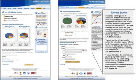
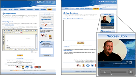
Our radical redesign test applied several changes to the eight-page registration process. This brief examines two key pages at the end of the process that tested text and video testimonials, as well as other changes.
The control pages sidebar featured a privacy and security block with logos and a message center for users to submit questions. The treatment replaced these items with testimonials and moved the security logo next to the form fields relocated from the previous page in the sign-up process. (Other elements tested on this page included headline, copy and navigation tabs, and the button calls-to-action.)
The control page featured a sidebar similar to the previous control page (privacy and security block with logos and a message center). The treatment added a short video testimonial to the sidebar and also modified the page headline, copy and navigation tabs, and the button text.
Results
| Page 6 (Text Testimonials) | Conversion Rate |
|---|---|
| Control |
59.46%
|
| Treatment |
74.55%
|
| Relative CR Difference: |
25%
|
| Page 7 (Video Testimonial) | Conversion Rate |
|---|---|
| Control |
11.62%
|
| Treatment |
34.96%
|
| Relative CR Difference: |
201%
|
What you need to understand: While the full gains cannot be attributed to the testimonials alone, the testimonials were among the most prominent changes to the pages — particularly the video clip. These results make a strong case for additional testing.
Conclusions
Testimonials played a significant part in increasing the conversions in this radical redesign test. The size of the conversion lifts correspond to the different treatments (smaller gain from the text testimonials, larger gain from the video clip).
What factors made these testimonials more effective?
- Their proximity to aspects of the process that created anxiety — the last two pages of the registration process and submission of personal information.
- Their authenticity, particularly the video clip, helped prospects relate to real customers and see their own problems being solved.
- Their tone helped lend a more personal feel to the registration process; this tone was also reflected in changes to the copy and calls-to-action.
Why Alleviating Anxiety Is Essential
Anxiety is defined as a psychological concern stimulated by a given element in the sales process.
While anxiety often stems from legitimate concerns, its degree and impact are often disproportionate to the measure of risk. You must address it on two levels: substance and perception.
Example: Your customer wants to know that if she has a problem with the order or the product, the problem will be corrected quickly and completely without undue difficulty. This is anxiety rooted in substance.
What the customer may fear, though, is that if she has a problem, she may be abandoned and “left out in the cold” or forced into a lengthy and time-consuming dispute resolution process. This is the impact of perception.
If you address the substance of anxiety but not the perception, you will achieve mixed results at best. This is why anxiety is more lethal to the close/conversion and the buy process than friction.
In turn, marketers must overcompensate for sources of anxiety in the buy process.
[Editor’s Note: This and other aspects of the MarketingExperiments Conversion Sequence are covered in more depth in our Landing Page Optimization workshops and certification courses.]
Using Testimonials to Reduce Customer Anxiety
Common sources of customer anxiety include:
- Quality of the product/service
- Reliability of the product/service
- Credit Card Security
- Price
- Competitiveness — Can I get it for less elsewhere?
- Cost/benefit — Is it worth the price for me?
To improve relevance, testimonials should be categorized and applied to pages where they intersect with sources of customer anxiety, for example:
Quality:
“I was pleasantly surprised to find that your program was not like the typical cheap shareware software so prevalent on the internet. Instead it is extremely well crafted and it’s obvious a mountain of research and effort was put into its design. The step by step instructions are meticulous and easy to follow.”
– Ken Smith, VP Sales
Brand X, Tampa, Florida
Ease of use:
“Dear sir, I am impressed at how sophisticated your software is and yet it is easy enough for my 12 year old son to use. And boy is it accurate!!! Thanks for creating such a great product.”
– Stephen Jones, Controller
Company B, Madison, Wisconsin
Four Keys to More Powerful Testimonials
To increase the impact of your testimonials, review your pages with these four principles in mind:
- Specificity:
How precisely do your testimonials address the sources of
customer anxiety and work to counteract it?
- Proximity:
What can you do to increase the proximity of the relief to the source of the customer’s anxiety?
- Intensity:
Are your measures strong enough to overcompensate
and address both the substance and perception?
- Authority:
Do your credibility indicators carry enough authority?
Do they fit with your intended audience?
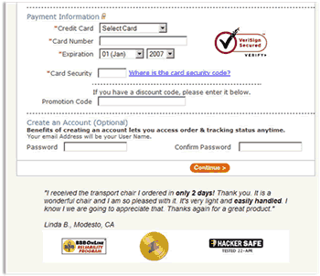
Example: Order Form Page
The step of the order process which asks for credit card information is a critical decision point (and a significant source of anxiety) for the customer.
In this example, the third party security logo is placed alongside the credit card entry form — the source of concern for which it is the corrective measure.
A powerful testimonial that addresses three concerns (timeliness, product quality, and customer satisfaction) is placed directly beneath the primary call-to-action button.
Additional credibility indicators below the testimonial add further to the intensity of the corrective measure — over-correcting at this crucial point in the order process.
Case Study 2: Testimonials & Logos
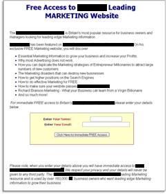
We conducted tests with a marketing information publisher to increase registrations for a free email newsletter; traffic came from PPC ads. Our primary research question: Which sign-up page will produce the highest conversion rate?
We used a radical redesign and tested two different treatments against the control, with significant changes to the design, copy, and calls-to-action. Both treatment pages used testimonials and credibility indicators.
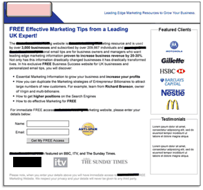
The original, control page is plain copy with headline, bulleted copy, short sign-up form, and button with call-to-action (FREE Access). The copy cites names from leading media outlets to establish authority and credibility.
Several changes were made to this treatment, including:
- Client logos and testimonials were added.
- Brand was emphasized with new header and masthead design.
- Logos to increase authority (BBC, The Sunday Times) were added below call-to-action.
- Anti-Spam medallion added next to sign-up form to alleviate customer anxiety.
- Revised copy uses specific data points to support claims.
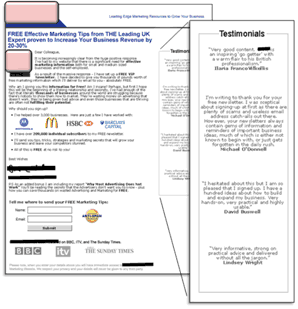
Like Treatment 1, changes tested to enhance credibility included adding client logos and testimonials.
- A CEO photo, letter-style copy, and signature frame the offer with a personal approach.
- The sign-up offer also emphasizes the free bonus report incentive.
- Different calls-to-action were tested above the form and on the submit button.
Results
| Control |
14.11%
|
| Treatment 1 |
7.11%
|
| Treatment 2 |
7.42%
|
| Relative CR Difference: |
– 49%
|
What you need to understand: The control outperformed both treatments — even though the treatments used a variety of research-tested best practices, including testimonials and other credibility indicators such as client logos and an anti-spam medallion.
Conclusions
In this case, the testimonials and logos were among the treatment changes that reduced conversions. Why weren’t the credibility indicators more effective?
- The control has an “informational” feel while the treatments have the feel of “sell”. Adding name-brand logos and an anti-spam badge created a different tone for the page.
- The control states the product as immediate access to a deep source of information, while the treatments emphasize “tips,” which have a lower perceived value.
- The revised copy, calls-to-action, and design in the treatments went beyond alleviating anxiety and altered the way many prospects perceived the offer itself.
Key point: Like any page element, even using best practices with credibility indicators does not automatically guarantee better results; they must fit the context of the page and offer — and be tested (and retested).
Testing and Applying Credibility Indicators to Pages
Many of the variable cluster tests weve conducted with partners used testimonials and credibility indicators as a key part of radical redesigns. While different elements factor into overall results, our research has identified best practices for testing and applying credibility indicators to pages, including:
- Use them in proximity to sources of anxiety (calls-to-action)
- The more specific the better (full name, title, company)
- Lead with the highest authority (job titles, awards, known names and brands)
- Use real photos or video instead of stock images
- Use real, recognized trust and security icons
Examples of application in other tests:
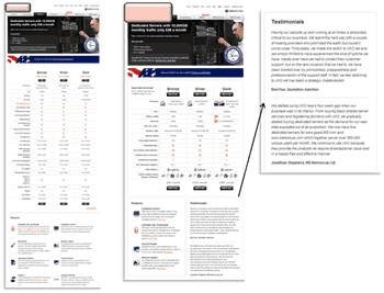
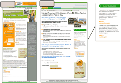
- Testimonials added right beneath sign-up buttons.
- Industry award featured in page header.
- Testimonials changed from white text on gray to black on white.
- Guarantee badge in treatment stands out more and is placed near call-to-action.
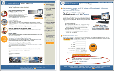
- PC Magazine quote moved below call-to-action; risk-free badge added next to form.
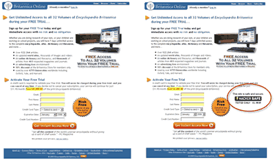
- Britannica tested using a Hacker Safe logo near risk-free badge and sign-up form. This change yielded a 13.2% increase in free trials.
- Strive for transparency and clarity in your marketing. Todays consumer expects it; tomorrows consumers will demand it.
- Simply plugging quotes, badges, and logos into your pages is not enough. To make credibility indicators more powerful, you must:
- Use them in proximity to the sources of anxiety on your site pages and in the buy process.
- Increase their specificity by breaking out testimonials into categories and applying them to the most relevant areas.
- Consider the intensity — is it strong enough to over-correct for anxiety and address both the substance and perception?
- Strive for authority by using the most reputable brands or names and as much detail as possible with attribution.
- Remember that even applying best practices is not guaranteed to improve results. Ensure that your credibility indicators fit the context of the page, offer, and buy process. And always test and retest to determine their true effectiveness.
Related Marketing Experiments Reports
- Clarity Trumps Persuasion
- Improving Conversions by 162%
- Optimizing Site Design
- Optimizing Free Trial Offers
- Transparent Marketing Tested
As part of our research, we have prepared a review of the best Internet resources on this topic.
Rating System
These sites were rated for usefulness and clarity, but alas, the rating is purely subjective.
* = Decent | ** = Good | *** = Excellent | **** = Indispensable
- The Web Credibility Project: Guidelines Stanford University ***
- Evaluating Web Pages: Techniques to Apply & Questions to Ask ***
- Why Testimonials Do (and Dont) Work **
- Powerful Testimonials Lead to More Clients **
- How to Get Great Testimonials, Even if Youre Just Starting Out **
- Using Testimonials to Increase Sales **
Credits:
Managing Editor — Hunter Boyle
Copy Editor — Frank Green
Contributor(s) — Flint McGlaughlin
Aaron Rosenthal
Jimmy Ellis
Bob Kemper
Ana Diaz
Gina Townsend
Production — Mel Harris
Austin McCraw
Cliff Rainer
Holly Hicks
Test Protocol — 1005
Test Protocol — 1040
Test Protocol — 1088


