“The ask.” That’s what your entire copywriting effort comes down to on your landing page. If you have an effective headline, great copy and compelling images, but you fumble at the two-yard-line – the call-to-action (CTA) – then all of your copywriting efforts are for naught.
So, what is the best way to ask the visitor on a landing page to take action?
“A call-to-action is simply a proposition of the value that will be delivered immediately after the action,” said Paul Cheney, Editorial Analyst, MECLABS. “The more value the prospect perceives in the call-to-action, the more likely the prospect will be to take action.”
To help you communicate that value with your calls-to-action, answer these four questions the next time you write a CTA.
Question #1: Is the value assumed or direct?
As Paul says above, your call-to-action should communicate value; essentially, it should have a process-level value proposition to tell your visitors why they should take the action for which you’re asking.

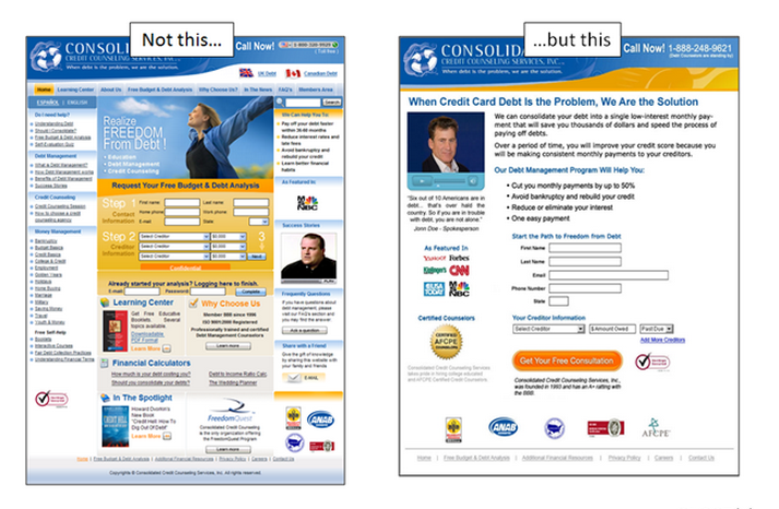
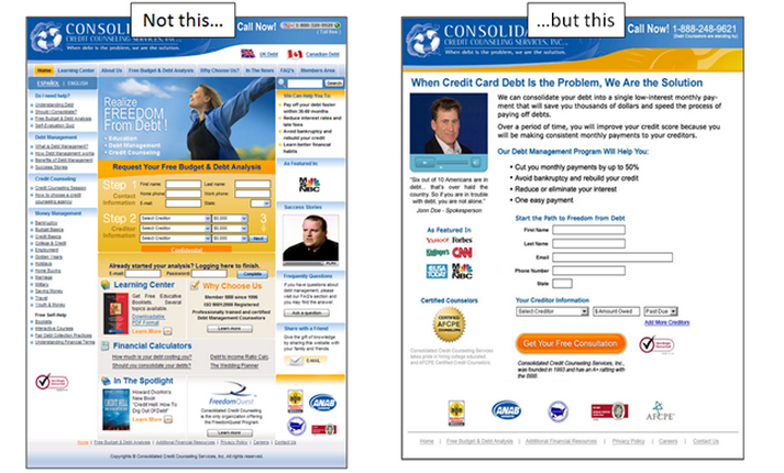
In the landing page on the left, the call-to-action is “Next.” The marketers are assuming that their visitors understand the value of hitting that button and acting.
In the landing page on the right, the call-to-action is “Get Your Free Consultation.” This call-to-action attempts to directly reveal what value the visitor will receive by clicking on that button and moving to the next step in the process.
The optimized call-to-action is one reason the page on the right produced a 357% increase in monthly clients.
Remember, the next step is hidden to the visitor. You must attempt to reveal what value the visitor will receive by advancing to that step in the process.
Question #2: What is the incremental decision level of the visitor?
Dr. Flint McGlaughlin, Managing Director and CEO, MECLABS, says, “An ‘ask’ that is premature (in the thought sequence)” is one reason visitors will not respond to your call-to-action.
So, in an extreme example, if you are selling a house on a landing page, it probably would not make sense for you to say “Buy now.” A more effective call-to-action might be “Tour this home.”
For a complex sale, your visitor is likely not ready to buy right away. So stop and think where the visitor is in the purchase process and what the most appropriate call-to-action is. Some examples:
- Register today vs. Learn more
- See full information vs. Buy now
- Preview report vs. Download now
Make sure you only ask them to do something that of which they already understand the value.
Question #3: Is the tone of my call-to-action appropriate?
Sunday, Sunday, Sunday! Prepared to get annihilated by the bone-crushing tunes of the Jacksonville Symphony Orchestra, during its performance of Symphonie Fantastique!
Again, an admittedly extreme example. For a much more subtle example, take a look at this email test.
While there are far too many changes from these two emails to attribute the 84.6% lift to just one factor, one significant difference is the tone of the calls-to-action (and, consequently, the emails themselves):
- Download Guide vs. View Full Article
This was a quarterly newsletter for business leaders from a large financial organization. The tone of the first call-to-action implies two things: they need a guide, and they should take the time to download it.
The tone of the second email is much less demanding. It allows them to view an article with more information.
Whether the misaligned tone is subtle or extreme, make sure it is in line with your audience’s expectations.
Question #4: Do I have a level of authentic urgency?
People are busy. Without a need to act now or soon, they will often put the action off.
On the flip side, marketers have so abused the words “act now” that they have become meaningless white noise.
However, when there is authentic urgency, it can help improve the conversion rate on your call-to-action.
For example, MarketingExperiments Web clinics are limited to 1,000 attendees. That is simply the limit of the webinar platform we used. When we added that simple fact to the call-to-action of our Web clinic invites, we were able to increase clickthrough by 15%.
Related Resources:
On the Inverted Decision Funnel
5 Common Call-to-action Errors
A/B Testing: 3 resources for copywriting and call-to-action optimization
Calls-to-action Tested: 3 words that increased conversion by 43%


It’s all about putting yourself in the “shoes” of your visitor/prospect. I like to “get inside their minds” and try to look at the website or whatever copy it is from their view/position. What would make them take action?
For the question #1 comparison the one on the right also has less distracting stuff on it, there isn’t those right and left columns full of links… many visitors will click on those and not optin.